Ok, so let’s first define different types of graphics and images so we are all on the same page. I know, this may seem like a no brainer, but for software companies there are a number of different options.
Software Screenshots
These are the hardcore real photos of your product interfaces. They are important for software buyers to see in the early stages of the process because they give confidence to the legitimacy of the product. You wouldn’t order shoes online if you couldn’t see pictures of them.
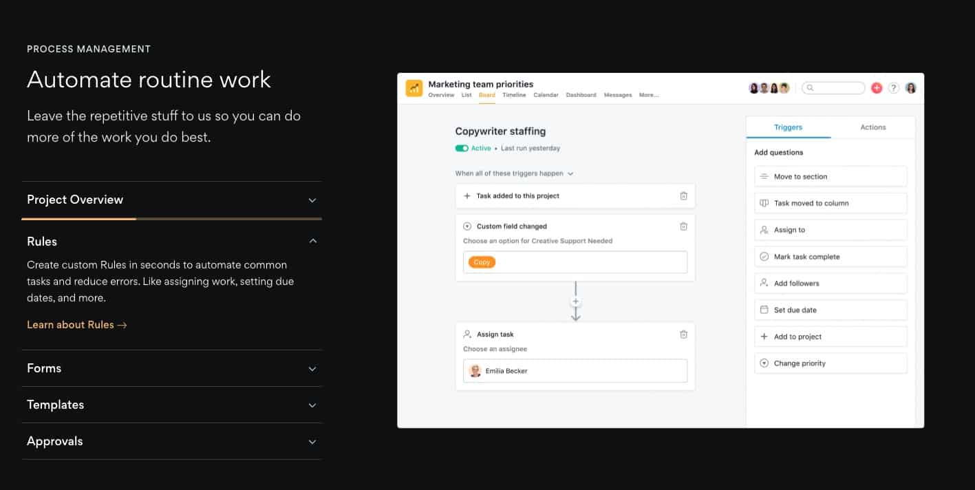
You can see this screen on Asana’s home page.
The one key factor here for SaaS companies – and this is important – is that your screens and user interface look good. A bad UX/UI design can turn away prospects and reduce your conversions.
That’s why we often use some of our other media types…
User Interface Snippets
When designing your SaaS website, using interface snippets can be a powerful way to show features.
It allows you to highlight key factors of the interface while removing anything that you aren’t that proud of.
The difference between snippets and our next type of graphic is that these look real and often use text instead of graphics to make it look authentic.
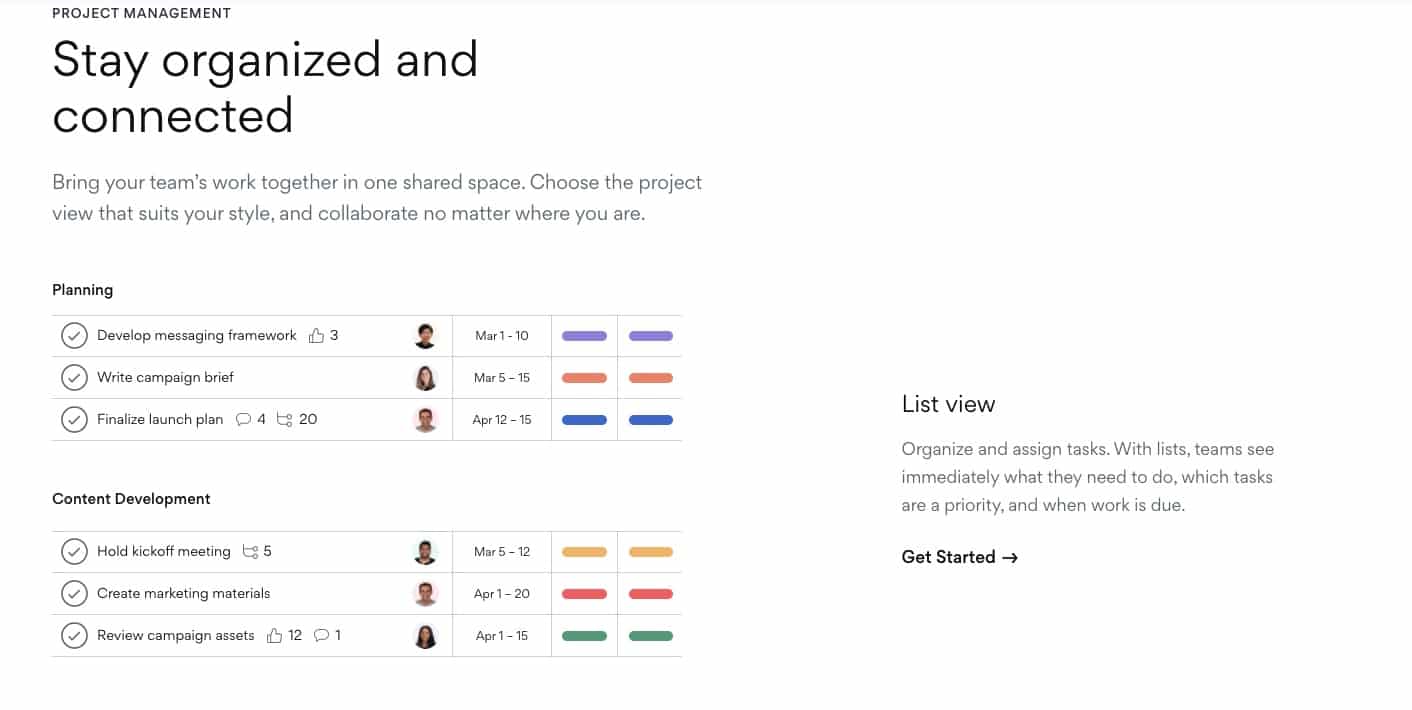
A great alternative to these software interface snippets is representative screen graphics…
Representative Software Screen Graphics
Other times you may want to show interfaces, but make them more representative than real. This allows you to really customize the focus of the graphic so you can tell any story that you want.
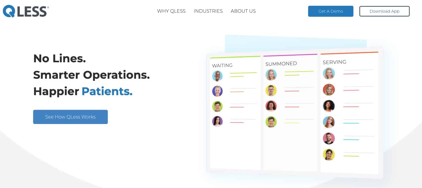
In the case of Qless, a queue management platform, they have not just representative graphics but many that are animated as well.
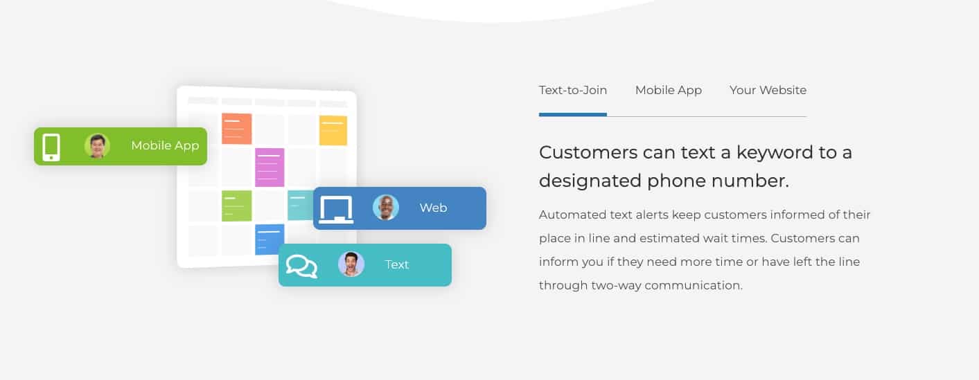
These graphics show the software functionality but do it in a way that is creative and lets the user focus on the concept less than the interface.
Conceptual Software Functionality Graphics
Our next category of imagery for a SaaS Website design is creating graphics that represent a concept. Often this is used to display the outcome of what a feature in the software achieves.
You can see here again with Qless Remote Join for Queuing that they are representing the fact that users can join from any location.
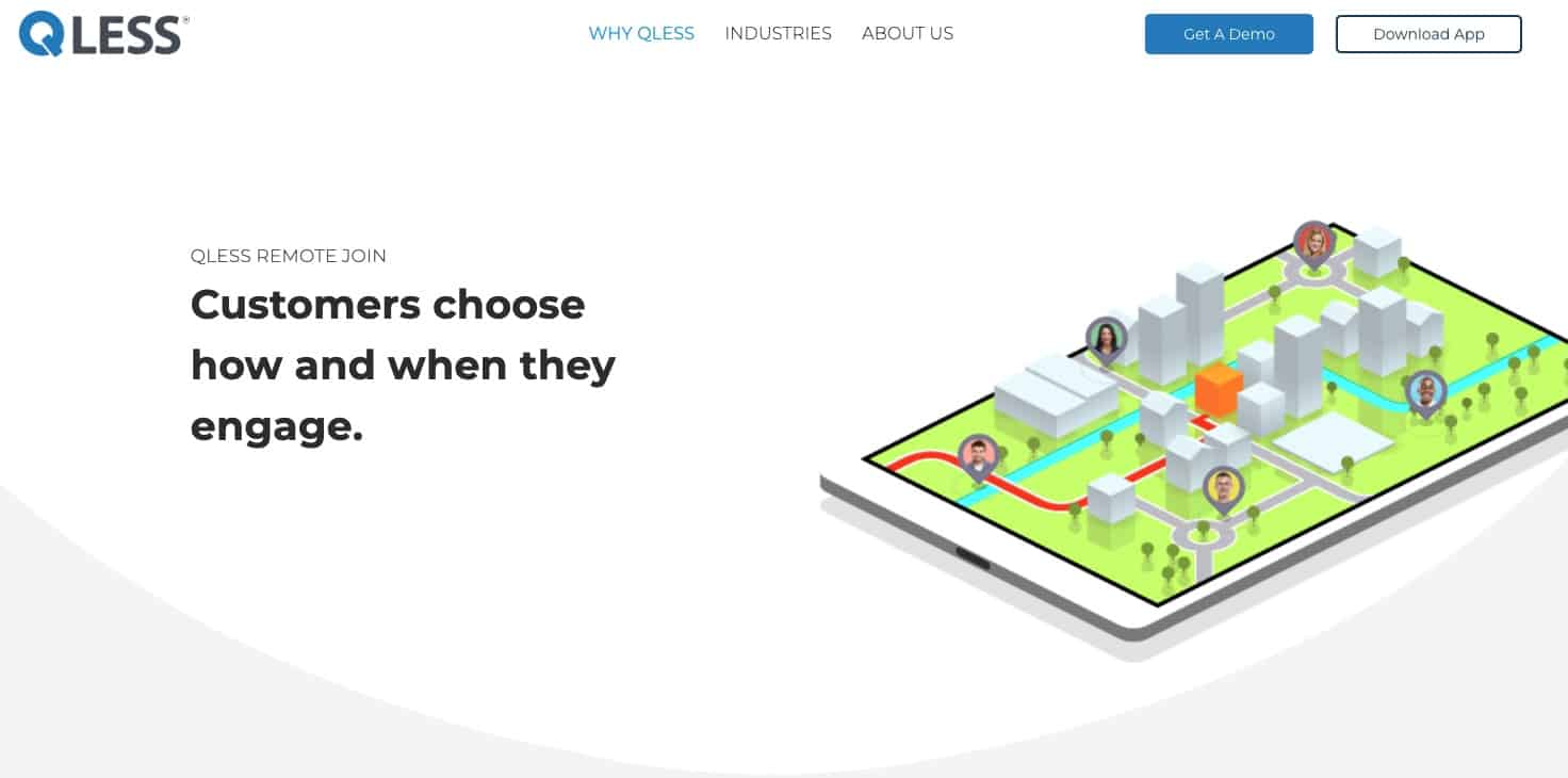
What is great about these graphics is that they really can help emphasize what the software does rather than how it does it. At the end of the day, software buyers want to know what they will get from it – what’s in it for me.
For the next imagery used on a software website, we take a little detour from showing product.
Audience + Outcome Imagery
As we described in the previous section, it is about displaying what is in it for the prospect that is visiting your SaaS website.
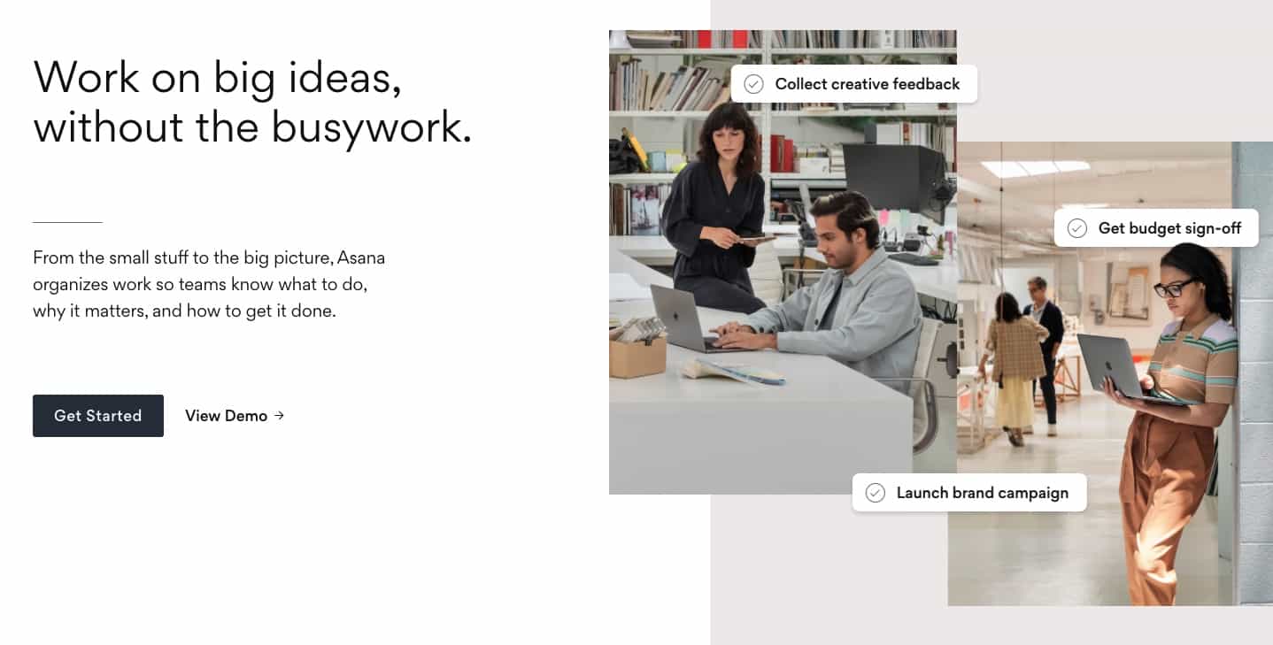
In this case it is showing real people which catches the eye, humanizes a software, and presents outcomes that those people achieve.
While you want plenty of software screenshots, you should not miss out on the opportunity to humanize your software brand.
Cultural Photography
We can’t deny that every software company struggles to hire the very best people to help them scale. Therefore, no respectable SaaS company can be without photography that represents their people and brand.
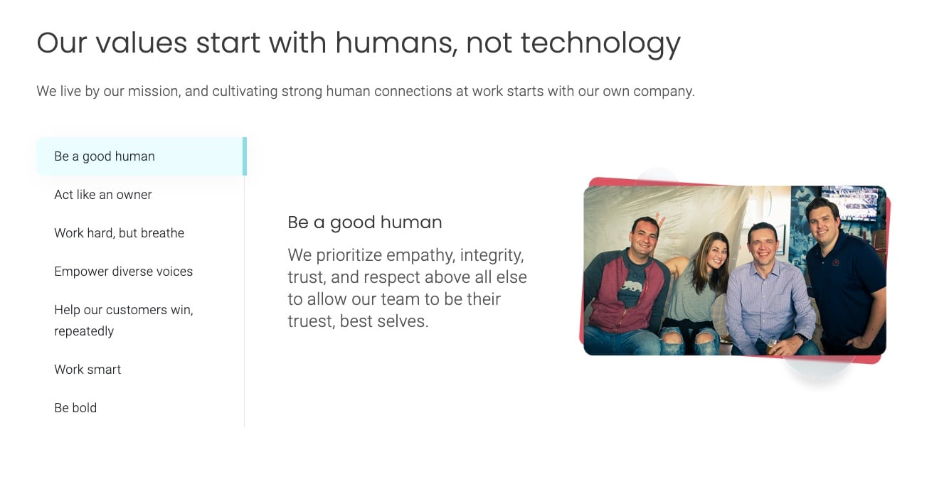
Socialive is a website we built and incorporates a mix of many of the media types we have discussed.
Leadership Headshots or Videos
Most software companies want to promote who is steering the ship to help both prospects and recruits gain confidence in the brand.
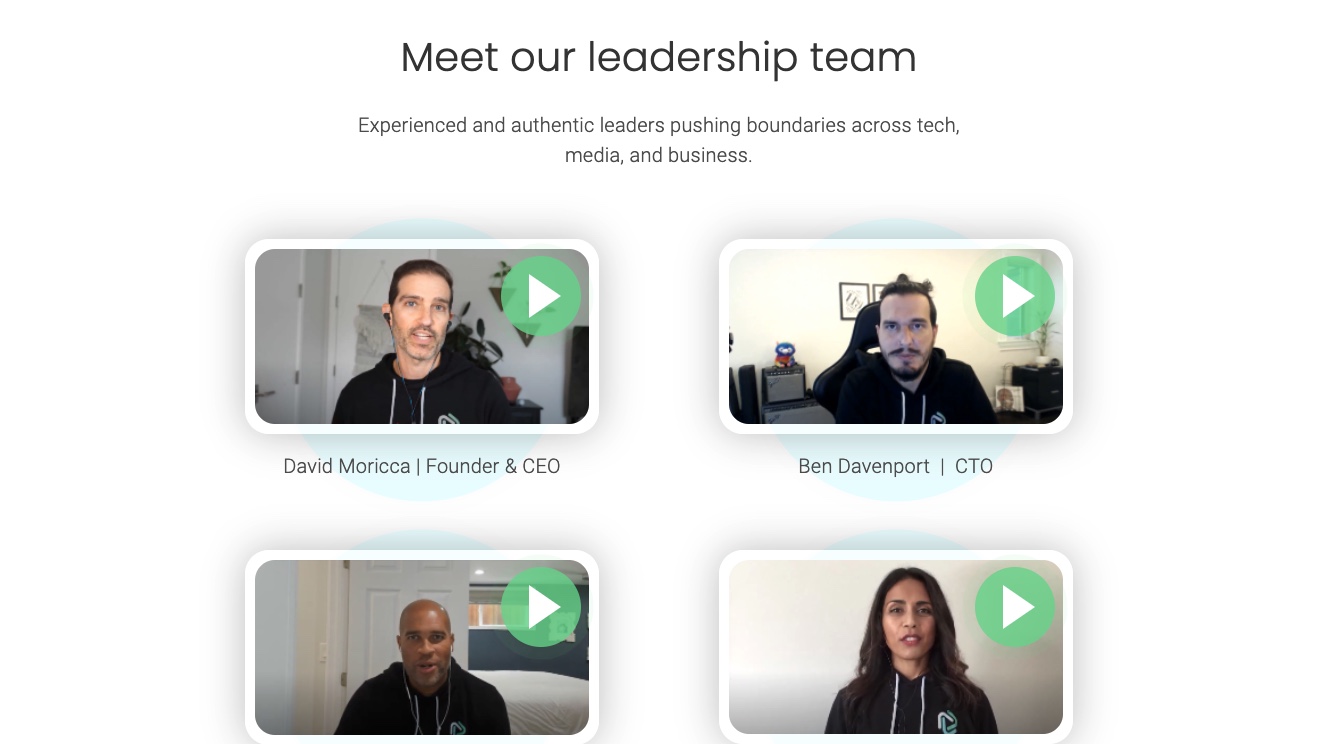
With socialive being a video-centric enterprise SaaS platform, it makes sense that we replaced the standard headshots with introductory videos.
Authenticity in SaaS Brand Imagery
This article title is all about authenticity in SaaS brands. All of these types of imagery are and feel authentic. Even our custom graphics that represent the user interfaces should match the functionality and feel unique to your software.
Authentic graphics look professional and increase confidence.
If you are a SaaS company looking to design or improve your website, a lot of strategy, time and effort should go into the graphics that you are choosing throughout the site.
