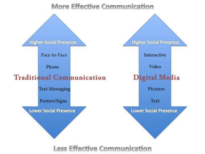
Regarding your company’s website, one of the most important variables to control for is the user’s experience. It can be argued that the customer experience is the end game, and how they fundamentally evaluate your brand. Whether you sell products or offer services, your customer’s experience is ultimately what they remember, and what they share with others. Sometimes they can have a poor experience with your brand or company before even being exposed to any products or services, based off of the judgments and assumptions they form after visiting your website. These days a quality, functional, and intuitive website is not an option, it’s a necessity.
Aesthetics and Design
In 1996, we could get away with having bland, text-laden homepages with pixelated, small-resolution images littered across the page with no discernable purpose. Those days are over, so if you don’t invest in a nice looking website, it creates a first impression that leaves a bad taste in your customer’s mouth. There are many resources available to help you design and optimize the layout of your new website, such as the experts here at Insivia. Take a look at our portfolio to see examples of how we have modernized our clients’ websites. Put yourself in the shoes of a customer, and try to experience the site as they would. You will likely find a profound difference between the before and after.
Functionality and Ease-of-Use
As attention spans decrease with the passing of time, so do most people’s patience and tolerance of functional problems within your website. Some of the biggest culprits are broken links, which can be easily fixed with a little maintenance, such as 301 redirects. Plugins need to be updated quite frequently, and if they are not, your servers are susceptible to crashing, viruses, and invasive hacking. Many of these will not cripple your website altogether, but could cause portions to stop working.
In terms of usability, the big questions you need to ask yourself are how logical or intuitive the design is, and how you can anticipate the needs or wants of your customer/user before they do. For example, many e-commerce sites fail to put a shipping calculator in a convenient place. If the customer has to wait until they input payment data to view options and pricing, they are likely to bounce off your page and shop with a competitor that puts the information they need to make a decision at their fingertips.
Usefulness
Arguably the most important of these factors is usefulness. It doesn’t matter how pretty or elegant your website is if your audience doesn’t find the content, products, or services useful. There are a lot of things that contribute to usefulness, but it begins with unique, original content that is presented in a rich and interactive way. The more interactive or rich the content is, and the more relevant it is to your audience, the more they will return and recommend or share your site with others.
Media Richness and Social Presence
Think of media richness as a continuum that is bookended with text, which is low-richness media, and video and interactive content, which is high-richness media. In between is audio, vines/bitmaps, and pictures. The basic tenants of media richness and social presence theories are that as complexity, personalization, and interactivity increases in a message, so does the ability of communicating abstract and equivocal concepts. What this ultimately means is that the richer a message is, the more effective it becomes at communicating, and the more the receiver feels “present.”

The impact this has from a perspective of user experience is huge. The more presence a user feels, the more they connect with the material and your brand, and therefore, the more likely they will be left with a positive association with it. This can lead to higher conversions, brand awareness, and share rates, among other things.
We would to talk about integrating rich, interactive media into your website. Drop us a line!
Written by: Tony Zayas, Chief Revenue Officer
In my role as Chief Revenue Officer at Insivia, I am at the forefront of driving transformation and results for SaaS and technology companies. I lead strategic marketing and business development initiatives, helping businesses overcome plateaus and achieve significant growth. My journey has led me to collaborate with leading businesses and apply my knowledge to revolutionize industries.
