For us, design is a lot less of art and a lot more of a science – if you want to get results that is.
Software-as-a-service companies large and small rely on their websites to gain awareness, drive conversions and convince prospects. With a goal of MQLs ( Marketing Qualified Leads ), PQLs ( Product Qualified Leads ), SQLs ( Sales Qualified Leads ), and of course Sales a website must be thought of as a science that requires logic and proof to drive increases in these results .
As the leading SaaS Website Design Agency, we are constantly evaluating what specifically works for software companies in driving website results.
Below, we’ll share a few tips that we have found to be effective for SaaS companies.
Top 5 Design Tips Quick Video
The One & Only Killer SaaS Website Conversion Webinar.
Conversion from visitor into a trial, freemium, demo or subscription is one of the most important strategies for a SaaS company. If you haven’t optimized your conversion, then there is no point in spending on marketing or improving retention.
SAAS WEBSITE DESIGN TIP #1
Leverage Your Navigation As A Way To Communicate What Your Product Does
Your SaaS website’s navigation is actually one of the best areas of real estate on your site – it is typically on every page and is also typically interacted with during almost every visit ( according to data and screen recordings ).
Strategically, this is an opportunity to think about how to structure your product as well as website to logically and immediately provide insight into what you do.
Visually, the absolute best way to take advantage of this real estate is to setup a mega menu that provides a lot more space both for navigational items as well as messaging.
Let’s take a look at a few SaaS Website navigations and discuss.
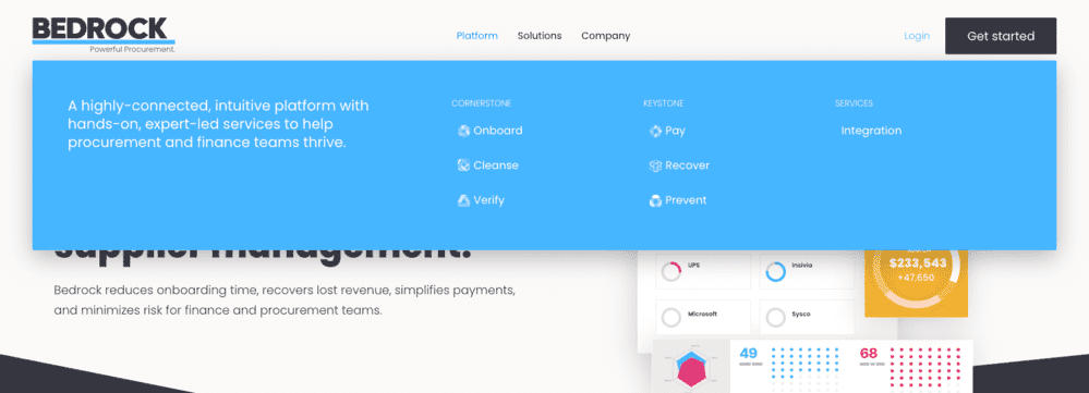
Our client Bedrock , a SaaS company for procurement, uses a mega menu to provide a short elevator pitch and the key components of their product.
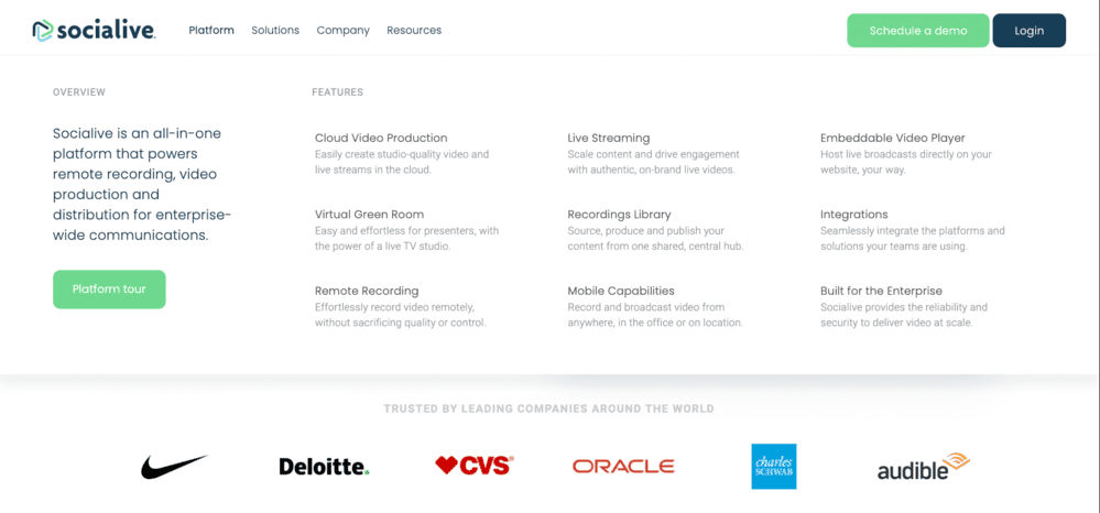
Another client of ours, Socialive , clearly depicts their platform features with descriptive text. Just by opening up this menu, the visitor gets a very scannable interface to see what the full product has to offer. So, without even a click to another page, the visitor has a solid understanding of the SaaS product.
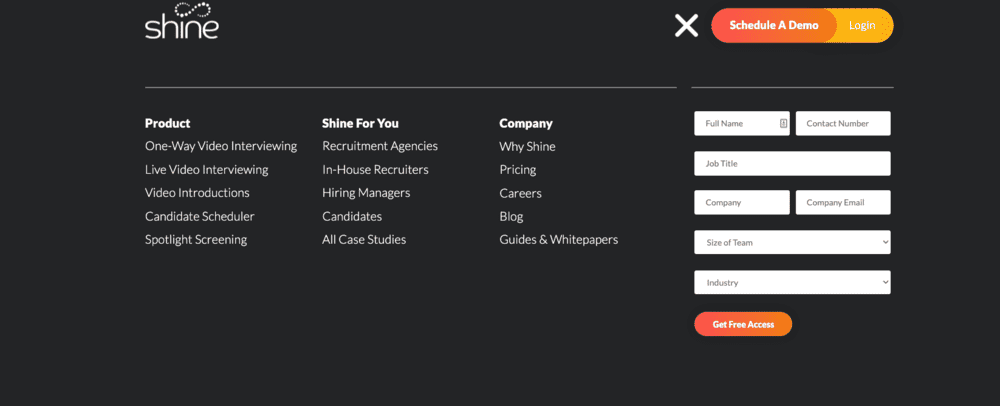
Another SaaS Website we developed utilizes a fullscreen menu that focuses the user just on navigation and includes a sign-up form for instant access. This type of navigation shows you the entire site architecture ( or at least all primary navigation items ) in one view.
It’s important to utilize tools like HotJar to watch real website visitors interact with your navigation. In an ideal world, you can test different navigation structures and messages to see what produces better results.
In our own tests, we have seen that Mega Menu designs often significantly increase the number of pages per visit, but can also sometimes reduce the average scroll depth of visits.
Based on direct feedback though, the real gain is comprehension of the product.
Case Study: The Ideal Navigation Menu (126 SaaS websites)
Each year, thousands of SaaS companies gather around the whiteboard to tackle the thorny task of changing the navigation menu and the taxonomy of the website.
The debates might take hours if not days. More often than not, the outcome is a compromise. And more often than not, they end up with a navigation menu that is not helpful to the target audience.
SAAS WEBSITE DESIGN TIP #2
Get your high-level messaging right before you do anything else.
One of the biggest mistakes we see companies doing on a website is building it around weak messaging. Our philosophy is to build a website as well as marketing on a strong foundation which is the messaging.
Where messaging often misses the mark is that a company is not clearly articulating what makes them unique and why customers should buy.
For SaaS product companies, this messaging needs to have layers that represent the product modules or features while still reflecting the core position of the brand.
SaaS brand positioning is a process that starts with dissecting your audience to truly understand what motivates and influences them to make decisions. With that understanding, a competitor comparison can open your eyes to market opportunities that allow you to position yourself uniquely in the market.
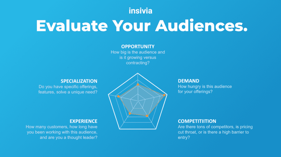
What is a Brand Strategy and why is it important for SaaS and technology companies?
As a software company, you must articulate in words and visuals why people should buy from you. That requires a smart brand strategy and market position.
SAAS WEBSITE DESIGN TIP #3
Showcase your product visually in a way that will excite people to take action.
Look, in some way we are all visual buyers – even the most logical of us benefit from seeing something tangible to help make a decision.
Visual Buying Is Ubiquitous
It doesn’t matter whether your are buying a shoe from Amazon for a CRM for your agency business, visuals drive action.
For software companies, it can sometimes feel difficult or daunting to showcase your product visually — especially if you have not perfected your user interface.
SaaS Website Visuals
SaaS product visuals are all about the user interface of the platform that people will be buying.
The reality is that you can try to use 100 words to explain a key feature or give the visitor an “ah-ha” moment seeing that key feature in action.
Our preference always animated screens that actually showcase actions of a user in the software.
SaaS Website Visual Examples
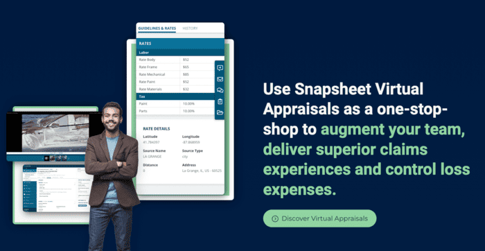
On Snapsheet’s website, we created these graphics that represent the user and the interfaces they would use in the software. This site in particular has a unique features that changes the images on scroll.
Saleslion, an online proposal software, utilizes a simple animation video to represent the software product. This SaaS website features a number of visual designs that represent how their software is utilized.
SaaS Screenshots & Product Tours for Conversion
Prospects want to be able see and feel a product before buying it and software is no different.
For software, our goal should be to provide an experience that allows visitors to virtually touch and try on our product before they convert.
SaaS Screenshots & Product Tours
SAAS WEBSITE DESIGN TIP #4
Make search optimization a center-point of not just your build, but your ongoing marketing strategy.
SaaS SEO is one of the most powerful product-led and sales-led software strategies available.
Driving traffic from search engines typically represents visitors that have a pain or need and are looking for a solution. Comparatively to other channels that force their way into a visitors path – like advertising, SEO is a channel that reaches prospects when they have demand for a solution or answer.
Here are some SaaS Website Design tips specifically for search optimization:
Individual Feature Pages
Typically people are looking to solve a very specific problem. While your product may solve many problems and have many features, people do not search at a high-level as much.
As an example, a video software might want a feature page about how to compress videos even if they have a full video platform as searchers will often ask a question like “how do I compress my video”.
Audience Pages
Creating pages that are unique to each of the different types of users your product has allows you to optimize for highly specific terms.
As an example, a CRM product might have industry pages including a “Manufacturing CRM” page that is optimized for searchers looking specifically for a manufacturing CRM.
This can also be done by department or job title for products that are focused on an industry already.
Create Great Content That Answers Your User’s Common Questions
Catalog questions that your current user base ask and utilize those for the topics of your blogs. If your current user base is asking those questions, then potential customers are most likely asking the same in Google.
Smart SaaS companies survey their customers or do focus groups for information beyond their product and utilize those topics to optimize their site for concepts their prospects are actually looking for.
SaaS SEO: An Actionable Strategy for Growth
If you look at the growth of some of the most successful SaaS companies, it’s clear that their SEO strategy is the key driver behind their success.
However, it’s vital to understand how to put together the perfect SaaS SEO strategy, the key areas you’ll need to focus on, and how to find opportunities to get in front of your target audience.
SAAS WEBSITE DESIGN TIP #5
Include multiple conversions that appeal to visitors in different mindsets and buying stages.
Not all visitors come in the same mindset. A few may be desperately looking to solve a problem, some may be planning ahead and others begrudgingly looking on behalf of someone else.
At the end of the day our goal is to drive conversions for our product – often these are for freemium account signups, trial period signups or scheduling a demo.
The thing to remember is that some visitors may be in a mindset or stage of their buying cycle where they are not quite ready to commit to those steps. Obviously, a CTA like a freemium account or trial is meant to be for those not ready to fully commit, but sometimes even those actions are a lot.
That is why a key tip for a SaaS website is to develop a wide range of other conversions that visitors can take. There are common ones like a webinar or newsletter signup, but it’s important to get creative and test out other ideas.
The best place to start is to think about your audience and strategically break out their pains, challenges, trends, interests, and existing tools they use to look for opportunities that would get them to take action.
Written by: Tony Zayas, Chief Revenue Officer
In my role as Chief Revenue Officer at Insivia, I am at the forefront of driving transformation and results for SaaS and technology companies. I lead strategic marketing and business development initiatives, helping businesses overcome plateaus and achieve significant growth. My journey has led me to collaborate with leading businesses and apply my knowledge to revolutionize industries.
