SaaS companies rely on their websites to drive traffic and conversions to scale. A SaaS website that fails to produce results will often mean a SaaS business that does not scale.
A SaaS website design must convert visitors into trials and demos. Plus the quality of a SaaS website often influences a visitors assumption of the quality of that software product.
How a well designed SaaS Website impacts growth.
Although you may already know the impact of your website to your growth, let’s establish a baseline of the importance of a great SaaS website design.
Driving Targeted Traffic To Your Site A smart SaaS website should be optimized for SEO – onsite optimization, expansive content, targeted landing pages, sharing integrations and more to build focused content and inbound links.
Check out 9 Tactics to Improve SaaS SEO.
Optimizing Conversion Most importantly, a well designed SaaS website will be designed to entice conversions. Often we want trials and demos, but also should offer other conversions for visitors earlier in the buying cycle ( tools, insights, webinars ).
Check out our SaaS Website Conversion Show.
Validation Confidence is a huge part of conversion and a well designed SaaS website will build confidence in the visitor every step of the way. A great design, quality product visuals, quotes, logos, and case studies are just the start to winning the validation game.
What Makes A SaaS Website Great?
A clean layout should not be all that your site offers visitors. The website also needs to be able to convert those visitors into leads. Your website design should follow all the best practices to engage, impress, convince, and convert visitors.
Before we look at some great SaaS Website examples, let’s look at some of the tactics and approaches that drive SEO, Validation and Conversion.
SaaS Product Visuals
Never ever underestimate the importance of product visuals. This is where SaaS companies that have not invested in a fantastic UX/UI for their software end up hurting themselves in customer acquisition too.
Just like an ecommerce visitor browses through product photos to get a sense of what they are buying, B2B SaaS buyers need to see visuals that they feel comfortable just to convert on a free trial.
Building confidence is a key step in driving conversions and most visitors will not gain confidence if they see no product visuals or see really badly designed product screenshots.
Hierarchy & Storytelling
Your navigation should be able to communicate what you do as much as your content does. With the right logical heirarchy, choosing the right words and designing your navigation you can provide insight into what your product does before anyone even hits a second page.
With hierarchy is also choosing the right pages to tell the story that you want visitors to see. This is both about helping visitors find the information they are looking for fast but also about providing your story of value and validation in a way to convince them to take action – a trial or demo.
Having pages for how your solution works for different roles or size companies, features that the audience most cares to understand and easy tools to evaluate the value are imperative to conversion.
Combined with hierarchy is the content layout and how you tell stories. Each page should build the story of the product, feature or usage. Just placing content on a page isn’t strategic whereas thinking about how you present your arguments in favor of your product in the right order will significantly impact the results you get from your site.
Pricing & Buying Cycle Conversions
Your strategy for presenting pricing is very important for B2B SaaS websites. Buyers want to understand the investment early in their journey, but depending on your pricing model you may have different requirements for what and how early your present pricing.
The challenge is that not providing any insight at all into the investment and cost of your product can turn off many buyers from even considering or converting.
The other key factor is having multiple ways for people to convert. Yes, we want a lot of CTAs for our registration, trials or demos but sometimes visitors early in their buying cycle are not ready for that yet. A smart strategy is to think of buyers in research, validation, conversion or closing stages and what content and actions are needed to support visitors in all of those stages.
Great Web User Experience & Interface Design
Beauty can be strategic. The overall look of the website impacts the confidence building and validation. It is shown that sites with less aesthetic pleasing sites and inconsistent design paradigms have higher bounce rates.
A great design uses consistency as a way to build familiarity for the visitor as they browse. Headlines all look the same, actions use the same colors, structurally the site has consistency so they do not have to re-learn the paradigms of how information is presented.
The other aspect of great design besides consistency is subtlety and not over designing. Simplicity should make messages and visuals the hero and subtle lines, shadows, overlap, colors are used to take a simple design and make it well thought out.
Anyone can design, but the best SaaS website designers in the world are able to use whitespace, subtle design and consistency to create a site that both looks great and produces conversions.
75% of website credibility comes from design
And 89% of consumers shop with a competitor after a poor user experience
Based on their strategic user experience and visual appeal, these are the top 10 B2B SaaS website examples.
A great website accomplished a number of strategies that we reviewed above. Here are a number of sites that we appreciate their strategy, design, and features.
BambooHR – Human Resources SaaS Site
This human resources software targets SMEs. What’s impressive about the site is the use of remarkable headers on the homepage. This is the kind of stuff which entices visitors to spend more time on your pages.
Similarly, the color of the navigation bar changes and stays on your screen even when scrolling down.

Key Takeaways For Your Website Redesign
- Utilize video to tell your story and explain features that your software provides.
- Include a thorough “Why” section with logical navigation that makes it easy for visitors to understand their outcomes.
- Create a wide range of resources including a 101 guide for your audience, calculator and podcast.
- Write case studies that feature real people from you customers.
Visit BambooHR
MailChimp – Marketing SaaS Example
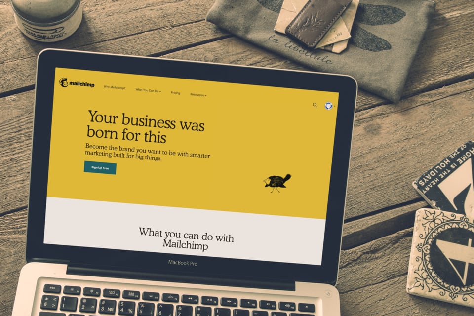
Arguably, this is one of the best SaaS website examples that you will find anywhere. MailChimp features a minimalist yet vibrant design. Being an email marketing platform, MailChimp changes its slogan regularly but the inherent message to visitors endures. The site’s homepage features two conversion paths. It uses a CTA that encourages visitors to sign up.
Key Takeaways For Your Website Redesign
- Have a little fun in your messaging and showcase your personality in a big way.
- Use bright or unique colors to stand out from the rest of the market.
- Develop a navigation experience that is easy and encourages exploration.
Visit MailChimp
Adyen – B2B Payment Software
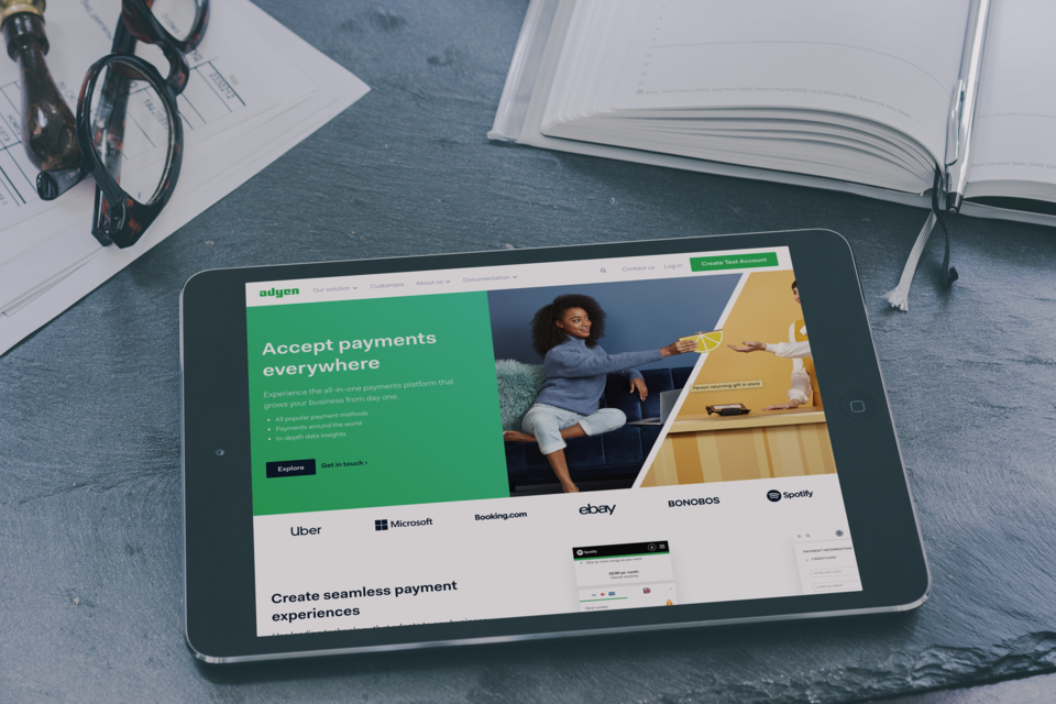
This SaaS company offers a multi-channel payment platform to businesses. The company’s homepage instantly addresses the main pain point of B2B buyers, which us how they can conveniently collect payments from their customers. Besides this, the homepage has a clean design and is easily navigable.
Visit Adyen
Dropbox – File Sharing Software
If you are looking for simplicity, there is no better place to experience it than checking out the Dropbox website. The file hosting service has a simple site with minimal clutter on its homepage. Therefore, visitors go through less information before taking action. When building a SaaS website, you can seek inspiration from Dropbox. Even so, you should carefully and strategically choose the information that you display on your homepage.

Visit Dropbox
Alteryx – B2B SaaS Analytics Website
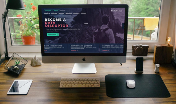
Another impressive B2B SaaS website example, Alteryx offers software for preparing, amalgamating, and analyzing data. The company serves businesses that require capabilities that go beyond whatever they get from Microsoft Excel. The moment you land on the Alteryx homepage, you will get an idea about what they offer, which is self-service data analytics.
Visit Alteryx
Flow – Project Management SaaS
This is a remarkable project management software provider. You will understand why Flow is among the top B2B SaaS website examples by scrolling through its homepage alone. The points mentioned on the homepage differentiate the company’s product from its competitors in a nutshell. The text is concise, and the layout clean.

Visit Flow
Evernote – SaaS To Organize Notes Online
This SaaS website caters for both procrastinators and the organized. Evernote is a note taking app that features a dynamic and simple design. Visitors know precisely where to proceed as soon as they land on the homepage. There is no better way to score leads.

Visit Evernote
Lambda Test – Browser Testing Online App
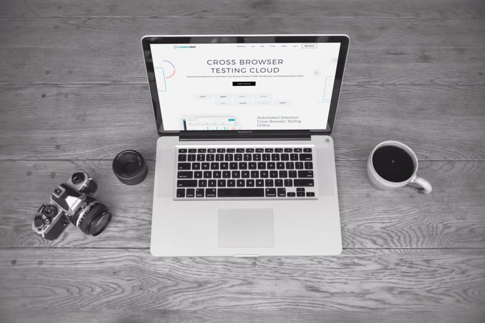
The company’s specialty is the provision of cross-browsing compatibility testing services for both mobile and desktop. As you scroll through the homepage, you are taken on a short yet descriptive journey of services offered by the company.
Visit Lambda Test
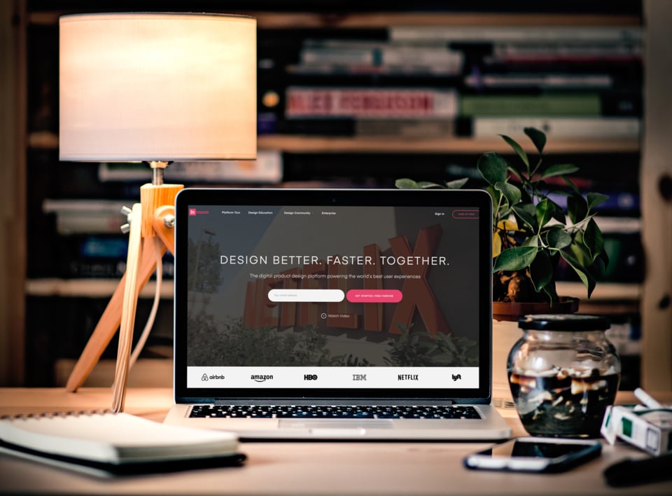
Invision – Website + Interface Prototyping SaaS
Invision is a collaboration, prototyping, and workflow platform. The site has an attractive layout, which doesn’t come as a surprise because Invision is a design company.
Visit Invision App
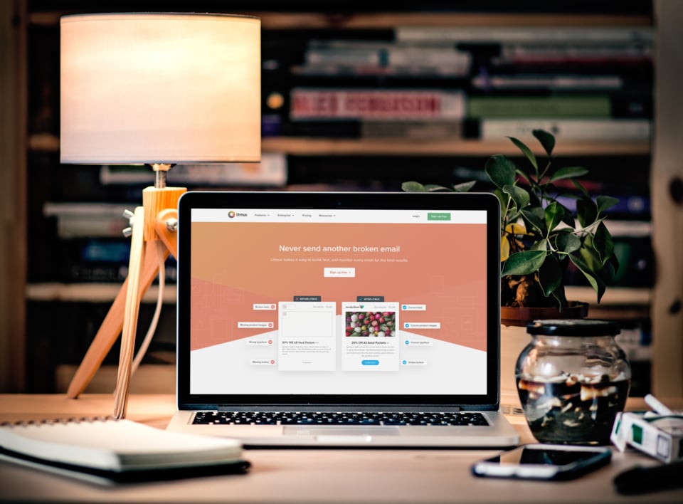
Litmus – E-Mail Testing SaaS Platform
If you are looking for a B2B website that features a sleek design, look no further than Litmus. This is an email testing and analytics software provider whose homepage alone can convert leads.
Visit Litmus
According to Gartner, 60% of the SaaS buying process takes place before the buyer ever engages with the SaaS vendor.
While we have talked about B2B SaaS Websites, now let’s explore some specific features that make great website designs.
One strategy we take great pride in is developing interactive content and conversions for SaaS Websites. Below are some examples from our own portfolio and from around the web.
Of the 5,600 B2B SaaS websites studied, over 40% had demo-based CTAs, and only 12% had trial-based CTAs.
Looking to explore more resources on great B2B SaaS Websites
8 Elements That Make A Great SaaS Website
Building a useful and beautiful website is difficult. It takes a lot of time, thought, and energy.
The 17 Best Software as a Service (SaaS) Web Design
A pretty decent list of SaaS companies that have awesome web designs.
10 of the Best SaaS Website Designs We Love
you can’t deny that when a buyer visits your B2B site, first impressions matter!
Written by: Tony Zayas, Chief Revenue Officer
In my role as Chief Revenue Officer at Insivia, I am at the forefront of driving transformation and results for SaaS and technology companies. I lead strategic marketing and business development initiatives, helping businesses overcome plateaus and achieve significant growth. My journey has led me to collaborate with leading businesses and apply my knowledge to revolutionize industries.
