Every software company wants to drive either freemium signups, trial registrations or get demos scheduled.
The impact of screenshots, product visuals and product tours can be underestimated though. Even more misunderstood are the detailed strategies that make these visuals more impactful in driving conversions.
When building your SaaS Website, great effort should be made to get your visuals right.
Why Are Visuals Impactful For Conversion
Our goal is to increase actions and conversions on our SaaS or Tech site.
Whether you are converting PQLs ( Product Qualified Leads ) or SQLs ( Sales Qualified leads ), screenshots, product images and tours are an absolutely essential ingredient in getting someone to convert.
Product Visuals Say More Than Words
Ok, it’s a cliche that a picture is worth a thousand words, but when you are talking about communicating product features, it is true.
Studies show that a visitor that looks at an animated screen of a product compared to a list of features / functionality, that the visual is more easily comprehended.
Too much text often can be overwhelming and taxing on our brains – especially in the circumstance of a sales funnel. It is different if the intention is education, but for visitors looking for a solution, we want to speed up the process of comprehension.
Product Visuals Build Trust
Everyone can be a bit skeptical. It’s actually part of our DNA to be cautious since our ancestors needed to survive in the wild.
Visuals often build trust because they add confirmation to the things that we are reading. The combination of smart copy with visuals help visitors confirm and collaborate what they are learning.
Product Visuals Manage Expectations
In marketing, we believe that building trust ( which drives conversions ) is about managing a prospects expectations.
We all hate thinking or believing one thing to only be surprised. With software purchases, this is often the case. Visitors want to know if the software does what they need or will produce the outcomes that they want.
What Types Of Visuals Should SaaS Companies Use On Their Website
There are infinite ways to display SaaS product screens on a website. The latest trends combine abstracted screens, human elements, animation and on page movement to produce highly engaging visuals.
Here are just a few examples of SaaS screen displays.
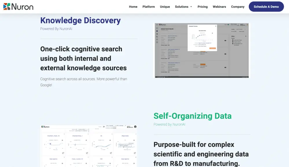
Actual Screenshots
One of the more traditional ways and quickly dying is to display actual screenshots. Often this is done simply to keep budget and effort low while still providing a visitor with insight into the product itself.
Representative Screens
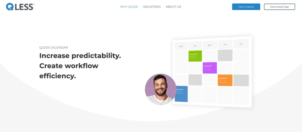
Representative screens typically take a whole interface or the most important parts and abstract them out as advanced illustrations of the products key functionality.
In this example below, what would be a complex calendar interface is simplified down to color coded calendar with a happy face.
Collage of Screens
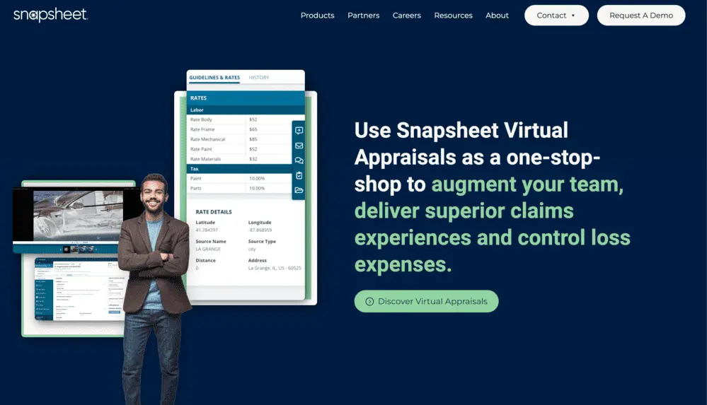
With either direct or illustrated screens, you can also display a collage of your SaaS product’s interfaces.
This one below brings a human element to it and actually changes the screens as it scrolls. Check it out here.
Real-World Images with Screens
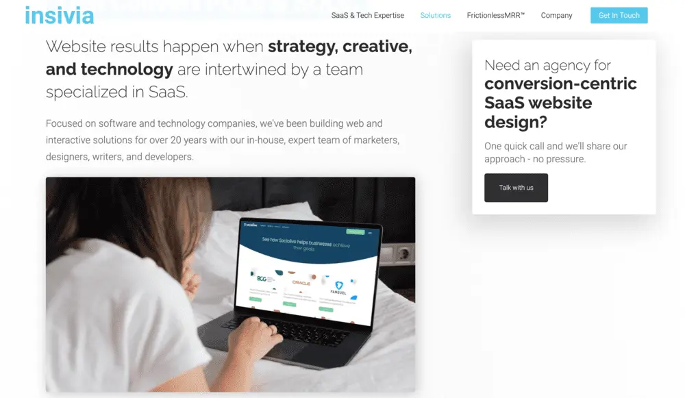
The below example is actually from our own site and is a video of a person using an interface. This gives visitors context of use and makes it feel true to life.
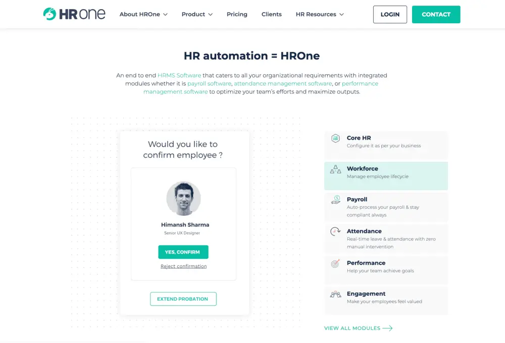
Tabbed Product Tour
A great solution for any display of multiple SaaS features is to present as a tabbed tour. Usually these are highly visual and allow visitors to easily traverse a set of related SaaS product features.
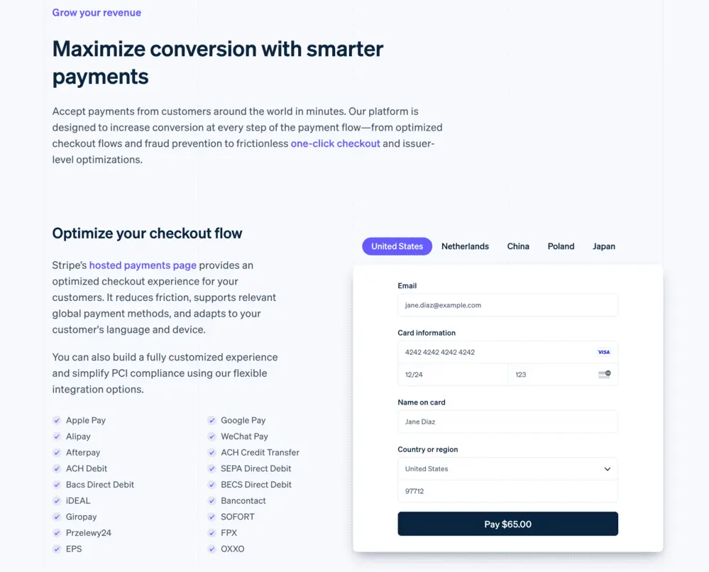
Feature Slideshow
Slideshows are very similar to tabbed interfaces, but often will have automatic rotation that forces the visitor to see multiple visuals. This is good for a feature that may have slight variations that are important.
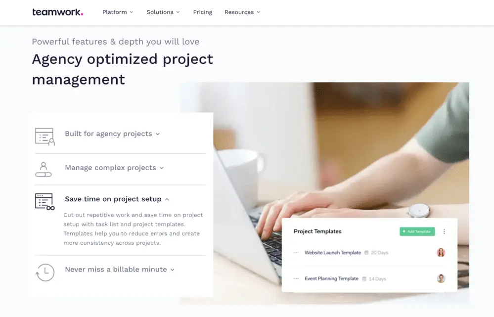
Product Real Life Videos
This example actually employs multiple of the strategies from tabs, to abstracted screen call-outs to video.
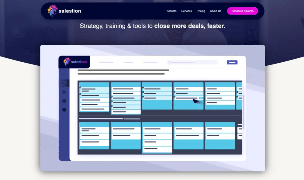
Product Animations
Animation – particularly explainer videos – is often used to showcase a Saas software product. These do not always have to be playable videos with audio and can be autoplay videos that showcase the products interface.
What Strategies Work Best For SaaS Screenshots & Product Tours
Design is art that leverages science and is targeted towards specific objectives.
What Are The Objectives Of Our SaaS Visuals?
Of course the primary objective is conversion, but we should break that down to determine what brings about conversion.
- Comprehension
An objective required is to help provide comprehension of what your software does as well as the pains it solves for a potential user. - Feature Verification
Screens should be leverage with text to verify what the user believes is the functionality. - Professional Trust
At a very high-level, screens make a visitor feel that this is not a scam or a bait and switch. - UX/UI Representation
The quality of the design represents the quality of the experience when a user actually purchases. Bad design on the website or in screens makes it assumptive that the product is bad.
What Science of Design Is Best To Achieve Objectives
Design is science. Understanding human psychology and best practices to influence others to do what we want. Some best practices to consider for your SaaS Website graphics are:
- Focus on what’s important
Screens have a lot of things on them. Remove what’s not important and showcase what will make the biggest impact with visitors. - Simplify objects and elements
The point of representative graphics instead of exact screenshots is to reduce clutter and therefore improve speed of comprehension. - Employ good contrast ratios
Contrast is important in all design, but make sure that elements can be seen. - Use color to differentiate from the website
Don’t let your screens and graphics blend in too much with your primary site to the point the are not seen. - Add movement when possible
Animation and video are great tactics to attract attention to visuals.
Watch Our SaaS Website Conversion Episode on Screenshots & Product Tours
In episode 6 of our SaaS Growth Weekly Show, we explored tips around using screens and product tours. The series is dedicated to how SaaS companies can improve conversion of their website.
Where Product Tours Fit In The Buying Cycle of Prospects
How To Leverage Explainer Videos
Using Demos in Your Funnel
Written by: Tony Zayas, Chief Revenue Officer
In my role as Chief Revenue Officer at Insivia, I am at the forefront of driving transformation and results for SaaS and technology companies. I lead strategic marketing and business development initiatives, helping businesses overcome plateaus and achieve significant growth. My journey has led me to collaborate with leading businesses and apply my knowledge to revolutionize industries.
