When preparing a strategy for a new SaaS web development and design project, it is smart to continuously consider what options are available; but, it is even more important to weigh your options with one crucial question:
What will drive better leads or conversions?
Good planning leads to better outcomes. Before beginning your SaaS web development project, compile a strategy that is unique to your business and value proposition. Consider what will be most essential to your business and who should be involved.
Poor planning has the potential to cause major problems:
- Delay project completion
- Increased costs
- Negative user experience
- Weak engagement and conversion
- Poor user adoption
- And even data leaks
Understanding what might happen is vital to enhancing your chances of success.
What are our key conversions & metrics?
In whatever ways your company communicates the conversion process, you must develop a blueprint on exactly how your SaaS web development strategy will support it.
We emphasize the importance of keeping things simple and straightforward. There’s no abundant need to fluff up any key messaging, especially when it comes to turning site visitors into potential future customers.
PQL vs SQL
Identify what customer acquisition model is right for you:
- Freemium
- Free Trial
- Demo
With the hundreds of potential pathways your customer journey can build out, a surefire way to provoke guidance among your teams is by very clearly outlining what your SaaS product is offering, which leads should have access and to what, what is most relevant to communicate, and more.
Freemium & Trials for PQLs
If you are offering a freemium or a free trial, you must continuously communicate transparently. This means that you are absolutely including the price, and pricing model that goes along with it, the trial length, what somebody should expect when they sign up for a trial, what exactly they need to provide in order to qualify for freemium or a trial, and more.
You need to be answering all of the potential future customers’ questions. And, the only way to do that is to ensure that your team is strategically looking at what is not only most often asked, but what is most meaningful to your target audience.
At this point you should consider how payment will additionally operate; if your SaaS company is able to accept credit cards or free charges at this point, requiring a credit card can be a double edged sword.
If you ask for a credit card prior to a freemium or free trial, users tend to lose interest really easily because some might think that you’re communicating an unsavory message. But, if you only require a credit card after a freemium or free trial, users tend to get lost very easily.
It is necessary to question what happens to your users. Consider additional pathways to push conversion like through email marketing campaigns or placing them on a newsletter list; keep them in touch. Plan out what will happen to folks who played around with your platform, and develop a method to track the ways in which those potential future customers use the platform. Continue intentionally ideating what you and your team can do to further support their needs.
It’s imperative that you question who needs to be involved; what is the technical process in comparison to the process that will drive your conversions?
In order to answer those questions you also need to consider what exactly will be driving those conversions and how exactly will you streamline it or make it easier. Consistent, and constant internal thinking and planning will have a greater impact on your success.
Demos for SQLs
There are many different ways to communicate what exactly you were offering, and how a visitor will move forward; This could include a form to fill out, a calendar to book on.
Explaining the value of demos and particularly what your demo offers should include an agenda, what happens in the demo, who will be there, what will a future potential customer gain, etc. And, all of which should be communicated clearly prior to registering for the demo itself.
At this point, users, who are going to be scheduling with you, with the intent of learning, are not interested in being sold. They want clarity, they want a conversation, they want to develop a relationship between them and their company and you and your company.
Internally discuss how user data will be tracked. Some questions you might consider:
- Once a potential future customer signs up for a demo, what happens in between the time of them signing up and receiving the demo?
- Are they put onto a newsletter, do they have an email exchange between an internal team member and them?
- What sells your brand best when it comes to being personable and strategic?
- What will you do to distribute user information to others on your team?
- What processes need to be put in place so you are able to track potential future customers, and what happens to them?
Should we display pricing on our SaaS website?
Every SaaS company, large or small, speculates about whether or not to include pricing in the initial stages of the customer experience journey. And, there are pros and cons to each approach. However, it is strongly recommended to communicate transparency consistently through your site.
Transparency Drives Trust
No site visitor who turns into a customer wants to be surprised by your pricing, or anything for that matter.
In this stage, site visitors are researchers. The key to getting a visitor to convert is trust and confidence in your product. Transparency is a foundation of trust. Consciously and subconsciously, visitors who do not see any pricing information at all feel fear and question if they can trust what they get after conversion.
Companies that feel like an open book exude trust and that wins prospects.
Use Competitors As A Barometer
It’s imperative that your strategy constantly considers what your competitors are doing. You run the risk of potential loss of customers because a competitor will inevitably be more transparent. Leverage competitor research as a barometer of your customer’s expectation to see pricing information before conversion.
That being said, in a market where others do not share pricing up front you also can gain competitive advantage by being the first to do so. If you have a higher priced SaaS product or pricing that is very customized to each buyer, there are strategies you can employ that both allow you to display pricing to increase conversions yet combat sticker shock.
Ready to seize opportunities and fortify your market position? Discover how Frictionless can empower your team to thrive in the competitive landscape! Get Started for Free.
Make Pricing Easily Understood With Design
Before you start your SaaS web development project and choose to display pricing, think about the layout of that pricing.
A number of styles are common, but each are used to communicate different types of pricing structures:
- Simple single price display
- Simple multi-tier tables
- Multi-tier tables that compare levels by feature
- Monthly and annual switchers
- Calculators and configurators
- Currency switching displays
Without investing time in understanding user perspective, in any design project, your website conversions will suffer. Remember who your target audience is and, arguably most importantly, what they expect.
Give Visitors Everything They Need To Convert
At that point of conversion, it is important to make sure that an opportunity has all the information that they need to take action.
Think of the questions users have and could ask before they would buy. This is a good opportunity to leverage team members across marketing, customer service and product development.
Here are some common questions visitors require before taking action:
- Can I cancel anytime?
- How do refunds work?
- What if a user chooses a freemium? Does that affect their future pricing?
- Who owns the user’s data? What happens to it?
What to do for high-priced or complex priced SaaS products.
For software and tech companies with higher priced solutions or products that have a high degree of customization there is often reluctance to display pricing.
In those cases, here are some options to consider:
Use a “Starts at” model
Start at a base price and move through the progression of how your pricing model is tiered, and why. Again, maintaining transparency is incredibly recommended. You may learn that your pricing model is not realistic, and this may give you the opportunity to re-evaluate your pricing strategy to ensure market fit and success.
Build a calculator
Develop interactive functionality that allows your visitor to build a solution or configure pricing based on key factors.
How do we visually represent our product?
There are a lot of pros and cons to every strategy around communicating your product design. Do you want to make sure that consistency is rampant throughout your SaaS web development. If your website does not look like you’re offering, it’s going to be confusing, and likely turn users away, because it feels as though you haven’t been transparent. So what are the different ways that you can actually approach communicating product visual styles?
First, is screenshots. Screenshots are really easy to obtain, and process, and they also don’t take up a lot of load time when it comes to your SaaS web development. However, it’s pretty rare that you see any type of screenshots on a SaaS website when it comes to actually providing insight on a product. Instead, screenshots really should only be used when it comes to adding depth or designed to other elements of your site. That could include blog posts and resource pages.
We strongly recommend the second option, representative user interaction graphics. This doesn’t necessarily mean that it has to be a short video or gift of your product, per se. It absolutely can be a short video or guess, there are studies that show that video has fantastic impact when it comes to driving conversions. However, it’s worthwhile to question what exactly the point of communicating your products design is. Nine out of ten times it’s going to be a matter of informing how your product looks, acts, animates, interacts, etc.
Example: Saleslion product videos
Saleslion is a product that helps build, calculate, prioritize, and compare solutions. It is for SaaS companies to provide to their prospects. It gives potential future clients an interactive experience, to customize their solution, and make the most complex offerings. Really easy to understand. At the top of their site, they have an interactive video that could easily play without sound, and still display there. User interaction experience.
As you can see, this video is very low fidelity, and only includes essential interaction graphics that would entice a potential future customer to schedule a demo. Rather than walking through the entire solution, or the entire site, sales lion approached this strategy with questioning what exactly they’re users will want to know, and what exactly their users are trying to solve. One of Saleslion’s major solutions is streamlining complex processes, and this video exemplifies just that.
What Tech is the Right Technology Stack?
Ultimately, choosing the right technology is a matter of what your goals are. When you’re choosing a content management system, you need to consider how integrating with other systems will work.
Content management systems are extraordinarily powerful, but they rely on highly technical persons; do you have the capacity on your staff to train and develop those highly technical people?
Where does SEO fall on your goal sheet?
It must be as easy as possible for your team to go into your SaaS web development, and make whatever pages necessary in order to increase your SEO. Otherwise, your marketing intern will have to go through unnecessary people and processes to turn out content.
How easy will it be for your team to update the content management system? Use tried and true options like HubSpot or WordPress when you are beginning this process. It’s critical to consider, and weigh, the pros and cons to any offering, but it’s better to just start your process.
Consider when choosing:
- Which option will give you stable speed?
- Each is different, so how will you build on top of it and what needs to go into it, both expertise and persons?
- When you are deciding, what kind of creative authority are you hoping to have? And what are you willing to give up when it comes to that?
- Good software with a bad build leads to a slow website that isn’t going to work very well, leading to poor SEO
- Bad software with a good build leads to a fast website, but likely some frustration.
- How are you able to integrate other systems?
Before you start your project…
Consider running a technology audit prior to beginning your project. What do you currently have that works? And what do you have that doesn’t work but is still taking up time and energy?
How will you manage…
- Email marketing software
- CRM
- CMS
- Analytics
- Visitor/ site tracking
Where does all of this information go? Who has control of it? Who makes decisions around it? List out what you have and what you want to continue using. Then, map out exactly who will be in charge, what processes need to be put in place, etc.
How will we communicate differentiation and value?
Creating an environment that represents your product is essential, but sometimes overlooked. If you walk away with anything from this article, it’s that consistency is key. If you are using primary colors like red, blue and yellow in your product, but pink, purple, green, are the strongest presence in the website development process, you’re doing something wrong. Maintaining brand consistency is incredibly important to developing parallel products. Who is involved in this decision making process? Who are the decision makers, when do they need to be included, who is your main leader, and who is best to answer questions? These are all imperative, to maintain brand consistency. Your voice, tone, imagery, design, etc. should mirror your SaaS product.
Examples of SaaS Web Development and Design We Love
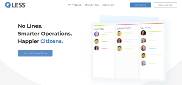
QLess: Descriptive, In-Depth, Easy-to-Read
QLess developed their site with intention to be incredibly digestible and straightforward.
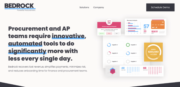
Bedrock: Bold, Exciting, Enticing
Bedrock developed their site to reflect their motives and brand goals.
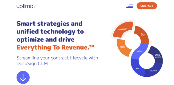
Uptima: Bright, Transparent, Informative
Uptima developed their site to be transparent, clear, and objective.

Top Web Development and Design of 2022
Key Takeaways
Don’t get us wrong, we understand this is a daunting, overwhelming process. Ultimately, however, it does not have to be. Your success is determined by ensuring that the right people are on board and that they are engaging in the right planning for the project. Making these decisions are difficult, but ultimately what is right for your product will shine through.
Insivia is a results obsessed company where agency meets consultancy. Dramatically scale your company with our expertise in market strategy, user retention, and web development and get in touch today!
Written by: Tony Zayas, Chief Revenue Officer
In my role as Chief Revenue Officer at Insivia, I am at the forefront of driving transformation and results for SaaS and technology companies. I lead strategic marketing and business development initiatives, helping businesses overcome plateaus and achieve significant growth. My journey has led me to collaborate with leading businesses and apply my knowledge to revolutionize industries.


