An experience customized to an individual – which can be done in many different ways – is personalization.
Personalization is a key element for improving conversions on your SaaS website. It helps to guide and educate customers, tailoring the user experience specifically to their needs. Personalizing content also enables you to build trust with potential customers, as it demonstrates that you understand their individual requirements and are invested in addressing them. It’s configured based on a visitor’s behavior on the website, user demographics, and their interests.
The primary goal for your website should be to help visitors get the most information that meets their needs as quickly as possible.
In a typical website, an experience is somewhat personalized in that they choose their own journey. B2B websites tend to have complex buyer journeys, so make sure you simplify navigation by segmenting users based on their behavior and preferences. Nowadays, people want a company’s website to meet all of their needs as well as their concerns and pain points. In fact, they might not know they want this, but subconsciously, it’s exactly what each and every person is looking for.
This isn’t a stab in the dark with what people want. Rather, marketers have found sales jumped by nearly 20% when clients had a personalized web experience.
But the market is hot and so is the competition. In a sea of never-ending options, if your website doesn’t give users the experience they’re looking for, they will quickly move on to another provider without a second thought.
Netflix is the perfect example of personalized content. When you log onto your Netflix account, not only do you have what you previously watched, but there are also suggestions of what you should watch next because of your history. And you don’t have to dig for this information either. It’s the first thing you see when you log into your account. Netflix utilizes personalization and original content to retain subscribers. They create “Netflix Original” shows and movies to entice people to gain access to that exclusive content.
How do companies like Netflix do this? They monitor each one of their users’ browsing, how they rate certain products or services and what they’ve bought in the past. Then they use this data to completely transform their content. When the customer returns back to their site, they are greeted with personalized, relevant content – no more digging around to find what they want. Instead, it’s right in front of their face.
Have a Strong Value Proposition
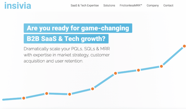
The homepage for your SaaS website should have a strong value proposition for your product/service. It’s where the visitor will get a first impression of your business, so you want it to be clear and easy to understand. There are so many B2B SaaS websites out there, what makes you different? Frame your value proposition to be unique so that you stand out from your competitors.
For Insivia, we ask the visitor a question and answer it with a clear and brief description of what services we provide for B2B SaaS businesses. You want your value proposition to have a balance of clarity but also leave the viewer wanting to learn more. This strong introduction should make the viewer want to scroll further and explore more of what Insivia has to offer:

Create Different Landing Pages
Make sure each page on your website has a purpose and does not contain too much irrelevant information. Create customized landing pages for different audiences, such as existing customers or prospects, so that you can provide a more targeted experience for each group.
Having a blog area on your website can also be a great way to create useful content. This should also be a purposeful area of your website and not a dumping ground for content that’s irrelevant to your audience.
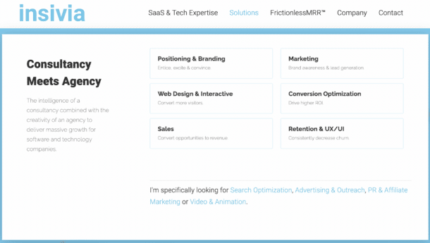
If your business caters to different industries, that’s the perfect opportunity to create landing pages specific to each niche. This requires you to understand each of your buyer personas so that you can narrow down your audience instead of trying to cater to a wide range of businesses. Make sure these industry pages are easily accessible in your navigation bar:

Focus on Mobile Optimization
Make sure your SaaS website is optimized for mobile so it can be accessed from any device and is easy to navigate regardless of the device being used. This will help increase user satisfaction and improve overall engagement with your website.
Mobile optimization is crucial since 59.5% of all website traffic comes from people using mobile devices.
You may have a strong marketing strategy when it comes to your website, but if it’s not optimized for mobile viewing, it won’t mean anything to the visitor. You need to have a responsive design for people to view on any device.
Make It Easy To Navigate
Ensure that visitors can navigate your SaaS website easily by providing clear navigation paths, descriptive page titles, and site search features. This will help people quickly find what they are looking for and make their experience more enjoyable overall. Fancy designs can look cool, but is it easy for the user to navigate? If it’s not then they will likely bounce from your site.
48% of users believe website design is the main factor when judging a business’s credibility.
Example : Insivia web personalization that enables users to get in touch with our team.

Make sure your site loads in a timely manner, and that the design is attractive to the visitor. Implementing a professional yet clean design is an effective approach not only for your reputation but the visual appeal of your business.
Monitor Your Website Performance
Use analytics tools to monitor the performance of your website and make sure it is functioning properly at all times. This will allow you to track page views, time spent on each page, and other performance metrics that can help inform future improvements.
Paying attention to your visitor data will give you more of an idea of what content you should focus on providing for your target audience. You can also use lead magnets (like signing up for a newsletter) to gather customer info. Then, based on the terms that brought them to your site, display various relevant content. The key here is not just making it relevant to what they’re looking for, but personalizing it as well.
Take advantage of the tools that are at your disposal:
- Use Google Analytics to keep track of each user’s journey.
- ExactTarget can help by offering customized recommendations.
- Monetate can help with cross-channel personalization.
- Visual Website Optimizer assists with dynamic content.
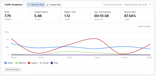
- SEMRush is the main tool we use to track our visibility and online presence.

While there are plenty of tools for you to pick from, these will likely be the most helpful in your personalization.
If you narrow down your demographic, you can figure out how to create messaging that will resonate with that particular audience. Your audience data can also help your sales teams fully understand who they’re selling to.
Leverage Automation
Take advantage of automation solutions such as chatbots or digital personal assistants to provide a more personalized and engaging customer experience. This will enable you to quickly respond to user inquiries, provide recommendations, and help customers find what they are looking for with minimal effort. It’s a quick and easy way to not only personalize the user experience but get questions answered. These tactics make the user feel less like they’re interacting with a robot and more with human beings.
Another area most companies neglect when it comes to their website is following up with email. However, email is a fantastic way to get the conversation flowing and keep it going. If you want to make this even simpler, switch to automated emails. There are so many different tools at your disposal to make email marketing easier and more effective.
A perfect example of this: Let’s say a visitor has a potential purchase in her cart, but left the page before she checked out. If you were able to obtain her email while she was on your site, you can send a follow-up email with her name, reminding her that she left an item in your cart. Not only are you encouraging the person to come back to your site but you’re also selling your products. Sweeten the deal and offer a discounted price for coming back. For example, offer 20% off the item in the person’s cart and see if it’s enough to bring them back to purchase the item.
Collecting a prospective customer’s email address can be a gold mine for turning visitors into leads. This is because it connects you with them so you can send emails personalized to their needs. For a B2B SaaS business, establishing a connection with your audience is crucial. Email is just one of the ways you can keep your website viewers from completely forgetting about you.
Conduct A/B Testing
Leverage A/B testing to experiment with different versions of content, features, and design elements on your website. This will enable you to determine which options work best for your customer base so you can maximize the effectiveness of your Saas website. Using data from this technique will help you make decisions without making estimated guesses. You’ll know exactly what works for your target audience and what doesn’t.
Utilize Video Content
For B2B SaaS products, one of the best ways to sell software is through explainer videos. This can add a ton of personality to your website. Creating video content can bring your software to life and make it simpler to understand for newcomers. Plus, video is the preferred type of content lately.
In fact, according to Hubspot, 94% of marketers agree that videos have helped increase user understanding of their product or service.
Video content also increases conversion rates! Hubspot also found that 84% of viewers that watch explainer videos decide to make a purchase of that product or service. A great example of a strong explainer video is on Socialive’s homepage. Their SaaS website design is sleek and simple, but the video is a key feature that brings it all together. Their video adds humor and personality to their product and creates a welcoming atmosphere in an effort to not overwhelm the visitor.
Personalize Your CTA’s
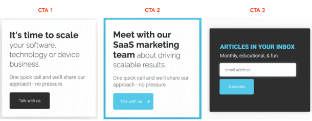
Another simple and easy way to personalize your SaaS website is to have a variety of calls to action that cater to your potential customer’s next move. Don’t create the same CTA for each landing page. Look at our website for example. The further you scroll, the CTA in the corner is dynamic and changes as you go.

Personalization on certain landing pages will also give the visitor a better idea of where you’re taking them next. If it’s all the same, or if it’s not clear, then they may be less inclined to continue. Call-to-action buttons should be relevant to the visitor’s journey and their buying intent. They should also be clear and concise. You don’t want to take your visitors down a rabbit hole that seems never-ending.
Create Dynamic Content
One of the best and fastest ways to create a personalized website is with dynamic content. This is content that adjusts to exactly what your unique customer needs based on already-there information.
Consider offering suggestions. Base your suggestions around browsing history or previously purchased items. You’ve likely seen this method on your favorite online retailer – you buy something, and there are suggested items near it. It’s like having a personal shopper right there with the customer. It’s a win-win for you and the customer.
For first-time visitors to your website, you can also give pop-up discounts or deals for them to incentivize them to sign-up. Pop-ups are great in moderation and if they’re relevant to the visitor’s interactions with your website. You don’t want too many pop-ups or else your site will come off to the visitor as “spammy”.
Dynamic content relies on visitor data to give alternative experiences depending on the path each person takes. Large companies tweak their recommendations based on what you interacted with in the past. You may have seen “you may also like” or “pick up where you left off” sections on your favorite sites. This provides the user with new options so that they don’t have to retrace their steps or sift through products that they already viewed. Utilizing the historical behavior of your viewers to your advantage not only helps you, but also provides the user with a seamless experience.
Key Takeaways
Since so many B2B SaaS websites are already taking part in this trend, you’ll want to start working your way toward a more personalized website. Mass marketing is in the past. It’s time to start customizing your customer’s online experiences to continue your company’s success. You’ll be able to meet the continually raised expectations of your customers, as you make each and every site visit one they will remember.
If you’re still in doubt about whether your website has strong key design elements, Insivia has got your back. We help B2B SaaS businesses drive conversions with dynamic website design and personalization.
Niche market combined with product focus creates intense demand.
Written by: Tony Zayas, Chief Revenue Officer
In my role as Chief Revenue Officer at Insivia, I am at the forefront of driving transformation and results for SaaS and technology companies. I lead strategic marketing and business development initiatives, helping businesses overcome plateaus and achieve significant growth. My journey has led me to collaborate with leading businesses and apply my knowledge to revolutionize industries.
