A well-designed website can make or break user engagement. When it comes to organizing information effectively, accordion menus have emerged as a powerful tool.
These dynamic elements not only enhance the aesthetics of a website but also significantly improve its usability.
Why Accordion Menus?
Accordion menus are characterized by their collapsible sections that expand with a click or tap, allowing users to access detailed information without overwhelming them with a cluttered interface. This design approach proves invaluable for displaying lists, FAQs, or any content that benefits from a hierarchical structure.
One of the key advantages of accordion menus is their ability to conserve screen real estate. They keep the initial view clean and compact, providing users with a clear overview while giving them the choice to delve deeper into specific sections as needed. This not only simplifies navigation but also creates a more engaging and user-friendly experience.
Furthermore, accordion menus can be highly intuitive. Users instinctively understand how they work, making them a suitable choice for websites catering to a diverse audience. Whether it’s a product feature list, a resource library, or a set of FAQs, accordion menus enable users to quickly locate the information they seek, enhancing overall satisfaction and reducing bounce rates.
The accordion menu design is a valuable asset for websites aiming to present lists and information effectively. It streamlines navigation, saves screen space, and boosts user engagement—a testament to the importance of thoughtful menu and information design in today’s web landscape.
Enhanced User Experience: Accordion menus simplify navigation, providing a clean and organized interface for users, which leads to a more pleasant and efficient browsing experience.
Conserves Screen Space: Accordion lists help save valuable screen real estate, allowing you to present more information without overwhelming visitors with a cluttered layout.
Improved Readability: By keeping content sections collapsed until needed, accordion menus reduce visual noise and make it easier for users to focus on the information they’re interested in.
Efficient Information Hierarchy: They enable the creation of clear hierarchies, making it effortless for users to access specific details or sections of interest without scrolling through lengthy pages.
Mobile-Friendly: Accordion design is especially beneficial for responsive web design, as it adapts well to smaller screens and touch-based interactions, ensuring a seamless experience on mobile devices.
Reduced Bounce Rates: A well-organized SaaS website with accordion lists can keep users engaged by allowing them to quickly find the information they’re looking for, reducing the likelihood of bouncing to competitor sites.
Faster Loading Times: Since only the initially visible content loads, pages with accordion lists tend to load faster, which is crucial for retaining impatient online visitors.
Simplifies Complex Information: Ideal for presenting complex product features, pricing plans, or extensive FAQs, accordion menus help break down information into digestible segments.
Versatile Design: Accordion lists are highly versatile and can be customized to match your website’s branding and style, ensuring a cohesive and aesthetically pleasing design.
User-Friendly for All Skill Levels: Accordion menus are intuitive, making them suitable for users of all skill levels. Visitors can easily expand and collapse sections without confusion.
Boosts Conversion: By streamlining information presentation and improving user engagement, accordion lists can contribute to higher conversion rates, such as sign-ups, demos, or sales.
Optimized SEO: Well-structured content within accordion menus can still be indexed by search engines, improving your website’s SEO performance.
Transform into a Marketing Powerhouse with Frictionless!
Unleash your inner CMO and revolutionize your marketing game. Our platform equips you with expert templates, tools, and AI guidance, empowering you to become the ultimate marketer. Elevate your marketing prowess with Frictionless by your side.

Challenges
In the absence of strategic website design featuring accordion menus, users frequently grapple with a myriad of issues that compromise their interaction with the platform. One significant challenge is the overwhelming abundance of information presented all at once. Without the collapsible structure of accordion menus, users must navigate through lengthy, cluttered pages, often leading to confusion and frustration. This not only diminishes the user experience but also increases the likelihood of visitors bouncing off the site in search of a more user-friendly alternative.
Additionally, the absence of accordion menus can have adverse effects on mobile responsiveness. With limited screen space on mobile devices, users are forced to endlessly scroll through content, making navigation cumbersome and time-consuming. This can deter mobile users, who constitute a substantial portion of website traffic, from engaging with the site effectively.
Furthermore, without the organization provided by accordion menus, the hierarchy of information becomes unclear, leaving users uncertain about where to find specific details or sections of interest. This can result in users missing crucial information or becoming frustrated by the lack of a logical structure.
Overall, neglecting strategic website design that incorporates accordion menus can lead to decreased user satisfaction, higher bounce rates, and missed opportunities for conversions, highlighting the pivotal role this design element plays in optimizing user experiences.
Define your target audience personas using AI with Frictionless.
Effective marketing and sales rely on knowing your audience inside and out. Leverage our free AI persona builder to get an unbiased view of your targets.
Strategy
Why accordion menus were the right choice for EsquireTek’s website based on design and interaction.
EsquireTek faced challenges with their old structure, including:
- Confusing navigation due to a lack of page descriptions.
- Limited user engagement and clicks on menu items.
- Ineffective encouragement for users to explore further.
- Absence of unique CTAs and corresponding imagery.
- Overall, there was a lack of incentive for users to click on menu items, and no on-page content directed them to these pages.
The accordion design is considered ideal for interaction due to several key advantages:
- Efficient Use of Space : Accordion layouts allow the display of multiple items with substantial content without overwhelming the webpage visually, maintaining an appealing aesthetic.
- Graphical Correlation : Accordion designs enable a clear graphical correlation between each item and its accompanying content, all while avoiding excessive vertical scrolling.
- Customization : Each featured item within the accordion can have a specific description, image, and Call to Action (CTA), providing a tailored experience for users.
For EsquireTek, the accordion design was the right choice because:
- Enhanced Visibility : Prior to the redesign, the navigation menu lacked descriptions, making it less user-friendly. The accordion format presents all options within the viewport, improving visibility.
- Rich Content : Accordion-style presentation allows for lengthy descriptions, unique imagery, and specific CTAs for each item, making it more engaging and informative.
Adding the content currently within the accordion into a menu format would not be ideal because:
- Limited Graphics : Menu structures are constrained in their ability to incorporate significant graphics or imagery that can effectively correlate with featured pages.
- Short Descriptions : Menus typically offer only short page descriptions, which may not provide sufficient information to engage users effectively.
- Content Overload : Trying to fit the current content, including unique CTAs and images for each item, into a menu would result in content overload and a cluttered navigation experience.
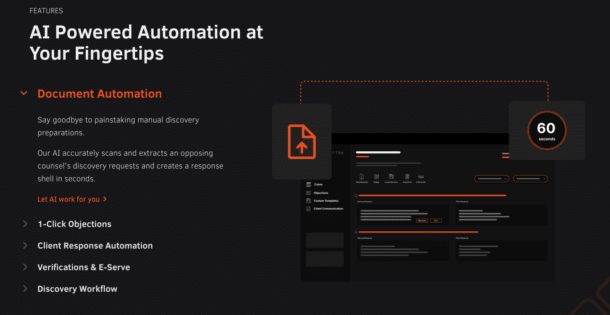
The accordion design for Esquire Tek was structured with key elements such as:
- Titles that change color to orange on mouseover, enhancing interactivity.
- An increase in font size when an accordion item is clicked to indicate the selected item.
- Image swapping to correspond with each item, aiding visual identification.
Accordion Menus for EsquireTek

Opportunities for strategic design space emerge. Ask, what can we visualize to our audience?
Additionally, there are areas to call to action beyond your general “book a demo” button that is likely on every page of your site.

Accordion menus are often strategically used to put a lot of information in one, easy-to-use and navigate space.
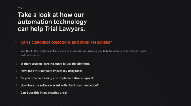
FAQ sections are the perfect opportunity to include an accordion menu design. Additionally, they can be very easily replicated across pages, and the great part is that they do not take up nearly as much space as a traditional FAQ section would.
