Extraordinary, unique website design is a critical piece of any successful SaaS company’s online presence. It is the face of the company, the representation of the brand, and the primary source of information for potential customers. A website with a well-designed, attractive, and informative design reflects well on a company and can be essential for its success.
First, well-designed websites provide an effective path for customers to find the services and information they need. A website with intuitive navigation and easy-to-find information helps potential customers learn about company offerings and make informed decisions about whether to make a purchase. Without a user-friendly website, potential customers could get frustrated and abandon the website.
Second, a good website design conveys the company’s message and brand image. A well-designed website conveys professionalism and trustworthiness that reflects positively on the company. With a website that looks professional and modern, potential customers may be more inclined to convert.
Uptima
What is Uptima?
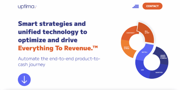
Uptima provides an easy to use tech stack that monetizes all touch points across all channels. They approach pain points your business feels with an authentic perspective that considers the growth your business can achieve years into the future.
Design
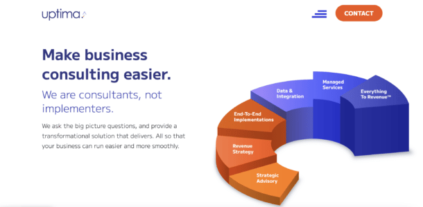
Uptima’s site is clean, easy to read, and bright. With everything from bold fonts and colors, to exciting design, Uptima’s site is incredibly visually appealing. It is interactive, animated, and informative; exactly what you want in a trusted site.
Uptima had a very bare bones site that did a poor job of properly explaining what they offer. Insivia was needed to work on their messaging and refresh their brand. Insivia was able to break down Uptima in a way that could be easily understood by potential customers. Since site launch, keywords that Uptima ranks for have increased from 40 to 194. So, we were able to not only simplify their messaging, but also heavily impact SEO.
Our Process
For Uptima we created a highly clean site the truly represents an enterprise consulting firm.To go above and beyond, we helped them take a core visualization of their solutions – the Infiniti wheel – and not only adjusted its design to be more comprehensible but also animated it to help draw visitors into engaging with their solution approach.
Another key strategy in this project was helping develop a site architecture that made it easy for visitors to understand what they do and find the information they were looking for. initially they’re offering structure and previous website architecture were confusing for outside audiences to truly understand what they did.
Snapsheet
What is Snapsheet?
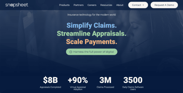
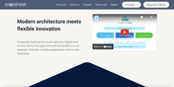
Snapsheet SaaS solutions are utilized as a digital end-to-end claims management software platform or as separate modules to attack the need their clients require urgently. These include appraisals, claims, and payments. Snapsheet automates communications, reduces cycle time, and improves adjuster efficiency.
Design
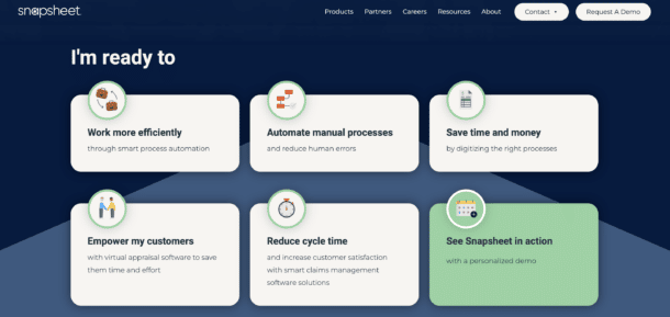
Snapsheet’s site is not just visually compelling, but it is dynamic and interactive. The homepage includes animation that allows users to explore the company offerings and lets the user personalize their customer experience with their “I’m ready to” section.
Our Process
Within 4 months, Snapsheet saw a 4x increase in search phrase terms that ranked within the top 100 of Google results. This is a direct result of our strategic approach to their site architecture, page structure, technical optimization, and overall approach to building a site that focused on targeted visitor acquisition.
In addition, we work very closely but the Snapsheet marketing and revenue team to build the site in a narrow timeline so that it could be unveiled and showcased at a key conference.
During the redesign process we also provided insight into their brand to help redefine their colors and fonts prior to beginning the entire website redesign process.
Mashore Method
What is Mashore Method?
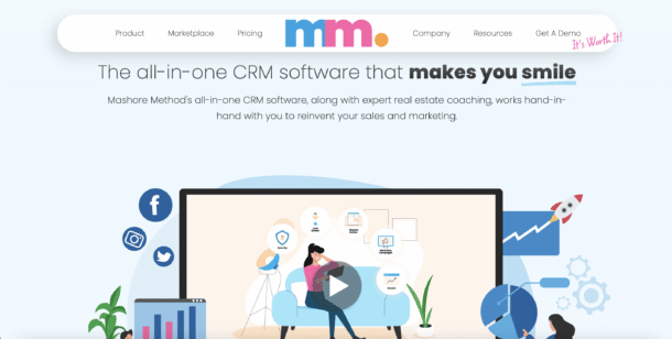
Mashore Method is an all-in-one CRM software that creates a frictionless sales cycle to help scale your real estate business. Expert real estate coaching works hand-in-hand with clients to reinvent sales and marketing strategies.
Design
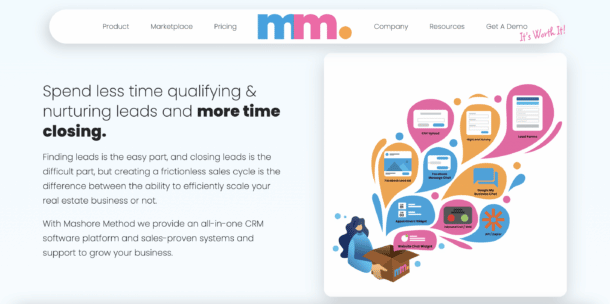
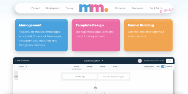
If one word describes Mashore Method’s site, it’s exciting. The design is inviting and innovative with bold colors. Ultimately, their site just feels a bit fun, and in the SaaS space, that isn’t always the reality. Plus, Mashore Method emphasizes smart design and digestible content with impressive visuals and videos.
Our Process
Mashore came to Insivia as a blank slate being a new software product spun out of an existing business. While the website was a culmination of our work with them, we help develop the fonts colors logos and overall look and feel that would drive this new product forward.
In addition, all of the animations on the website were created by Insivia to help communicate this new product to the market. As a new product one key aspect of our relationship was an agile approach that allowed us to launch the site in phases so that they could begin marketing and revenue generation as early as possible.
Bedrock
What is Bedrock?
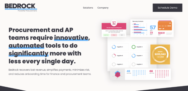
Bedrock is a SaaS platform that recovers lost revenue, simplifies payments, minimizes risk, and reduces onboarding time for finance and procurement teams.
Bedrock is truly a ground up delivery of a brand strategy, website, and marketing. We started with complete trust from XPro ( the former company name ) to build an entire new brand starting with a new name. To develop this new name, identity, messaging and overall relaunch of an existing software product, We spent meticulous time understanding their target personas, auditing their competitors, and working in workshops with their entire revenue team.
Design
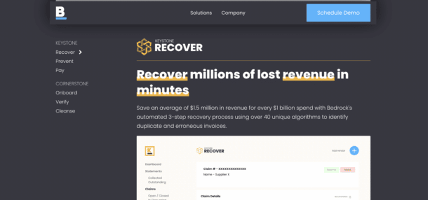
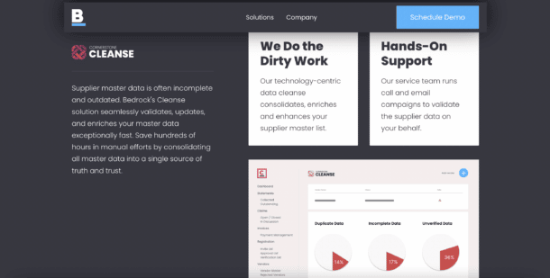
Bedrock went through a dramatic transformation, both in brand and messaging. And, it’s paid off. Their site is lively and impressive. Bedrock does one of the best jobs in compiling and arranging their color palette throughout their site’s demonstrations and visuals.
Our Process
Rebranding a well established business can be difficult, but with several extensive strategy workshops covering all aspects of our clients core values, we developed a memorable brand for our client with Bedrock. Through collaboration, along with the Insivia team’s efficiency and tenacity, we created a new brand with messaging in just a few weeks that the client is excited to represent. In addition to a full rebrand we were also responsible for developing a new website for the client. With an accelerated timeline we provided the client with their new brand and website to present during the grand opening ribbon cutting event for their new office in St. Petersburg, FL.
The site which is only recently been launched, is a strong Foundation upon which we are now executing marketing and public relations campaigns to scale their software product sales.
Nuron
What is Nuron?
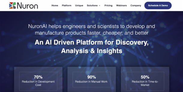
NuronAI is a SaaS platform for engineers and scientists that helps develop and manufacture products faster, cheaper, and better. It is an AI driven platform for discovery, analysis, and insights that dramatically reduces the cost and time of development through automation. “Nuron centralizes all internal and external data knowledge in one place, enabling the use of big data and AI technologies for machine-augmented decision making.”
Design
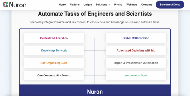
Nuron is a dynamic company that required a powerful design to communicate their solutions. The site is informative over anything and designed intentionally to provoke scrolling and interaction. Nuron is a fantastic example of keeping things simple and straightforward; design over decoration.
Our Process
Nuron initially brought Insivia on to revamp the UI and UX in preparation for outbound marketing campaigns aimed to grow Nuron’s client base. After executing on these changes, Nuron quickly moved into a retainer for Insivia to run and optimize Nuron’s marketing efforts. Since Insivia has been operating as Nuron’s marketing team, Nuron has generated strong leads with some of the largest fortune 500 companies in the world. While these potential clients are still in the sales process, a single successful conversion will effectively double Nuron’s YOY revenue.
Brokermint
What is Brokermint?
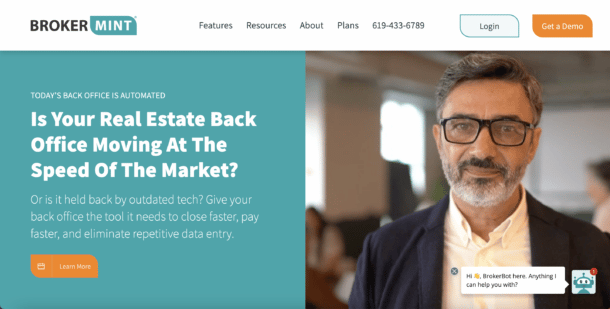
Brokermint is a trusted platform that helps top real estate brokerages close more deals and grow their businesses. It is an easy to use cloud-based solution choice for over 1,500 brokerages supporting over 65,000 agents.
Design
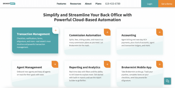
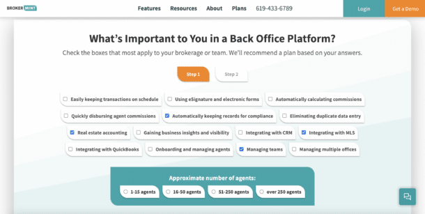
In dealing with real estate in any capacity, trust is a major factor. Brokermint’s site was designed to elicit trust in a site visitor. Friendly faces, digestible information, complex processes deconstructed, and more. The Brokermint site is consistent, simple, and sticks to their brand fluidly.
Edthena
What is Edthena?
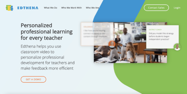
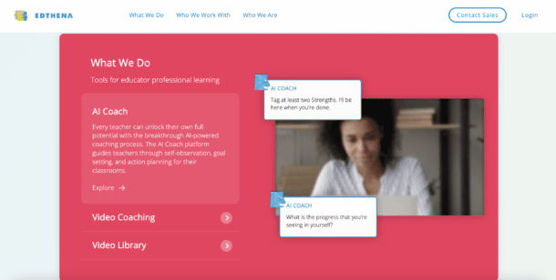
Edthena is a SaaS platform designed to help teachers gain personalized professional development. They make feedback more efficient with their long list of offerings including the AI Coach that guides teachers through action planning and goal setting, Video Library that offers shared professional videos, Video Coaching that offers full-featured video learning for observation, coaching and collaboration, and Professional Services for streamlined consulting that helps educators design systems for better learning.
Design
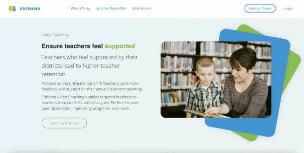
Edthena’s site is compelling and lively. It leans into the colorful and creative with bold uses of their brand visuals and theme. With animation and clear calls to action, Edthena’s site entices viewers to learn more and sign up.
Our Process
For Edthena, we worked with them strategically to help better present the product and features to the market. Previous to in Insivia the messaging, website, and visuals were relatively basic since they were new in the market. This meant that we needed to spend time understanding what pages were most valuable to communicating their product and value.
In the end, we were able to deliver a site that scored well on search engine optimization factors to set them up for significant growth end search traffic as well as a number of new conversion points that would help drive SQLs.
Shine Interview
What is ShineInterview?
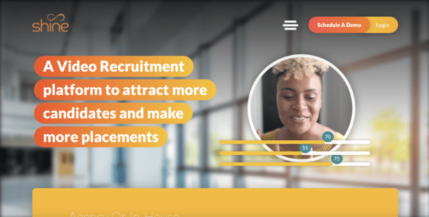
Shine Interview is a video recruitment platform that aims to attract more candidates to make more intentional placements across all markets.
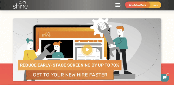
It offers One-Way Video Interviewing that enables users to create predefined questions for candidates to respond in their own time, providing a consistent and fair interview process, Video Introductions which attracts candidates using personalized video, Spotlight Screening that effortlessly allows users to comment on and rate a candidate throughout the interview process, and Candidate Scheduler to seamlessly move candidates through your recruitment process by allowing self-scheduling of interviews and assessment through one centralized platform.
Design
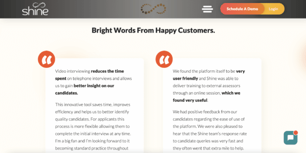
Shine Interview has done a phenomenal job of maintaining consistency. The site is inviting and feels friendly. Interviewing candidates is a tough process that requires so much attention to detail; Shine Interview’s site perfectly conveys their solution while being bright and entertaining. The site has a great balance of visuals and smart animation to communicate the platform.
Tech Elevator
What is Tech Elevator?
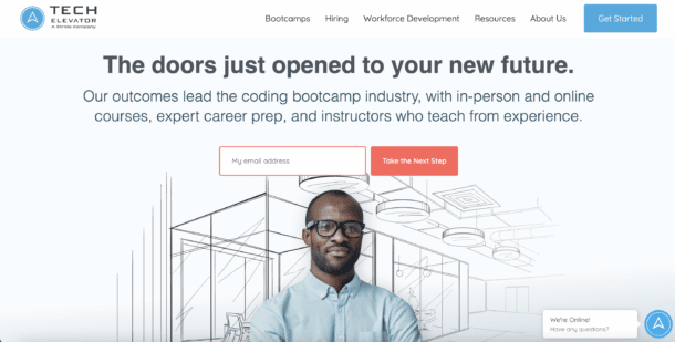
Tech Elevator is a SaaS solution that leads the coding bootcamp industry. It offers in-person and online courses, expert career preparation, and instructors who teach from thorough experience. Tech Elevator supports and leads people with no coding experience into high-earning careers.
Design
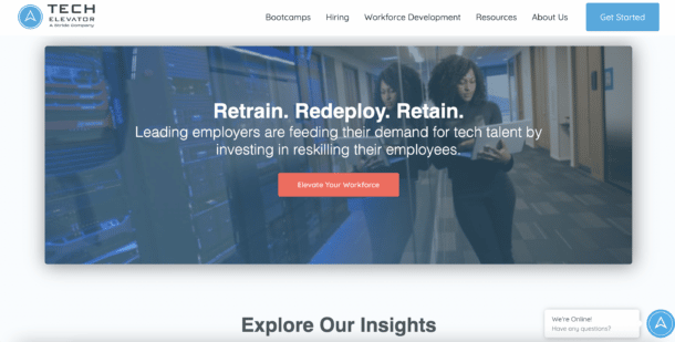
The Tech Elevator site just simply makes a visitor intrigued. With a mixture of artistic graphics to imagery, the site is designed to entice some curiosity. Tech Elevator’s site isn’t doing too much, there are clean lines, simple and straightforward design, digestible information, persuadable language, and more.
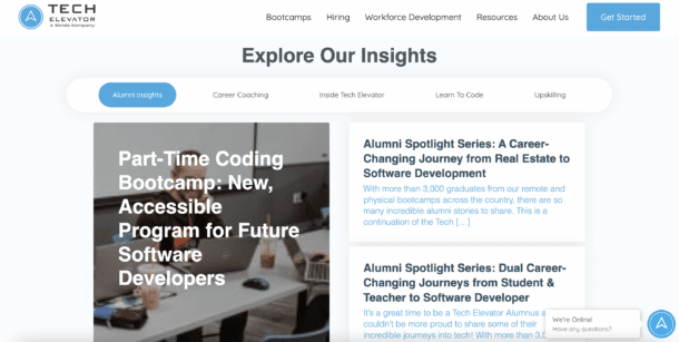
It additionally offers a myriad of ways to learn from their home page alone with testimonials, employee recognition, videos, guides, and even short assessments to determine not only if Tech Elevator is the right solution for you, but also a custom guide to what your skill level needs in order to become a professional.
Our Process
Insivia was needed to redesign the Tech Elevator website – specifically focusing on the UX/navigation and a backend platform that could act similar to a CMS. Using WordPress, Insivia was able to incorporate universal modules and tagging methods to create a website that is easy to update on the backend. For the end-user, content was broken down into more digestible categories that focused on Tech Elevator’s target audience.Since launching the site, Tech Elevator has had a 54% increase in keywords, and 16% increase in traffic. I also admire the modern way we refreshed their brand, to focus more on engaging their target audience.
Qless
What is QLess?
QLess is a queue management platform that seamlessly manages customer flow. Businesses run into countless obstacles, and QLess is the platform that helps you overcome them. Everything from appointment scheduling to business intelligence, QLess monitors your businesses’ workflows in real-time and aims to improve workload visibility and increase productivity overall.
Design
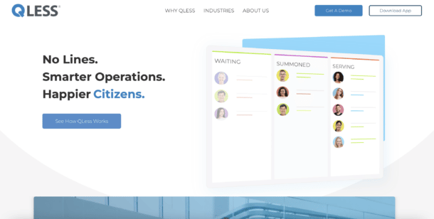
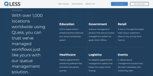
QLess’s site is polished and easy to use. Immediately upon visiting a user is welcomed with a deconstructed interface of their platform that flawlessly communicates what to expect with their platform. The interaction on the QLess site is additionally exceptional with bold, bright colors and scroll methods that attract visitors.
We’re proud to say that the QLess website was recognized by DesignRush for best website designs.
Our Process
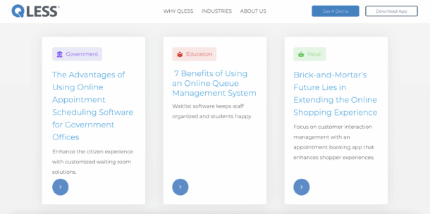
For QLess, there was a wide range of strategies that we help them implement in this website development process. Like many of our other projects, we started with really helping them determine their site architecture to better communicate their product to unfamiliar visitors. In addition, we also created a graphic strategy to develop visuals of their product that were abstract, flexible, animated, and truly helped capture audience interest.
One of the other key strategies what is a feature that allowed visitors to select certain factors about their needs to then personalized there’s site experience and content that they would engage with.
These keep elements along with an overall powerful design helped QLess significantly increase MQL to SQL conversions immediately upon launch.
MobileLocker
What is MobileLocker?
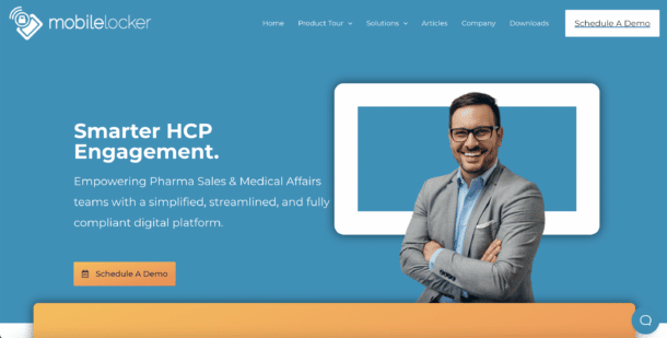
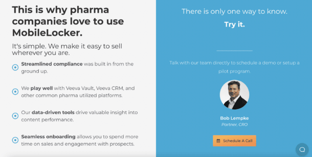
MobileLocker is a smarter HCP engagement. It empowers pharma sales and medical affairs teams with a simplified, streamlined, and compliant digital platform. They aim to accelerate sales by delivering the right content to the right people on any platform with complete visibility into prospect interactions
Design
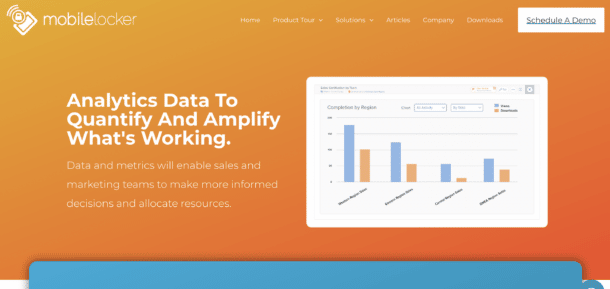
MobileLocker’s sleek homepage design entices the visitor to scroll further down the page. With clean animated graphics, as well as some customer testimonials, it’s vibrant with positivity towards their product. With your homepage, you want the visitor to take action. So, towards the bottom of MobileLocker’s page there’s a strong CTA to schedule a discovery call.
Our Process
Insivia started with MobileLocker by helping them strategically look at their marketplace messaging, overall brand, and approach to customer acquisition. The website was a delivery on strategically determining that their product focus on a narrow market. We not only helped them determine a more narrow go-to-market strategy, but then worked with them to execute this on their website and social channels.
RezStream
What is RezStream?
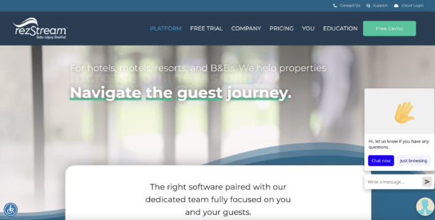
RezStream is a platform for hotels, motels, resorts, and bed and breakfasts where they help properties better navigate the guest journey, increase online visibility, drive more direct bookings, automate and streamline operations, and ultimately make more money.
Design
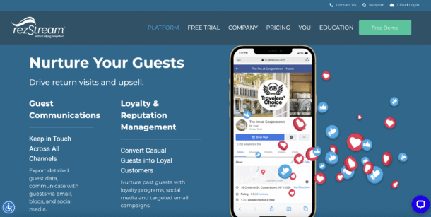
RezStream’s website is informational, without being overwhelming for the visitor. As you scroll down it shares some of their key features and the why behind how the software improves your business. Not only does it give useful information, but it allows you to take action by filling out a quote calculator and scheduling a demo. With a design like this, RezStream doesn’t leave their visitors hanging.
Our Process
As a SaaS company that helps its target audience develop websites, Rezstream wanted a partner that they could both trust and work very closely with during the process. One of the key outputs of the strategic process for designing the website was helping determine how they would display and present their pricing to the outside world. Previously they had not shown any pricing but we’re looking to start adjusting their model to a product led approach.
We worked closely with them to come up with a tool that would allow audiences to configure their own pricing based on factors of their business but still leave the process open-ended to encourage visitors to convert.
Socialive
What is Socialive?
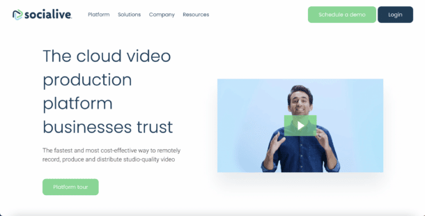
Socialive is a cloud video production platform on which businesses can rely. It is the fastest and most cost-effective way to remotely curate studio-quality video content. Socialive is an all-in-one platform dedicated to recording, producing, and distributing high quality video. Users can effortlessly capture any recording type regardless of internet connection and build excellent productions to later distribute.
Design
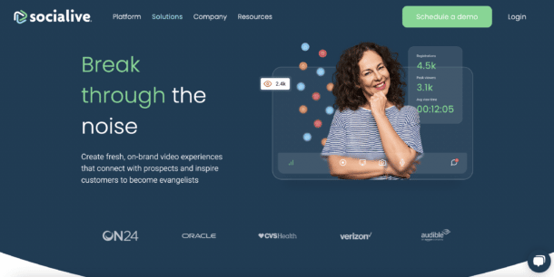
Socialive’s website brings their cloud platform to life. With SaaS products, you have to be creative with how you market your product. Socialive executes a strong engaging explainer video that gives an overview of their product. It adds personality to their brand and makes the visitor interested in learning more. Further down the page it briefly walks you through their features and industries they cater to. The accent colors are bright, and the overall design is clean and airy.
Our Process
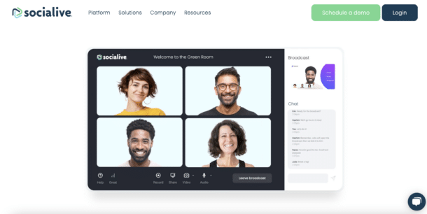
One of the biggest challenges in helping Socialive redesign their site was strategizing with them on how to properly present their enterprise messaging as well as free personalized experiences for the wide range of departments and audiences they were looking to reach. We worked closely with them to outline personas, develop Enterprise messaging, and build a site architecture that could speak to the variety of visitors.
Knk
What is KnK?
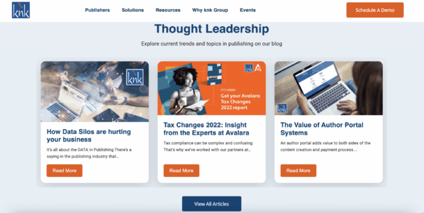
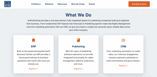
KnK is a one-stop-solution for publishing companies seeking to digitize their business. From fundamental ERP features including financials or publishing specific needs like rights management, KnK utilizes marketing automation with their CRM to offer a single tool using reliable data across publishing companies’ entire business.
Design
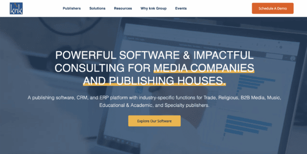
Knk’s homepage instantly comes to life with B-roll footage playing behind the hero message. It’s simple, and not too distracting. This is a great way for your website to avoid falling flat. Right off the bat there’s a strong CTA urging the visitor to explore their directory of software features. Further down on the homepage they also share the industries they work with and what solutions they solve.
Saleslion
What is Saleslion?
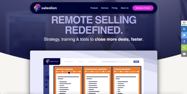
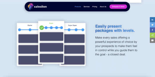
Saleslion is a product for other SaaS companies that helps build, calculate, prioritize, and compare solutions. Saleslion customers provide their personalized Saleslion product to their prospects in which they receive an interactive experience to customize their solution and make even the most complex offerings easy to understand.
Design
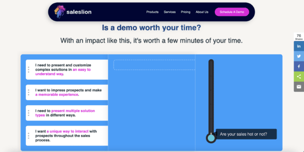
The Saleslion website is bright and colorful, while still making a strong impression for the visitor. The text is bold and it’s followed by a clean animated video that gives you a preview of the product. Not only does the website do a great job of explaining their sales tool, but there’s an interactive aspect towards the end of the page. You can drag and drop the solutions you’re looking for and the website will tell you if Saleslion is right for you. Since Saleslion is an interactive sales tool, it only made sense to make the homepage just as interactive as the product.
Key Takeaways
Smart website design is critical because it allows businesses the ability to stand out from their competitors and accurately represent their brand. It attracts customers and ensures they can easily find the information they are looking for and accomplish their goals. By creating an intuitive and effective design, businesses can increase user engagement and build trust with their customers, making it a critical aspect of any business success.
If you are seeking support in website design, reach out to us today to learn how Insivia can elevate your company’s web development strategy!
