There are a number of ways in which usability testing, strategic planning, and custom digital tools can play a huge role in driving sales, reducing returns, and engaging customers with your eCommerce brand.
The key to it all is to focus on optimizing the entire shopping experience to make it easy, seamless and engaging across multiple platforms – especially mobile.
Make It Easy
The positioning and appearance of the “add to cart” or “buy” button has major implications on how often people click it.
The last thing in the world you need is somebody having to look around to find it. It’s the digital equivalent of trying to buy something at your local big box store, only to discover the salesperson you need is out back on a smoke break.
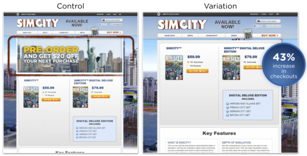
Just check out what is happening below in this side-by-side of an eCommerce product page. While a banner would seem to catch attention, it pushes the “Add to Cart” when higher on the page gets more conversions.

See more examples like the above on the optimizely blog.
Make It Seamless
Do not put any barriers in front of a consumer looking to spend money.
Making the shopping-buying-checkout process simple and easy will significantly increase eCommerce orders.
Allow people to navigate to and from their cart easily without losing their place, and provide supplemental product and accessory suggestions that will not only drive sales and profitability but will increase satisfaction as well.
Make It Engaging
According to an Invodo study, online shoppers are 1.8x more likely to buy after viewing a video.
Videos are a great way to showcase your products, and there are a number of ways to use the moving image to help sell your product. Demonstration videos are great for products that are complex, intricate, or new-to-the-world products. Video banners are great for a variety of products. Advertisement videos are fantastic to include if they are humorous or supplemental to other ads but leveraging video for products can excite and convince customers to buy.
Amazon has been using animated images of women modeling their designer line of dresses on the corresponding product pages for a few years now. This is a great application of video for apparel, as many women find it helpful to see how the dress fits at various angles and while moving.
Modcloth takes a different approach. Their customers model the products that they have bought. This is a brilliant crowdsource model that not only saves Modcloth time and money, but it engages their customers on social media platforms and gives them an opportunity to see their products in the “real world.” Brilliant.
To take this one step further, imagine having a live feed that pulls from your customers’ social media accounts that showcases your products. This is a great way to create customer advocates and provides “social proof” of your brand and products.
Make It Interactive
Product builders, configurators, and filters are nothing new. You can find them on most retail or e-commerce sites. But they have remained relatively unchanged for far too long.
Product viewers provide the capability for your audience to view, inspect, or interact with your product. There is an old sales trick that has (anecdotally) proven to be highly effective: if you want somebody to buy something, put it in his or her hands. The digital equivalent of this is an interactive product viewer. The Wove smartwatch is a great example of this. With the rise of mobile and tablet users, making the interface touch/swipe friendly is a must.
Product configurators are interactive tools that allow a user to build or customize products by choosing between any number of pre-determined criteria. A great way to spice these up are by incorporating a drag-and-drop interface. Some of the better ones show the end product being built as new options are selected. The build-to-order process is great for engaging customers, and really helps them build a relationship with your brand. In many cases, integrating a social media sharing feature is a winning bet because it allows them to share their creations.
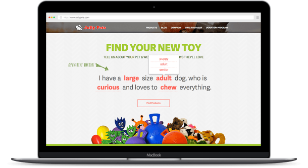
Product filters have been around since the dawn of e-commerce. These are tools that allow a user to view certain products based on categorical choices, though some are better than others. Retailers often make the mistake of using a generic plugin when a custom solution would be more appropriate. We built one for Jolly Pets that is really unique.

To encourage site visitors to interact with the tool, we built it into a sentence. We tried a couple of iterations through an A/B testing process before we settled on the final design, and it exceeded our client’s expectations. Jolly Pets specializes in creating toys based on play habits, and matching those with their target audience was a major priority.
The interesting thing to note is that Jolly Pets is not an e-commerce site, so these types of digital tools have applications in a variety of settings. This tool ultimately serves two purposes. The first is that it helps site visitors to identify the specific toy that they need. As for the second purpose, in a more abstract sense, the interactive nature of the tool allows visitors to engage with the Jolly Pets brand and is part of a larger strategy that we developed. This configurator works in concert with a retailer-locator function and a really unique social media integration.
Check it out yourself at the Jolly Pets site.
Make It Mobile
Online e-commerce shopping from mobile and tablet devices is growing more and more every year.
The native vs. web debate will always be a consideration, but you should always make sure your customers have a great experience shopping on your site using a mobile device or tablet regardless if you have a dedicated app or not.

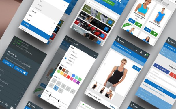
UX Collective has a great article and examples of well-designed mobile eCommerce experiences.
If you wish you create a mobile app as well, great, but it wouldn’t be wise to assume your shoppers are going to download or use your app. The bright side of optimizing for mobile is that it forces you to remove some of the clutter from your products page.
Putting it All Together
Buyers are becoming increasingly educated and savvy. They are as familiar with the products that they shop for as the manufacturer. Many shoppers use the internet as a showroom to do their research and to compare prices prior to buying in store. This is called webrooming.
This is the opposite of showrooming in which shoppers browse in store before buying online. People don’t necessarily fall into one category or the other; their buying habits change based on a variety of factors including sales, time of day, season, or the type of product.
For retailers that have both an online and brick-and-mortar presence, one thing we do know is that customers tend to incorporate both buying/shopping styles, so the their shopping experience needs to be seamless and consistent between platforms. They should be able to find the products online that they viewed in-store, so the live and online shopping experience will compliment each other.
One final thought to keep in mind is that the online shopping experience needs to accommodate customers at every position in the sales funnel. It’s easy for a flesh-and-blood salesperson to qualify the customer and identify their needs, but many e-commerce sites struggle to do this digitally. As a hypothetical example, customers that are further along in the buying process are are not looking to compare “mobile audio subwoofers,” they are looking to compare “12 inch DVC 2 ohm mobile audio subwoofers with a RMS power handling of at least 200 watts.” This needs to be balanced with accommodating the needs of customers in the beginning phases of the process who may not know what they are looking for. A well thought out product sorting, filtering, or configuration solution can do that.
Do you Need a theme for your eCommerce site? Check out the WordPress marketplace theme by Wbcom Designs.
Also, check out our product configurator page to learn more about our solutions and processes and drop us a line today.
Our team of strategists and gear-heads are here to answer questions, spark ideas, and help design and develop the perfect site and/or digital tool.
Don’t be shy, contact our agency.
