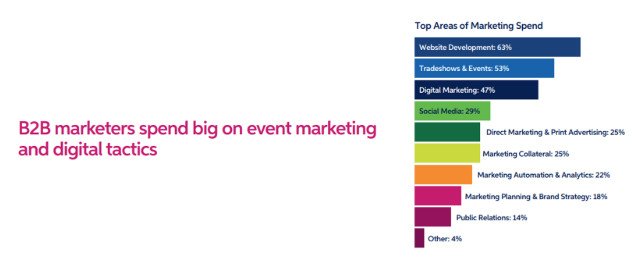
No matter what industry you’re in, if your company is selling primarily business-to-business (B2B), you’re going to need a great website to grow and succeed over the long run. But developing a great looking (and functioning) B2B SaaS website isn’t something that happens overnight.
But today’s digital B2B environment is much different than even just a few years ago, so you’ll want to make sure that your current website strategies reflect what most likely to work today, tomorrow, and well into the future.
For example, in the past, reaching buyers via mobile and smartphone was considered principally a consumer endeavor. But today, roughly 40 percent of B2B buyers utilize smartphone and tablet devices at some point in the buying cycle. Moreover, upwards of 94 percent of buyers say that design is the number one factor in terms of a website’s first impression.
That being said, developing a holistic strategy for your B2B website goes far beyond mobile optimization and smart graphics.
Great B2B websites are designed to facilitate the primary business goals of your company whether that be generating leads, increasing sales, or differentiating your product or service in the marketplace.
From developing a comprehensive thought leadership strategy to implementing targeted landing pages, here are some of the top website strategies that B2B companies of all shapes and sizes should seriously consider.
The SaaS buying process can be a lengthy one.
And according to Gartner, 60% of that process takes place before the buyer ever engages with the SaaS sales experience.
1. Use A Thought Leadership Hub for Your B2B SaaS Brand To Establish Expertise and Build Confidence
B2B buyers want to get the best tool that will solve their pains. Proving your expertise establishes your capability to deliver value.
For many B2B companies, the buying cycle takes quite a bit longer than for consumer-oriented ones. You may have to engage various stakeholders within a single organization over the course of weeks, months, or sometimes years before a sale is finalized.
And over that course of time, the sales prospect will be evaluating several other vendors to determine which is the best fit for their organization. To help prospects overcome various hurdles along the way, many B2B companies invest heavily into producing thought leadership content and materials and consolidating them into a resource hub on their website.
In fact, 44 percent of business decision makers (and 55 percent of C-level executives) say they give organizations their contact information in exchange for high quality thought leadership content.
The types of materials and content in your thought leadership hub might vary depending on your business and target audiences. But usually, the main components are consist of many of the following marketing assets: Whitepapers, Ebooks, Infographics, Analyst Reports, Case Studies, Webinars, Tutorial Videos, and Customer Success Stories.
As you build your bank of content over time, you’ll want to make sure that your hub webpage evolves as well, making it easy for visitors to sort through and find the content that’s most useful to them.
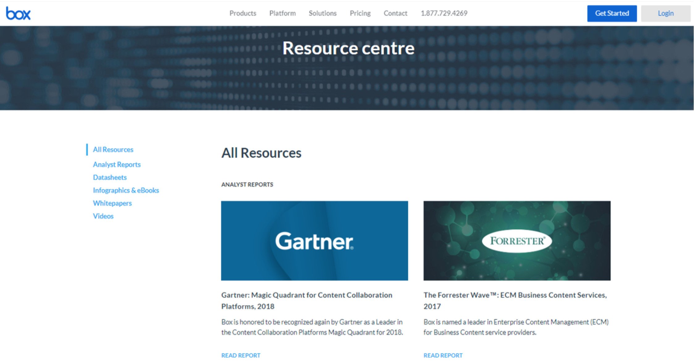
The Box resource center is a good example of a clean, easy to navigate layout and interface.
When building out resources and content for your thought leadership hub webpage, there are a few critical factors to keep in mind. First, make sure to focus on the problems or pain points that of your target prospects that your product or service is designed to solve.
You’ll want to show that you’re the foremost expert in your area with well-produced whitepapers, case studies, and the like. Second, have collateral that’s available on a variety of mediums. Some buyers prefer to read a research paper, while other might only have time for bite-sized video.
And finally, make sure to capture contact information for your most valuable resources for lead generation and re-marketing purposes.
The first five search results receive on average 67.6% of clicks while the remaining five receive just 3.7%.]
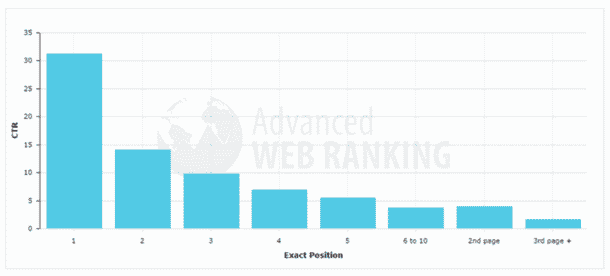
Click-through-rates for the top 3 to 4 results are the lionshare of visits for a search result. For B2B SaaS companies looking to scale, SEO is extremely important to acquiring customers.
2. Responsive Design & A UX That Wins For Core Web Vitals
Responsive is an expectation, but making that experience truly easy to use and optimizing for core web vitals is a step above the norm even today.
In today’s world of smartphones, laptops, and tablets, you simple just never know what device your visitors and sales prospects are viewing your site on. And if your website isn’t designed to adapt and respond to what device and operating system the viewer is using, users will be left with a lacklust experience.
For many, visiting your website is the very first step in the buyer journey, so you’ll want to make sure that your website is developed with what’s known as Responsive Design principles and technology.
The principle of responsive design is fairly simple. Your website will detect – and respond appropriately – to whatever device the visitor is using. If someone is viewing your site from the newest iPhone, for example, the site will automatically resize itself for that particular screen size.
Visitors will be able to easily navigate your site and find what they need, rather than having to navigate a desktop-oriented site on their smartphone.
And responsive design generates results, as 62% of B2B companies improve their sales just by switching their websites to being responsive to mobile.
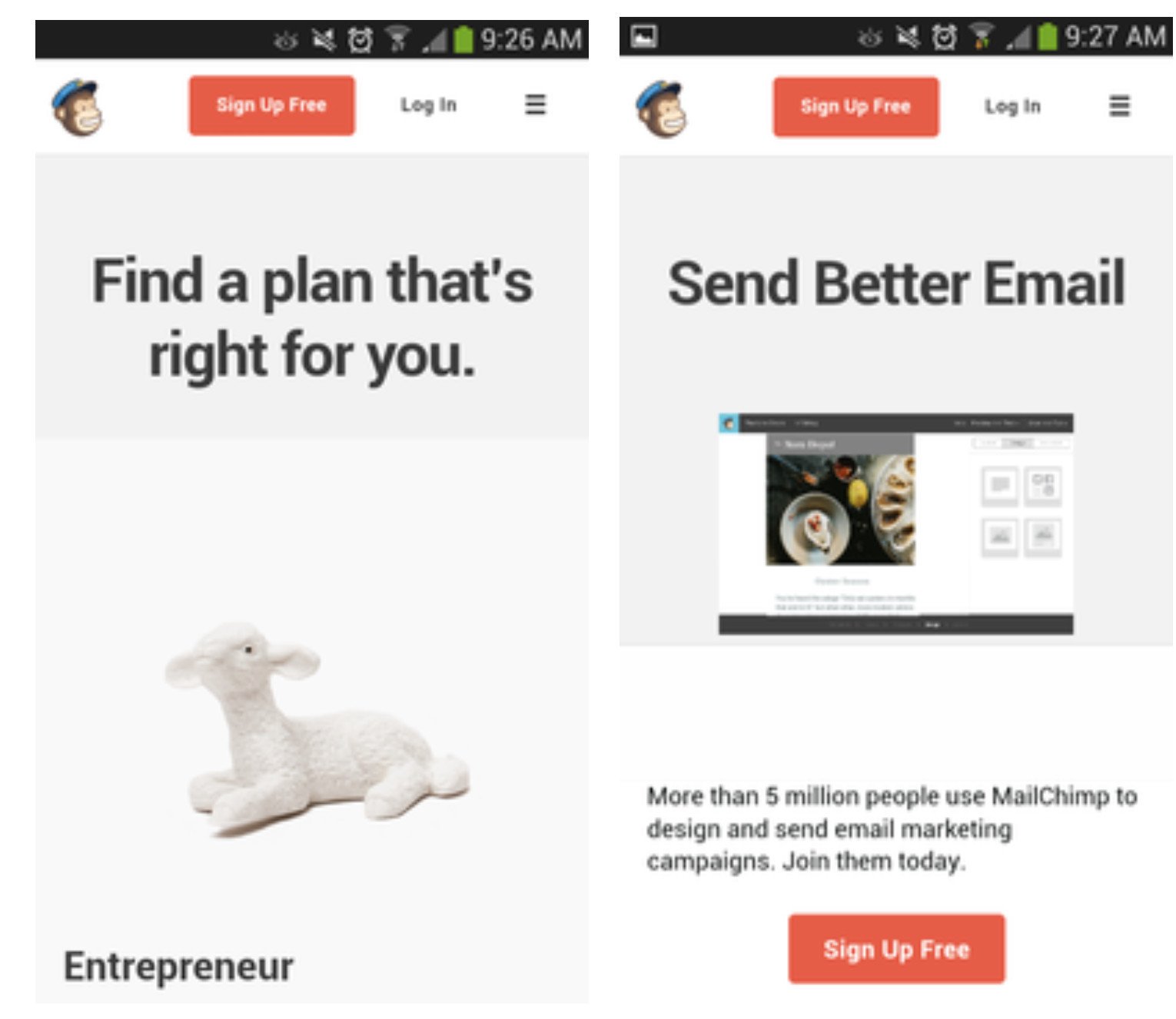
Mailchimp’s mobile interface is an excellent example of responsive design
While you might think your B2B website is currently responsive, most businesses are far from fully optimized for mobile, tablet, PC, and other devices.
If you haven’t lately, now might be a good time to conduct a responsiveness audit of your website across all devices and operating systems. First and foremost, you’ll want to drill down into image sizes and other factors that might affect loading times.
Sure, users can view your website on their smartphone, but if it’s too image heavy and takes a long time to load, the result will be a high bounce rate. Next, make sure to connect your website to Google Analytics (if you haven’t already), and monitor usage statistics based on device and OS.
Make improvements to your site’s responsiveness over time, and track the results of whatever metrics you’re focused on (conversions, traffic, etc.). It’s also not a bad idea to bring in an expert, partner, or consultant in web design to make sure your site is as responsive as possible.
3. SaaS Websites Need Consistent Calls to Action At All Stages of The Buying Cycle
Provide actions for early researchers as well as ready to buy visitors for ultimate success.
No matter what your business is, undoubtedly one of the primary functions that your website serves is to gather contact information and generate leads.
However, many B2B companies “leave money on the table” with regards to leads, simply because their websites lack consistent, clear calls to action throughout their website. It’s not enough to simply have a “Contact Us” page, or a “Request Demo” section at the bottom of your homepage. By strategically placing calls-to-action throughout your site, you’ll be able to increase your lead database and fill your sales pipeline simply by making a few changes.
While most large enterprises employ dozens of designers and experts to ensure their website is optimized in terms of CTAs, the fact is that 70 percent of small business websites fail to display clear CTAs on their websites.
One common problem is that many businesses simply don’t realize the opportunities of CTAs on various pages of their websites. Sure, you might have a “Request Demo” on the homepage, but you might also want to include a “Subscribe to Our Newsletter” on your blog page or “Download Free Whitepaper” on your resources section. The point is, you don’t want to miss out on opportunities to collect valuable contact information that might turn into sales leads.
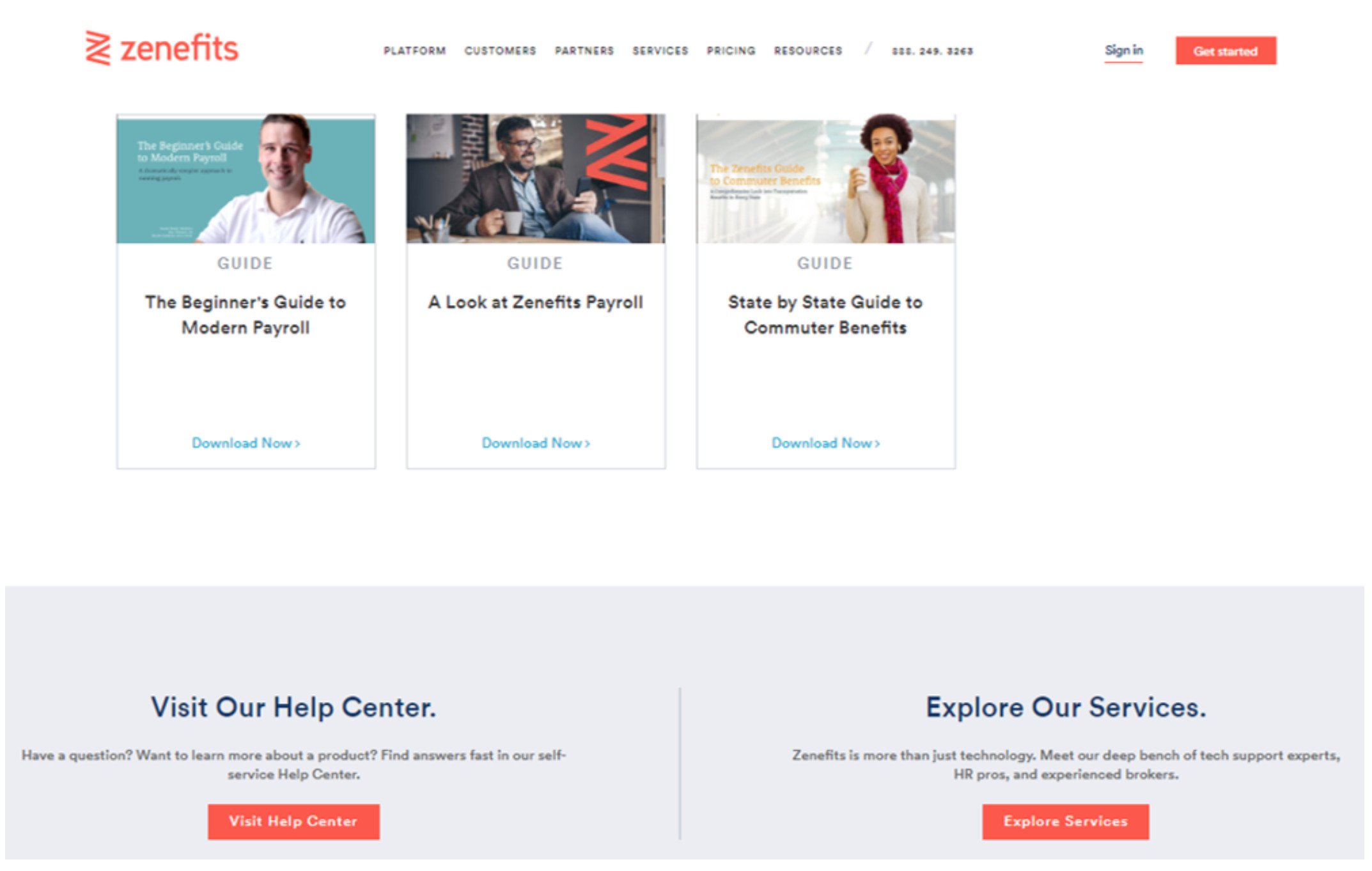
Notice the multiple, clear, color-codes CTA buttons on Zenefit’s B2B website.
When designing your CTAs for different web pages, you’ll want to keep a few things in mind. As evident in the Zenefits example above, it’s a good idea to color code your CTA buttons so they stand out substantially from the rest of the static content. Also make sure that any forms or information people have to fill out is short, clear, and easy. While you do want to get as much information about the sales prospect as possible upfront, keep in mind that your sales team can also elicit helpful information as they qualify the prospect at the top of the funnel. And don’t make the wording in your CTAs overly “salesy.” You want to communicate that the prospect will get something of value in return for taking action to get them in the funnel. You can uncover their pain points later on, and position how to sell your product or service on an individual basis.
4. Create Targeted Landing Pages for SEO, Paid Advertising, and Personalization
Landing pages are one of the best ways that B2B companies can get the most of their SEO and search engine marketing. If a sales prospect comes across your website via organic search, for instance, they might click through to the page on your site most relevant to what they’re looking for. Once they click through, they might be presented with a landing page specific to the product they’re looking at, with a CTA that’s also congruent. You’ll want one landing page for those visiting your homepage, another for those looking at your services, a different one for your resources hub, and so forth.
The problem is, while many B2B organizations employ landing pages, they either use too few or don’t have the ones they use properly targeted. According to MarketingSherpa’s Landing Page Handbook, 44 percent of B2B landing page clicks take the visitor to the homepage. Moreover, 62 percent of companies have six or fewer landing pages on their website. And only 52 percent of B2B organizations continually test their landing pages to improve conversions. A focus on targeted landing pages will not only serve to generate more leads in your database, it will also put you well ahead of the competition that (more than likely) has far too few landing pages.
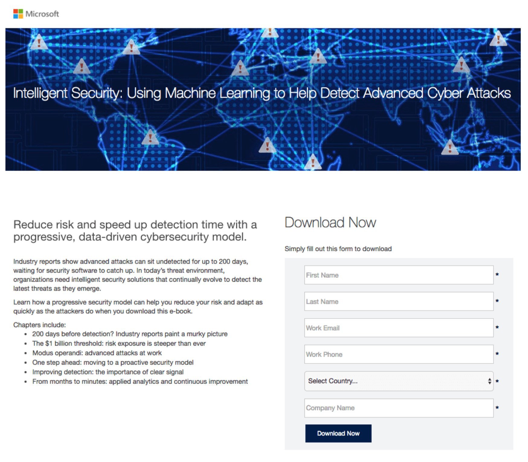
Microsoft’s Cybersecurity targeting landing page – https://instapage.com/blog/landing-page-examples
When formulating a plan for your targeted landing pages, make sure to tailor each page not just to the target persona you’re going after, but to different stages in the sales cycle. If a prospect is visiting the page that has datasheets of product specifications, then they’re likely further along in the evaluation stage. In that case, your landing page is better off being along the lines of “Contact us for a quote” instead of “Subscribe to our mailing list.” You can even experiment with embedded customer testimonials or “Thank You” landing pages to extend an extra CTA opportunity.
By now you’ve recognized that website design strategy is just as important (if not more in some areas) in B2B as in consumer. Things like a thought leadership hub, responsive design, and targeted landing pages should be cornerstones to your website strategy in 2018 and beyond. Generating leads, filling the sales funnel, and closing deals can be tough sledding, so you’ll want to have every digital advantage you can get.
Written by: Tony Zayas, Chief Revenue Officer
In my role as Chief Revenue Officer at Insivia, I am at the forefront of driving transformation and results for SaaS and technology companies. I lead strategic marketing and business development initiatives, helping businesses overcome plateaus and achieve significant growth. My journey has led me to collaborate with leading businesses and apply my knowledge to revolutionize industries.
