Throughout 2020 and 2021, the already growing B2B SaaS and Software market proved essential to keeping businesses functioning. This B2B business growth is expected to continue. According to the Global Software as a Service (SaaS) Market 2021-2025 report, the SaaS market is expected to grow by $99.99 billion from 2021 to 2025.
Increase of SaaS companies means increase of SaaS websites. This market saturation makes it even more difficult to stand out. What does a B2B company need to do to stand out and find their user base?
Many components contribute to a successful website. Ultimately, a B2B SaaS website serves to convert website users into leads and eventually into paying customers.
Insivia’s B2B SaaS and Software industry expertise provides in-depth knowledge about how to combine great user experience and a strong brand persona while focusing on converting users to leads. Our experiences with our clients have shown us the keys to a successful website and how to help the right people find and explore your product offering(s).
Below we’ve shared the key elements to a successful B2B SaaS and Software website, as well as top SaaS industry examples of each key element for 2022.
What Does a SaaS Website Need?
A SaaS website has an essential job: convert users to leads. The website must have certain key elements that help guide users along in the buying process that provides an experience that shows them what they need to make a decision. These necessary website elements include a value proposition, product visuals, high quality UX and design, and content.
Value Proposition
A bad website will have a user closing the tab saying “wait, what do they do?”. In the B2B environment, your website is a crucial way to open the door to prospective customers while connecting with current customers.
The copy on your website tells the story to users about who you are and why your ideal visitors should care. This copy is crucial to what users will leave your site knowing about you. Consistency and clarity are incredibly important to driving home the message that you want users to receive.
What is a Value Proposition?
A value proposition is a succinct way of telling a visitor why they would be making the right choice by doing business with you. In a couple sentences or less, the visitor needs to understand exactly what to expect as an outcome of teaming up.
A strong value proposition should be placed above the fold and be the first thing that users read on your website. The value prop copy is typically the first thing people read on your website, intended to pique your users’ interest to continue on your site.
Product Visuals
You know your products inside and out. Your website visitors don’t. Potential customers are visiting your website to learn more about what you offer. If customers don’t have the opportunity to peek behind the curtain and see how your products look and function, they likely won’t have a full understanding of what your product is. Promises of improved ROI can only go so far if visitors don’t have the opportunity to see how they will get there.
What are Product Visuals?
Product visuals are guides, pictures, videos, or virtual walkthroughs showing potential customers what it looks like to actually use your product and interact with its UX/UI. These could be highlighting different standout website features, “how-to” videos for example, or sharing high quality screenshots.
If you were browsing on a B2C website looking for a new pair of sneakers, you would expect to see pictures of sneakers to determine if you liked them or not. B2B SaaS customers need the same treatment. Seeing images of what it’s like to actually work in a B2B SaaS or Software product helps give B2B customers confidence in their decision to continue their buyer journey.
High-Quality UX and Design
94% of potential customer first impressions have to do with your website design. A professional, clear, consistent, and easy-to-use design and UX should architect a straightforward path to purchase. Prospective customers feel more confident with an artfully crafted website, as 75% of website credibility comes from design.
Poor UX has detrimental impacts: 89% of consumers shop with a competitor after a poor user experience. Unattractive designs and frustrating UX leads to higher bounce rates and fewer leads.
Within a website design, there should be a clear hierarchy and story as well as opportunities for lower commitment conversions that ultimately lead to buying.
What is Website Hierarchy and Storytelling?
When navigating through a site, the hierarchy of the site structure should logically make sense. A website navigation should be well-researched and clearly understand the audience and their needs. A well thought out hierarchy gets users where they want to be as quick as possible.
Content layout tells the story of your products, what features they have, and how they’re used. The layout of content should be thought out in a strategic, logical order. A logically laid out website will produce significantly better business results than a disorganized website.
What are Conversion Opportunities?
On a B2B SaaS or Software website, having conversion opportunities with low barriers to entry on a website prior to buying are key to staying in touch with these customers and giving them insight into your products without making a monetary commitment. The key here is to understand what your buyers need at each stage of the buyer journey, and what actions they would need to help them get to the next stage. These could be conversions like interactive tools, interactive quizzes, trials, or newsletters.
Content
Many of the top B2B SaaS and Software companies have become thought leaders in their respective industries. Much of this is thanks to consistent content marketing created for customers and potential customers. Content marketing helps with search engine optimization (SEO), audience loyalty, raises brand awareness, and creates industry authority.
What is Content Marketing?
Content marketing focuses on creating and distributing website content for targeted audiences. Content is key to answering questions your audience has, building trust and expertise in the market, and generating leads.
Now onto some examples of each of these elements.
Best SaaS Websites 2022: Value Proposition
Zendesk Chat
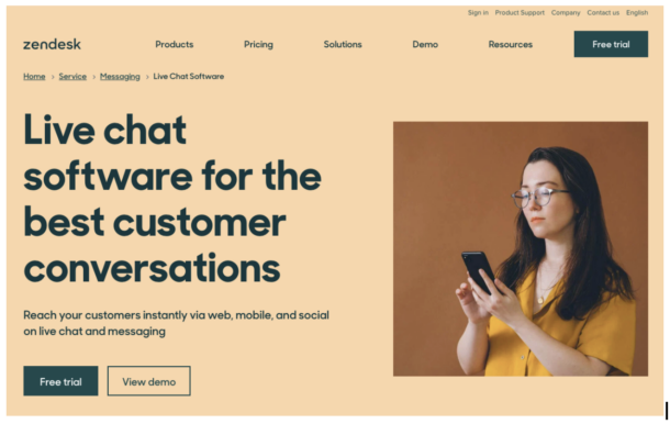
The product page for Zendesk Chat successfully conveys what value they provide to their businesses: instantly reaching customers via a multitude of channels. This is conveyed quickly and succinctly, in two sentences. Bonus points for being above the fold!
Grammarly Business
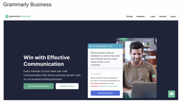
Writing assistant platform Grammarly highlights their value proposition well. The product page for Grammarly Business shares their purpose and value with ease. The value proposition is simple: “win with effective communication”, with a more detailed sentence below about how Grammarly Business provides that win.
This example is particularly strong because the navigation is simple, important content is above the fold, the product is shown in action, and the value proposition is clear.
HubSpot
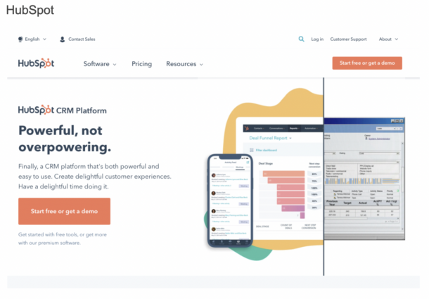
HubSpot’s homepage shows off the HubSpot CRM Platform. The value prop here makes it clear in a few short sentences what they can do for you: a CRM platform that creates good experiences for both customers and for the business employing it.
Best SaaS Websites 2022: Product Visuals
Dropbox Business
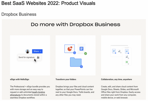
File hosting business Dropbox’s B2B arm shows off their product simply. Dropbox Business both shows and tells with their product visuals on the product page for their B2B product segment. They share key features of what customers can do with their product, but also show what it looks like to actually take this action. The visuals are larger than the words – this is important to helping users remember these key features.
Evernote Teams
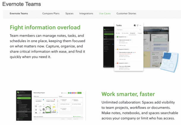
Task management and organization company Evernote knows how to show off the product for their users. The Evernote Teams site section shows images alongside blurbs about benefits that teams will reap from using their products. Instead of just stating these benefits on a bulleted list, they show how Evernote makes it possible. This screenshot shows only two of four benefits listed by the company, with the other two being “Harness your team’s knowledge” and “Manage it all, easily”.
Drift
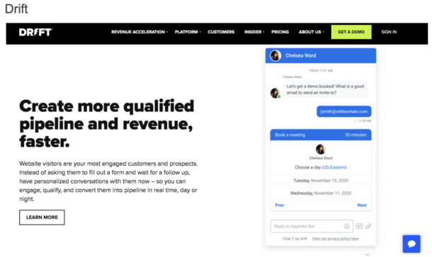
AI-driven live chat provider Drift shows four product images alongside a clear benefit. Their website has tons of product imagery laid out throughout so that there is no question at all about what the product looks like, helping build trust with potential customers.
Slack
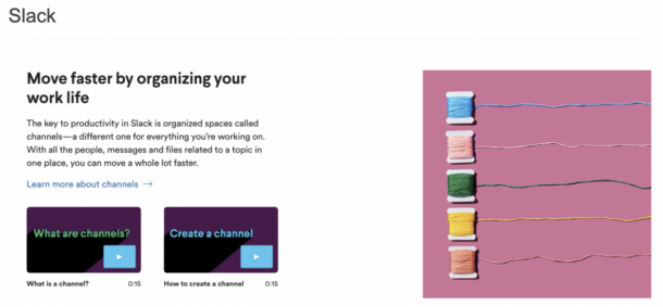
Communication platform Slack shows off their product through videos that both provide insight into the product itself and help users that already have the product. Through short video clips, users can see the product in action.
Best SaaS Websites 2022: UX and Design
Salesforce
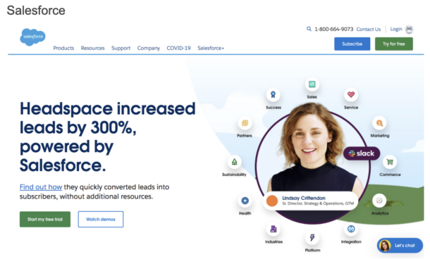
Cloud-based software company Salesforce understands how to build a hierarchical website with a logical user journey flow. In this case, the conversion opportunities identified above the fold on their homepage are ready to catch users at the many various stages of the buyer journey. There are conversion opportunities to subscribe, start a trial, watch demos, or live chat.
Shopify
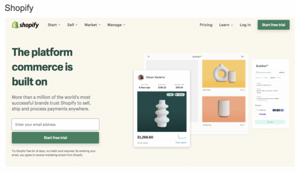
E-Commerce platform Shopify has an extremely well thought-out yet simple navigation to help users quickly jump to the area of the website most relevant to them. The overall site hierarchy guides users along the buyer journey seamlessly and has a well-designed UX.
InVision
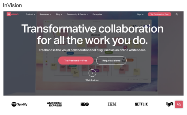
Visual collaboration tool InVision overall has an aesthetically pleasing UX, and the layout is laid out in a manner that is straightforward. The consistent branding and storytelling throughout the website content are what make InVision pop.
Best SaaS Websites 2022: Content
Mailchimp
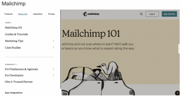
Marketing automation and email marketing platform Mailchimp knows both their audience and their subject matter. They’re a prime example of how to build out content in a way that keeps their audience engaged while also attracting new users. They have content built out for many use cases: 101 content, tutorials, marketing tips, case studies, inspiration, and communities.
Trello
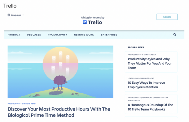
Project management platform Trello supports its users with a well-built out blog. The blog gives a variety of resources to find new customers and help current ones. From productivity tips, to remote work articles, to use cases for Trello, the platform has great content to engage users at all buyer journey stages.
Hootsuite
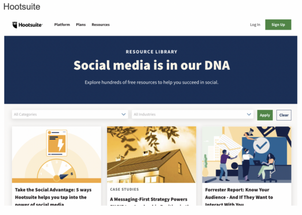
Social media management platform Hootsuite is another website with incredibly well researched, planned, and executed content. Their resources consist of a whole host of offerings: social media trend reports, webinars, a blog, case studies, and a social media academy called Hootsuite Academy.
BambooHR
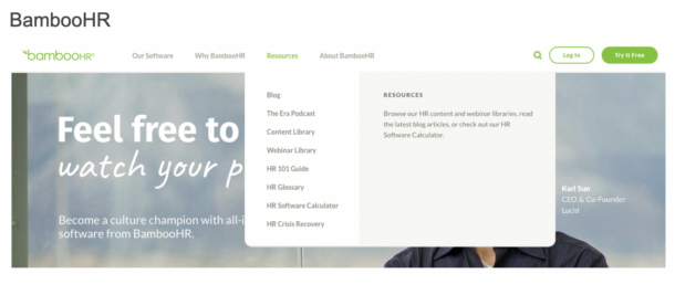
Human resources SaaS company BambooHR supports their HR-centric audience by providing them tons of resources to succeed. From blogs to a podcasts to HR guides to webinars and even more, BambooHR shares lots of thought leadership and use case content to help new and existing customers alike.
Building a Best in Class Website
B2B SaaS and Software websites in 2022 are all about creating an experience to logically guide your audience through your product, no matter where they are in their buying process.
If you’re looking to cut through the noise of the SaaS space and connect with your audience, Insivia can help.
Learn more about how we can help you design and develop your B2B SaaS and Software website.
Written by: Tony Zayas, Chief Revenue Officer
In my role as Chief Revenue Officer at Insivia, I am at the forefront of driving transformation and results for SaaS and technology companies. I lead strategic marketing and business development initiatives, helping businesses overcome plateaus and achieve significant growth. My journey has led me to collaborate with leading businesses and apply my knowledge to revolutionize industries.
