Using Mega Menu Navigation on Your SaaS Website
MEGA menus! Why are they so mega and why can they help drive mega conversions for your software website?
Let’s look at a few SaaS & Tech Mega Menus First
These two videos should give you a good sense of what a mega menu is if you didn’t already know. Basically the concept is to provide more options and utilize more real estate on the page for visitors to explore the navigation of the site.
This first example is from a technology education organization that has a wide range of content for various audiences.
Our second example is a B2B SaaS company that provides the ability to explore multiple sub-products, features, solutions and a wide range of different resources.
The Power of Mega Menus for SaaS Websites
There are a number of reasons that mega menus can be impactful for a SaaS website, but let’s first focus on the reason that we like them the most.
Helping to tell the story of what you do and why.
The right mega menu design and setup on your website will help new visitors understand more about your product and company before ever needing to click a link or load a new page.
Many visitors to a website will hover over navigation before they even scroll making this prime real estate to help start telling your story.
Second, people don’t actually like going to new pages – stats show that new page loads slow visitors down in their mental evaluation process and their interest wanes quickly. With this reduced time to make an impression, you want to get as much across without new page loads.
Finally, people want to find what they are looking for fast. Everyone comes to a website with an agenda or need in their head even if it is subconscious. A mega menu helps present a number of options to the visitor so they can find the content they are looking for quickly.
How Does a Mega Menu Tell A Story About Your Product?
If you watch videos of people browsing websites or look at eye-tracking, they scan a lot and read very little.
Your two biggest opportunities to get your key points across are navigation titles and page headlines.
The right phrasing of navigation titles can help explain what you do.
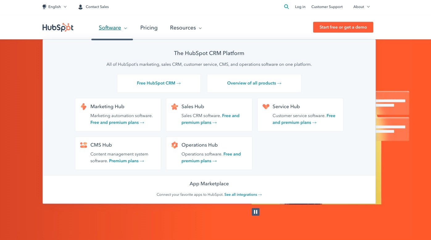
Let’s take hubspot

If I were to come to their site and the first thing I hovered over was the “Software” link:
- I would have clarity this was a software product.
- Would see CRM platform at the top to prime me that this has to do with sales.
- See Marketing, Sales, Service, CMS and Operations to have a sense of all the product can do.
- And if I didn’t know something like CMS, it has the full word content management system right below in it’s explainer.
There are other options on this mega menu that can help tell the story too and we have not hovered over any other menus yet, but at this point I have a decent understanding of what Hubspot is without a lot of time or clicking.
Also, I can dial in on what I am most interested in very quickly.
The alternative that some companies use it to have one page for Software / Platform / Product and then a person has to wait for that to load and then scroll to learn even the high-level of what the software product does.
Using your Mega Menu for Search Optimization
As a SaaS SEO Agency, we are raving lunatics when it comes to the value and impact that SEO can have on a SaaS companies growth.
Since search engines utilize technology that looks at the links on the page and then follows all of them to “Crawl” your website and index it in their databases, it is important they can find your top pages very quickly.
In comes a mega menu which by default often features many of the pages that you want to rank the highest for your key terms.
In addition, Google uses the text in a link to help determine what the topic of the page is about. With navigation, your goal is to make it clear to the visitor where they are trying to go so often the link text is extremely well thought out to describe the page.
Written by: Andy Halko, CEO, Creator of BuyerTwin, and Author of Buyer-Centric Operating System and The Omniscient Buyer
For 22+ years, I’ve driven a single truth into every founder and team I work with: no company grows without an intimate, almost obsessive understanding of its buyer.
My work centers on the psychology behind decisions—what buyers trust, fear, believe, and ignore. I teach organizations to abandon internal bias, step into the buyer’s world, and build everything from that perspective outward.
I write, speak, and build tools like BuyerTwin to help companies hardwire buyer understanding into their daily operations—because the greatest competitive advantage isn’t product, brand, or funding. It’s how deeply you understand the humans you serve.
