Galactic Guide to Website Redesign: Navigating the Cosmos of Creativity for a Site That’s Out of This World
In the beginning, there was the Internet.
This has made a lot of people very angry and has been widely regarded as a bad move.
However, in the grand scheme of things—or rather, the grand scheme of the web—it was, perhaps, inevitable that the cosmos of online presence would expand into the vast and chaotic digital universe we navigate today.
It’s a universe where websites flicker into existence and wink out with the regularity of stars, and your mission, should you choose to accept it, is to make yours supernova rather than a black hole.
Your website, that digital face you use to grin awkwardly into the multiverse, needs to be more than just a mere blip on the radar of your SPaDar ( spa ce ra dar for non hitchhikers). It needs to reach for the stars, to be a beacon in the cosmic night, guiding lost spacefarers to the warmth of your online hearth.
It should be a place where visitors—human, Vogons, or otherwise—can dock their ships, kick off their anti-anti-gravity boots, and say, “Hey, this is a segment of the space-time continuum I could linger in.”
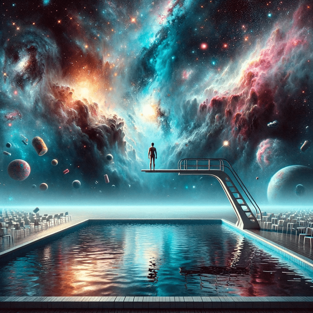
So, here we are, standing at the edge of the universe’s diving board, where the air is thick with the scent of potential and fear of the candy bars in the pool.

We’re about to embark on the greatest adventure since Zaphod Beeblebrox piloted the Heart of Gold with nothing but his wits and a towel.
Together, we’ll navigate asteroid fields of code, skirt black holes of bad design, and charm the space socks off the cosmos with a website that’s more stunning than a Pan Galactic Gargle Blaster.
Whether you’re a seasoned hitchhiker with thumbs well exercised in the art of digital freeriding or a fledgling earthling who still thinks a slider is just a tiny burger, fear not.
This guide is your friendly companion, your electronic thumb for the journey ahead—just remember, don’t panic. After all, designing a great website is a lot like the universe itself: mostly harmless.
Well, as long as you do it right. So grab your towels, puny earthlings. It’s time to redesign at the speed of night lights.
Choosing Your Web Design Team
Embarking on the cosmic voyage of web redesign, one mustn’t just pick any motley crew. Your digital Heart of Gold needs a prime selection of interstellar individuals, each adept in their own realms of expertise.
So let’s break down the roster to produce a bounce killing website:
The Designers
Ford’s Focal Foragers
These are the visionaries who will chart the course of your website’s visual journey.
- Look for a proven portfolio that resonates with your brand’s universe. This means look for designers who have done site’s like what you want to audiences you want. to reach.
- Ensure they’re versed in UX/UI design ; your spaceship should be as navigable as it is stunning. If people can’t find what they are looking for quickly on a site they will be lost in the void and just want to get out.
- Their creativity should be boundless, yet aligned with the latest web standards like the laws of physics. Creating a new world that breaks all the rules also breaks all its inhabitants. There is for sure such a thing as too crazy.
The Developers
Don’t Panic, OK, Maybe Panic
These logical savants turn the designers’ dreams into tangible realities.
- Confirm their code is as clean and structured as a well-organized pantry in the Restaurant at the End of the Universe. You want to score high on Core Web Vitals .
- Make sure they’re fluent in responsive design; your site must look good on devices from here to Magrathea. There are way more than 42 screens sizes out there unfortunately, so the devs need to be meticulous.
- Test their problem-solving skills ; when faced with a supernova, you want them to navigate, not evaporate. If a really great build doesn’t have a challenge or two, you’re doing it wrong and you don’t want to be left without a towel.
The Project Manager
No Vogons Allowed
This is the guardian of your timeline and resources.
- They should have experience steering projects through asteroid fields of scope creep and black holes of budget constraints. Websites evolve every second – sometimes every comando-second – and you need someone that can work through those naked punches.
- Look for a master communicator , for they’ll translate between human and developer tongues. Let’s be honest, you can barely describe what you want and designers rarely want to hear it, so you need that intergalactic bridge.
- Their organizational skills should be legendary ; a cluttered project board is a sign of impending doom. Sitting on the other side of the zoom call it looks easy, but for the web team it’s a lot of moving pieces.
The Rest
Of The Randomly Random Crew
Consider the following bullet points as your checklist for assembling a team capable of launching your web presence to the far reaches of the digital galaxy:
- Creative Compatibility : Ensure that your designers’ style and ethos warp harmoniously with your brand’s core values. Look for industry specialists that know how to survive on your crazy planet.
- Marketing Minded : Designers and developers who have never been off planet web design might not build a site that will take you very far when it comes to traffic and customers.
- Leadership and Vision : You need some crazy species to inspire, turning the mundane into the magnificent.
Remember, you’re not just creating a website; you’re creating a calibrated conversion cabbage … lots of Vitamin C?
Each member of your crew plays a pivotal role in navigating the vast and often unpredictable cosmos of web design.
Choose wisely, for the fate of your online odyssey rests in their capable hands.

Website Planning and Strategy
In the same way that no sane interstellar hitchhiker would thumb a ride on a spaceship without knowing its destination, no web design project should start without a clear trajectory.
This stage is about plotting your course through the cosmos of content, design, and functionality.
What is Your Mission’s Prime Directive?
Set Goals Like a Galactic Explorer
Define the purpose of your website as clearly as Zaphod Beeblebrox’s ego. Are you aiming to sell products, provide information, or showcase your voguish Vogon poetry?
Your goals should be as S.M.A.R.T. as a supercomputer—Specific, Measurable, Achievable, Relevant, and Time-bound.
- Identify your Endgame: Like a map to Magrathea, know your ultimate destination. Conversion rates, user engagement, or the number of Galactic Credits spent—what does success look like to you?
- Establish Milestones: Break down your quest into smaller quests—these will be your checkpoints, like finding the legendary planet of Fintlewoodlewix.
Research by Locke and Latham has shown that in 90% of their studies, individuals who set specific and challenging goals perform better than those who set easy or no goals. This underscores the importance of ambitious, well-defined objectives in driving superior performance and achieving success.
Competitive Analysis and Understanding Your Audience:
The ‘Don’t Panic’ Approach
Whip out your Sub-Etha Sens-O-Matic and scan the digital landscape. Understand what other spacecraft in your sector are doing.
Who has the most appealing design? Whose hyperdrive is most efficient?
This intel is crucial for ensuring your website isn’t left adrift in space.
- Probe Competitors: Be prepared to hitch ideas and inspiration from the best. Remember, imitation is the sincerest form of flattery, unless you’re a Krikkit robot, then it’s war.
- Your Audience Is Your Universe : Who are your visitors? What planets do they come from? Understanding your audience’s needs, desires, and web-surfing tools will ensure you don’t accidentally cater to the wrong species.
By carefully planning your mission’s prime directive and preparing for all the variables of the digital universe, you’re setting yourself up for a journey smoother than a Pan Galactic Gargle Blaster.
42 5 Tips For Website Strategy
- Define a great architecture that is super duper intuitive and lose visitors.
- Start at the end with the goals and work backwards – The Moonwalk approach.
- Use wireframes to create a journey first that is based on the order of content presentation – design should be informed by strategy.
- Plan multiple conversions for every page and layer them like a strategic cake where the most desired conversions are near the top.
- Study competitors, but don’t copy cause they could always just be idiots.
Try using a tool like the Frictionless Persona Builder.
Keep your towels at the ready and embrace the process with the knowledge that every great adventure is just a planning session away from reality.

Technology and Platforms
Before you can take this website design journey, you need to ensure your ship is equipped with the right gadgets and gizmos.
In the world of web design, this means choosing the right Content Management System (CMS) and technologies that will empower your site to communicate across the infinite reaches of the internet.
CMS (Content Management Systems)
The Right Ship Is Everything
Like choosing a spaceship with the right Infinite Improbability Drive, selecting a CMS that can handle your site’s needs is critical.
Whether it’s the robustness of WordPress, the flexibility of Drupal, or going for a headless CMS, your website platform should help, not hurt.
- Easy Editing: If you can’t easily edit your site, then it is basically pointless in a world where marketing moves at the speed of light.
- Customization Capabilities: Ensure your CMS allows you to do what you need to create a killer experience.
- Personalization: The equivalent of a Point-of-View gun for user experience — it should make everyone see things your way (metaphorically speaking).
- Scalability: Can your CMS grow with you, or will it crumble like the ruins of the planet Kria? It should be as adaptable as your spaceship in face of the unknown.
Technologies
The Babel Fish of Web Design
Your website should be as universally understood as if you had slipped a Babel fish into your visitors’ ears.
This means picking technologies that are widely supported and easy to interact with.
- Multi-device Communication: The languages of HTML, CSS, and JavaScript should be the bedrock of your site—they’re the standard issue communication protocols across the galaxy.
- Universal Translators: Frameworks and libraries like React or Angular might be your cup of tea—or rather, your mug of Janx Spirit—if you’re looking to create a more dynamic experience.
Equip your digital vessel with the best tools the tech universe has to offer, and you’ll find that navigating the web is as smooth as cruising through hyperspace—just watch out for those pesky asteroids, or in your case, browser incompatibilities.
With the right CMS and technology stack, you’ll be ready to make the jump to light speed in the web design hyperspace.

UX/UI Design Principles
Crafting a website that’s as captivating as the Heart of Gold’s improbability effects requires more than just a fancy control panel.
It’s about creating an environment where visitors—or shall we say, inhabitants—feel right at home. This stage of the journey dives into the UX (User Experience) and UI (User Interface) design principles that will make your website a place where everyone wants to land.
A British study found that design influences 94% of first impressions. Ensuring your website is visually appealing and user-friendly is crucial for establishing trust and encouraging engagement from visitors right from their initial interaction.
Creating a Great Experience for Inhabitants
Just as the Guide has a big friendly button that says “Don’t Panic,” your site should present a clear path for users to follow.
Navigation items, mega-menus, buttons, and links should be the hyperspace bypasses that get users where they need to go, quickly and efficiently.
- Standard Navigation: Don’t go crazy on a unique navigation approach or funny jargon. Keep it simple stewy.
- User-Centric Design: Craft each page with the user’s journey in mind. Think of it like designing a city: make the most visited places the easiest to find.
- Consistency Is A Friend: Visitors do not want to hit every page and relearn how your site works. Just make it easy.
Balance Creativity and Consistency
Your website can be as whimsical as an evening on Eccentrica Gallumbits’ home planet, but it needs the consistency of the Vogon Constructor Fleet’s work ethic.
Align fonts, color schemes, and layouts to create a cohesive universe.
- Harmonious Design Elements: Like a well-rehearsed chorus of Vogon poetry, ensure that every element sings together, not louder than the others.
- Consistency Again: Don’t hate, it’s important. Not just a consistent layout, but consistent design style and images make you look as professional as a Galactic President.
Resonate with Your Type of Visitor
Your design should speak to the species that will be frequenting your site.
Are they business beings from the Corporate Cluster or free-spirited travelers from the Creative Nebula?
- Audience-Aligned Imagery: Use visuals that reflect the interests and aspirations of your visitors, much like how the Guide includes little-known facts to delight the curious explorer.
- Storytelling Graphics: Use images to support the points you want to get a cross.
Create Graphics That Will Build Confidence in You
High-quality, original graphics are the equivalent of a reassuring thumbs-up from Ford Prefect. They instill confidence and convey professionalism.
- Brand-Centric Design: Let your graphics be the flag that waves proudly on your newly terraformed world, unmistakable and reassuring.
- No Stock Please: People can tell.
- Show interfaces: If you have a software product, do not be shy, show that shamoo.
Use Multiple Types of Media
Incorporate various forms of media like Marvin might integrate new parts—seamlessly and with purpose.
Videos, infographics, and audio all contribute to a rich, multi-sensory experience.
- Purposeful Media: Don’t just throw in a soundbite of a whale’s thoughts mid-fall; ensure every piece of media serves a clear purpose in your user’s journey.
Be Strategic, Not Just Creative to Drive Conversions
Your creativity must have the gravitational pull of a small moon, attracting visitors towards action—be it signing up, making a purchase, or contacting for more information.
- Call-to-Action Constellations: Strategically place calls-to-action like beacons in the night sky, guiding your users to the next step in their intergalactic journey.
- Hard & Soft: Hard is a form or call; soft is a download or webinar. All hard, no soft is no fun for conversion.
In sum, designing your website should be an adventure in balancing the wild frontiers of creativity with the gravity of user-centered design principles.
By doing so, you create a digital planet that not only dazzles the senses but also serves as a beacon of functionality and purpose—a place where visitors land and think, “This is where I was meant to be.”

Content Creation
You either convince people to go to Magrathea or they go back to their planet to be destroyed by an interspace highway.
Without great content, no visitor will be convinced to convert.
Engaging Text, Images, and Videos
Crafting Content That Resonates Across the Universe
Just as the tales of Zaphod Beeblebrox are legendary, so too should be the content on your site.
It should capture the imagination with compelling text, vibrant images, and captivating videos that draw visitors into your orbit.
- Mixed Media Marvels: Combine text with imagery and video to create a tapestry of content that’s as rich and varied as the lifeforms in the galaxy.
Make It Easy to Read
With Strategies Like F-Patterns
Humans often scan websites in an F-pattern, much like searching the night sky for constellations.
Format your content to align with this natural behavior. Use bold headings, bullet points, and short paragraphs to create a map that even a Pan Galactic Gargle Blaster-addled brain can navigate.
- Galactic Guideposts: Employ subheadings and bullet points as guideposts to help travelers on their journey through your content.
Write Headlines for the Scanners Who Never Read the Content
In a universe where some species only communicate in hyper-spatial express routes, headlines must stand out.
They should be intriguing enough to stop a spaceship thief mid-theft, compelling them to read on.
- Nebula of Noteworthiness: Craft headlines that are clear, engaging, and packed with keywords that resonate with the interstellar web wanderer.
Tell Stories That Build Confidence
Share success stories, testimonials, and case studies that build credibility as effectively as a solid reference from the Hitchhiker’s Guide itself.
These are the tales that turn visitors into believers—and believers into ambassadors.
- Trustworthy Testimonials: Let the universe see the glowing reviews from satisfied lifeforms across the galaxy.
Write for Your Audience, Not for Yourself
Remember, you’re not writing an autobiography of your journey to the Restaurant at the End of the Universe.
You’re providing content for your audience—make it about them, their needs, and their cosmic curiosities.
- Empathy Engines: Power your writing with understanding and empathy for your audience’s challenges and aspirations, just as a good hitchhiker knows the importance of seeing the universe from the point of view of others.
By pouring the right fuel into your content engines, you ensure that your website’s journey through the digital galaxy is not just seen, but also felt, remembered, and shared across the universe.
It’s about crafting a narrative so engaging that it could calm a Bugblatter Beast of Traal.
With this approach, your website won’t just be a destination; it’ll be a journey that no visitor will forget.

Prototyping and Feedback: The Iterative Universe
Embarking on the voyage of web design, one must embrace the iterative nature of creation. It’s not unlike preparing for a jaunt across the cosmos; you wouldn’t leap into hyperspace without testing the engines first.
Iterative Design
Launching Small Shuttles Before the Starship
Begin with prototyping, akin to launching small reconnaissance missions or shuttles before the main vessel.
- Testing: These early models of your site are crucial in charting a course that avoids asteroid belts and black holes.
- Prototype Phases: Roll out your website in phases, starting with a bare-bones layout that includes your main navigational structure and content outline. Think of it as a skeleton ship, preparing to be fleshed out.
Collecting Feedback
How to Listen and Adapt to Your Audience
- Focus Groups: Just as Ford Prefect gleaned insights from a myriad of life forms, so too should you gather feedback from a diverse group of users. They are your eyes and ears across the universe, picking up signals you might miss.
- User Testing: Conduct user testing sessions to observe how real users interact with your prototype. Watch for points of confusion or frustration as they navigate, and identify what captures their interest.
Refining Your Blueprint
Analyzing Feedback for a Smoother Voyage
- Adaptive Adjustments : Use the feedback to refine your prototype. This is the art of tweaking your hyperdrive so that when it’s time to go full throttle, you can do so with confidence.
- Iterative Improvements: Implement changes in waves, constantly iterating based on the feedback loop. Each version should be an improvement on the last, moving ever closer to the ideal user experience.
User Experience (UX) Testing
- Wide-Net Testing : Cast a wide net across various demographics to ensure your site resonates with all life forms. What works for a Trillian may not work for a Marvin.
- Diversity in Design: Strive for a design that’s universally accessible, taking into account the vast array of user preferences and needs. Remember, the web is a universal medium, and your design should reflect that inclusivity.
By following this iterative process and valuing the feedback from your test pilots, you’ll ensure that when the final version of your website is ready to launch, it will soar through the digital cosmos with grace, purpose, and a user experience that is truly out of this world.

Written by: Tony Zayas, Chief Revenue Officer
In my role as Chief Revenue Officer at Insivia, I help SaaS and technology companies break through growth ceilings by aligning their marketing, sales, and positioning around one central truth: buyers drive everything.
I lead our go-to-market strategy and revenue operations, working with founders and teams to sharpen their message, accelerate demand, and remove friction across the entire buyer journey.
With years of experience collaborating with fast-growth companies, I focus on turning deep buyer understanding into predictable, scalable revenue—because real growth happens when every motion reflects what the buyer actually needs, expects, and believes.
