Custom Analytics Dashboards
There is an overwhelming amount of data in analytics, so Google has made it possible to create custom dashboards so you don't have to thumb through a ton of irrelevant information. You can create multiple dashboards for different roles or departments. We'll walk through creating a dashboard called "content marketing" step-by-step.
Getting Started
In the reporting tab, click Dashboards from the menu on the left. After you click +New Dashboard, you will be given the option of blank canvas or a starter dashboard. The best thing to do is just select starter dashboard because you can always customize it later.
Widgets
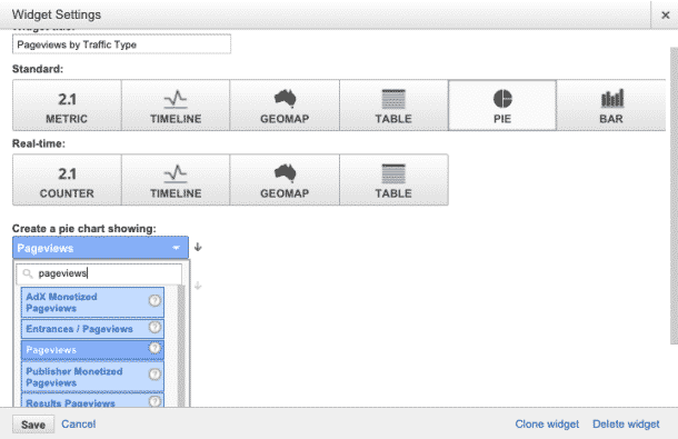
Your starter dashboard will be populated by several widgets which are comprised of lists, graphs, and charts. If you hover over any of the titles, you are give the option to edit or replace them with other metrics by clicking on the pencil icon. When you do, a screen will pop up allowing you to add widgets. You are given the choice between standard or real-time widgets. The former will be your go-to most of the time.
For our content marketing dashboard, we know we want to track how many people are viewing our content, and discover what channels we are reaching them.

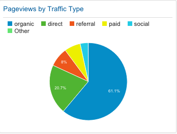
That being said, we want to create a pie graph that compares pageviews by traffic type. This will break down the proportions of site traffic from our various channels such as social, organic (search), or direct. This information is telling when examined and compared over time. Curious about your ROI from social media or paid advertising? This is a good way to measure it. Once you set the parameters, the widget will look like this:

Building the Dashboard
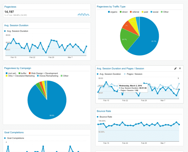
You can repeat this process for any number of widgets. For my hypothetical content marketing business, I also included widgets for Average Session Duration, Bounce Rate, Average Session Duration and Pages/Session, and Pageviews by Campaign. Please note that for in order for Pageviews by Campaign to provide any meaningful information, you are going to need to set them up. Here's what my completed dashboard looks like:

From this dashboard, we can track the following:
- how many people are coming to our site
- where they are coming from
- how long they are there
- my bounce rate; how many people are leaving without exploring the site
- how effective my individual campaigns are
These data can illustrate how effective our campaigns or methods are and is a great tool when observing change over time. The hardest part of this process is choosing the metrics and understanding what the changes can indicate. Every business is different, so identifying the core KPIs and metrics based on your unique needs is key.
Final Thoughts
Hopefully this gets you started. When used properly, Google Analytics is a powerful tool that can help you optimize not only your site, but your marketing tactics as a whole.
Analytics can be confusing and intimidating. When working with our clients, we take a very personalized approach to find the right solutions to their problems. One of the services we provide are analytics audits and consultation, which includes creating custom dashboards for your team. Click here to learn more, or contact us today to get information about pricing and availability.
Don't forget to like, follow, and connect with us on social media.