For tech and software companies, there might not be a more important customer-facing marketing asset than a website.
A tech company’s website is the first impression that potential customers will get of your business and be the primary entrance into your sales funnel.
The thing is, designing a great SaaS website doesn’t just happen overnight for the majority of highly successful technology companies and brands. There’s a lot to take into account in terms of what product or service you offer, the industries you serve, and what your potential buyers are like.
Building the necessary depth to your website, including the right resources, and having a powerful call-to-action must all be tackled and executed in the most customer-centric way possible to grow any technology or digital business.
Data also backs up how important web design is to technology companies.
A recent study conducted by a leading design technology company found that 38 percent of people will stop engaging with a website if the layout and/or content is unattractive.
Moreover, upwards of 94 percent of people cite poor design as the number one reason they mistrust a company’s website.
So how exactly can your company produce a website that’s not only functional and easy on the eyes, but that gives potential buys all the information they need, positions you as a thought leader, and generates a substantial amount of sales leads?
From product tours and online tools to cultivating an active customer community, here are Insivia’s top eight website design tips and tricks for technology companies.
1. Landing Pages For Technology Company Websites
Unless you’ve been hiding under a rock for the last few decades, you’re familiar with the concept of landing pages. In short, a landing page is a standalone web page, designed specifically for a marketing or advertising campaign.
Often landing pages are leveraged for:
- Search & Display Ads
To optimize conversions, you must direct a visitor to a page that relates to the Ad’s copy and subject matter. - Organic Search
Focused landing pages are a key ingredient in ranking for specific key phrases - Audience Landing Pages
Today, having pages for audiences by market or role is a key strategy to personalizing the journey with little technical lift.
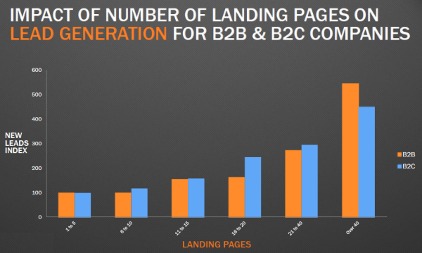
Don’t be afraid of creating as many landing pages as you think are necessary for each customer segment:
Companies see a 55 percent increase in leads when increasing the number of landing pages from 10 to 15.
This simple example helps to illustrate one of the major advantages to using landing pages when designing your website: Search Optimization. When you optimize your landing pages for search and pay-per-click (PPC), it will help your website rank higher in Google and other search engines.
Then, as people are more able to find your website through better search rankings, they’ll be clicking through to your landing page where you’ll have a direct, easy, tailored call to action for people to complete.
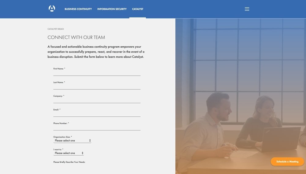
If you’re a Software-as-a-Service (SaaS) company, for instance, you might want sales prospects to set up a live demo with one of your salespeople.
With the use of landing pages, you can tailor the messaging to the type of potential customer, based on their search terms and ad they click through and maximize the chances they commit to the call-to-action (CTA). And that’s one of the ultimate benefits of landing pages, is driving more leads through paid search.
Here are some quick tips to help optimize your landing pages for the right target personas and customers:
- Strong Headlines that are both relevant to your PPC terms, and speak specifically to the pain points of the specific audience.
- Clean Design that comes across as trustworthy and professional. You want people to engage the CTA, but without being overly “salesy.”
- Strong Copy and wording is critical. You’ve taken the effort to get the prospect there, so don’t lose them with weak (or unclear) wording on your landing page.
- Easy forms that don’t take the user too much thought or time to fill out. Your sales people can get additional info later on, but for now you just want to make the CTA as painless as possible.
- Eye-catching buttons that make the CTA obvious and easy. Again, the wording in the button should be clear, concise, and powerful.
Here are some great examples to check out:
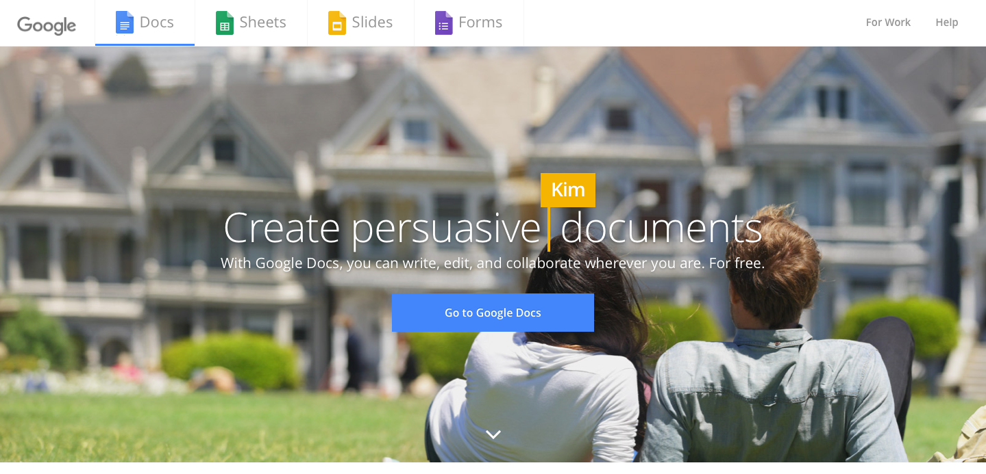
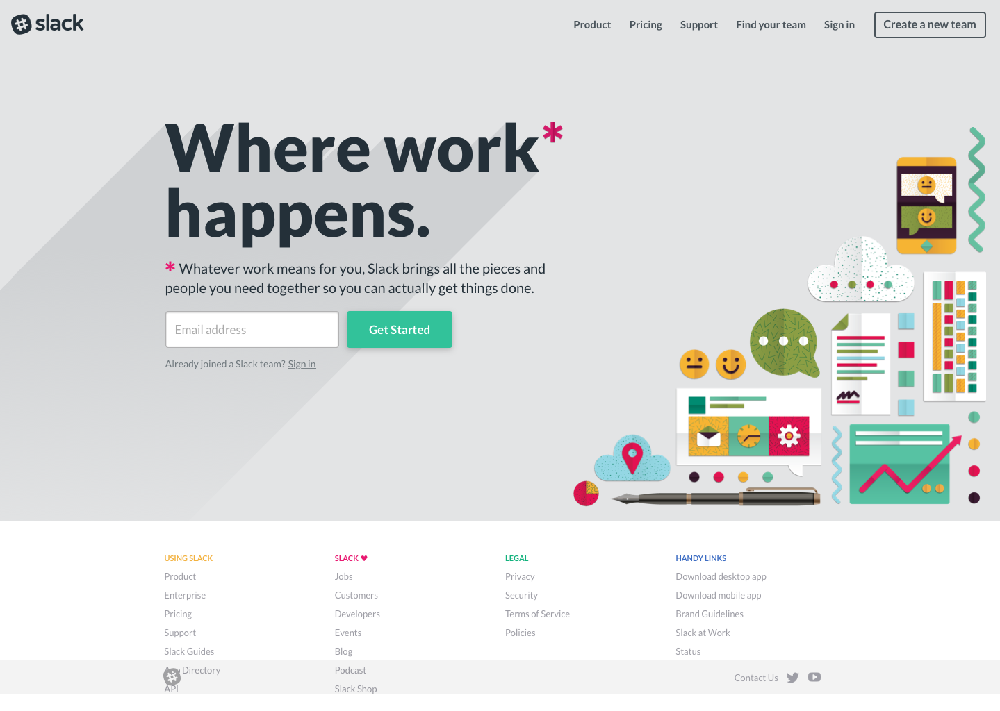
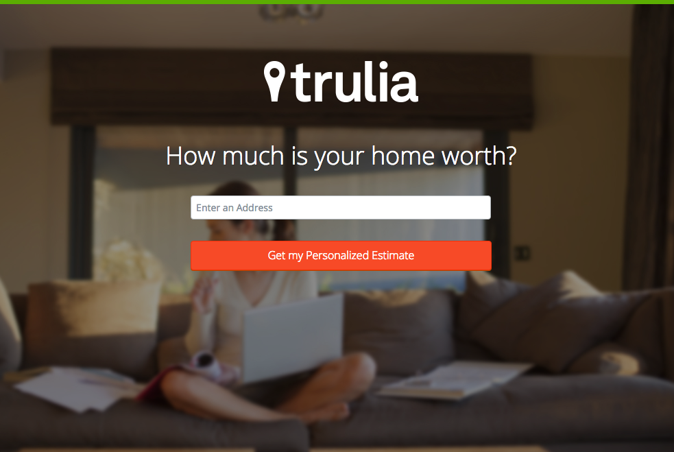
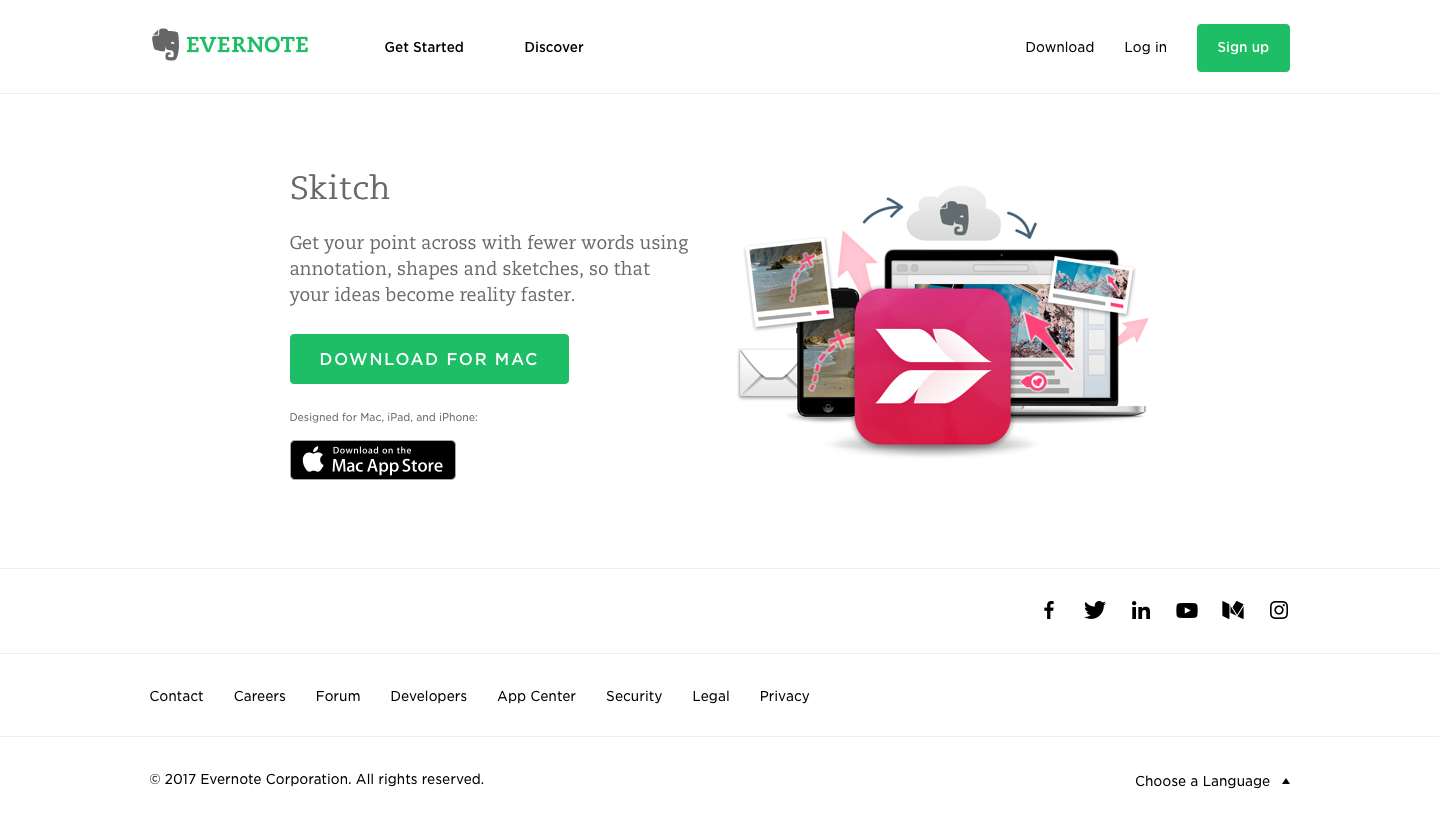
When designing a new website for a technology or software company, the strategy, technology, structure, and design of landing pages must be a primary – if not the primary – part of the process.
In many ways, landing pages are more important than your homepage or core website pages because smart marketing strategies will drive more traffic to your landing pages than anywhere else.
A sign of a successful marketing program is high volumes of visits and conversions on landing pages used in advertising and search optimization.
“The end-goal is to get your landing page to do the selling but your PPC ads must do the initial convincing. In the same way it’s important to match search terms with the content of the ad, it’s equally important to make sure that the landing page is tied directly to what the prospective customer is expecting to see and experience when they arrive on the page.”
2. Build Great Product Tour Pages For SaaS Products or Tech Services
Depending on what kind of technology company you are in, your product or service likely has a plethora of features, functionality, and configurations.
However, the mistake that many tech businesses make is trying to explain everything in words and text. While strong writing and copy do go a long way towards giving users the right information, there are much better ways to familiarize people with your offerings.
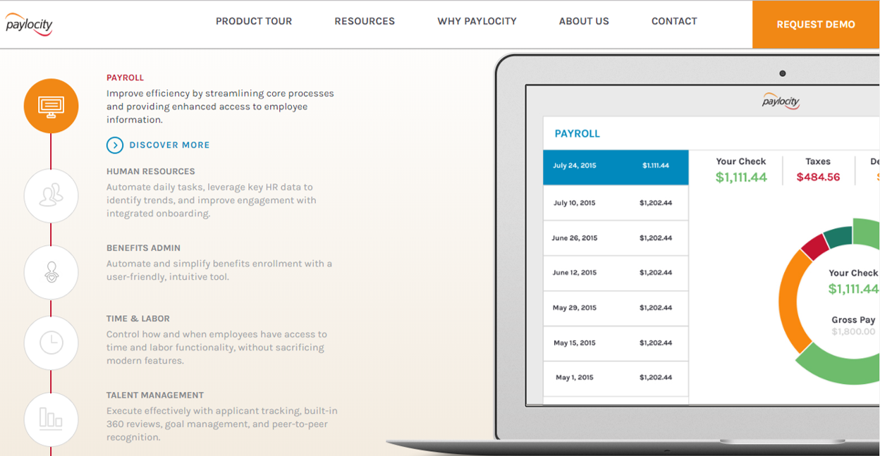
That’s why product tour pages are normally instrumental in shortening the amount of time it takes sales prospects to get a full grip on your technology. Product tour pages can vary, but are usually in a gallery format (versus long scrolling pages) and make effective use of graphics and videos to get the point across.
That being said, here are the four essential elements that make up any good product tour page:
Sequential Steps
Whether it’s a picture gallery, video sequence or long scrolling page, make sure each step is clearly defined. You want to move the visitor down a logical path, towards the eventual goal of becoming a customer.
Start at a general, high level about what the are the major issues or challenges that your product solves, then move gradually into specific features and functionality.
Bite-Sized Content
Each step in your product tour page should highlight one important aspect of your product or service that’s easy to digest and understand. If your product is an app for personal financial management, for example, don’t try to present everything in one product tour slide or video.
Have bite-sized content for savings, investing, and budgeting presented separately, making it easier for users to digest.
Short & To the Point
An important thing to keep in mind is that your visitors live busy lives, and their time is precious. They’re looking at your product or service because it can help them in one way or another, whether it be saving time, increasing income, or enhancing efficiency for their business.
Great product tours understand this and are short and to the point, seamlessly connecting the dots between the product and the results it will get for customers. Be succinct and clearly present your key value propositions in a to-the-point way that’s mindful of the visitor’s time.
Clear Call to Action
One thread that should run throughout all of your website design is that you want the right prospects to begin engaging with your sales cycle. Product tour pages should be no exception, and in many ways can be the most effective page on tech companies’ sites for high-quality lead generation.
At the end of the product tour, you’ll want a clear call-to-action that helps visitors that the next step towards becoming a customer. CTAs like “Request a Demo” or “Schedule a Free Assessment” are common in the technology industry, and the benefit is that when leads do come in from your product tour pages, the prospect will already be at least somewhat educated and familiar with the look, feel and functionality of your product.
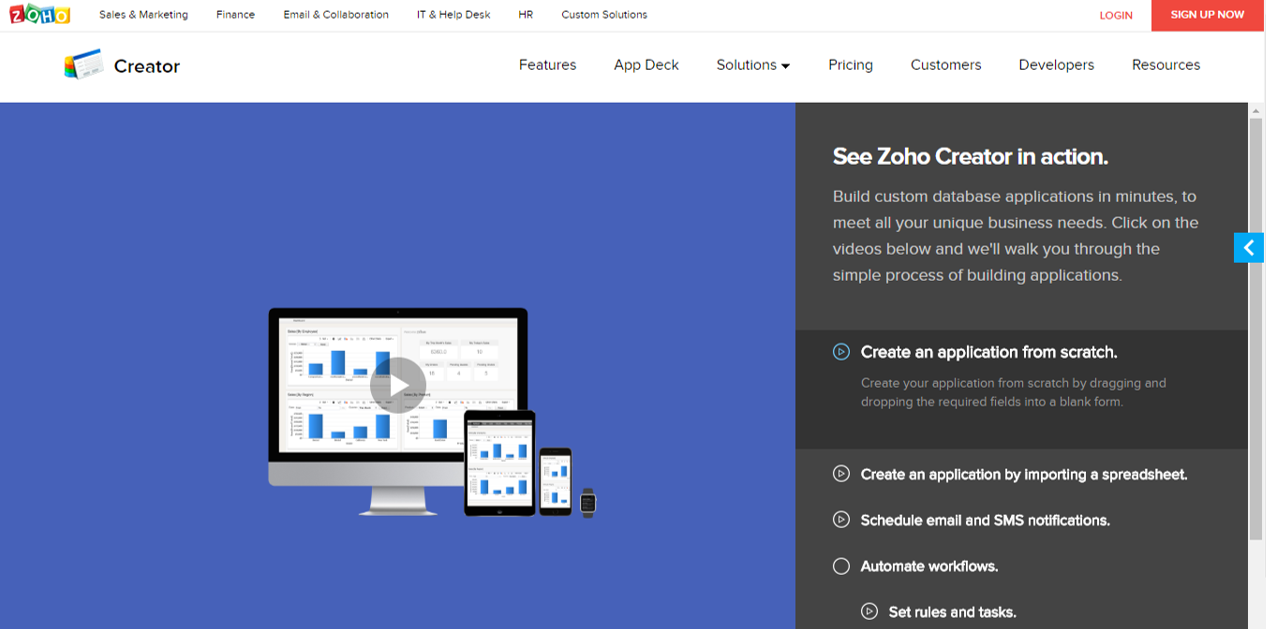
Zoho’s Creator product tour lays out steps in the sidebar
Paylocity has clear CTAs for each step, as well as Request Demo
“Product tours create a highly visual and crystal clear explanation of the value your product or service provides. If you have a product that needs explanation, or that isn’t easy to grasp in a few short seconds, consider using a product tour to help your visitors get understanding to help them make the decision to become your customer.”
3. Your Website’s Tech Resource Center and Blog
Technology buyers and customers can be some of the savviest consumers in the world. When it comes to evaluating new technology products or services, rest-assured they are doing their homework.
They’ll be reading white papers, product comparisons, and chatting on industry message boards to ensure they make the right investment in a technology that matches their business or personal needs.
So, why not make it easy for them to do most of that legwork from your website?
That’s precisely what a great Resource Center can help accomplish, educating and informing your future (and often current) customers on a regular basis. But a resource hub has to be done correctly, as the majority of resource sections on websites are not targeted properly towards specific users and prospects.
Here are some types of content that you should consider incorporating into your resource center, depending on your product, service, and/or target customer:
Articles + Lists
Solving your target audiences challenges and pains is a great way to attract visitors through search optimization. Google is often used to find solutions and creating relevant, valuable content to satisfy that need is a key strategy.
Case Studies
Before becoming customers themselves, prospects want to know how your company has already positively impacted similar customers. Case studies are a great way of showing the nuts and bolts of how your technology works with customers.
Formulate case studies for different industries, business sizes, and customer types so that any kind of sales prospect feels like there is a success story they can relate to.
Whitepapers
When done correctly, whitepapers can be a great way of positioning your company as a thought leader within a specific industry or area of technology. Whitepapers should be based on concepts, challenges, or issues that are critical to your core customer base.
They should be educational, highly informative, provide unique value and insights, and (most importantly) be unbiased and non-promotional.
Webinars & Tutorials
To establish themselves even further as thought leaders, many technology companies conduct free webinars or post video tutorials within their resource center. Webinars can be especially useful because it’s a real-time, interactive way for potential customers to engage with subject matter experts within your company.
These webinars can then be archived, spliced, or edited for future consumption in your resource center.
Infographics
While whitepapers and case studies are great resources, not everyone has time to dig deeply into those topics on a daily basis. Infographics are a great way to engage top of the sales funnel prospects in a short, fun and interesting way.
Infographics often present key facts, industry statistics, or product overviews in a format that can easily be digested in a matter of minutes.
Industry News, Reviews & Reports
Showcasing a wide range of industry information can help make your site an authority for a topic. Just a few examples are industry news, product reviews, trend reports, conference schedules, and much more.
Including this type of information will help increase search ranking and solidify that your company has a pulse on the industry.
Product Feature Releases
For technology and software companies, releasing information about new features for software or equipment is valuable to your audience. Existing customers can stay up-to-date on changes while new customers can get a sense of the pace of evolution.
No matter which types of resources you decide to provide to your audience, you’ll also want to account for the fact that your library will grow rather quickly over time.
Make sure you constantly adjust and adapt your resource center layout to include things like advanced search, organization by content or industry type, and above-the-fold featured content of your latest (or most relevant) resources.
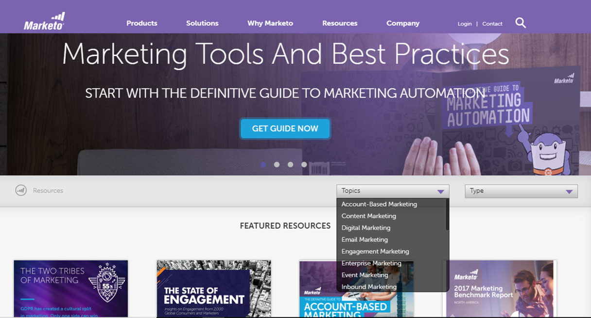
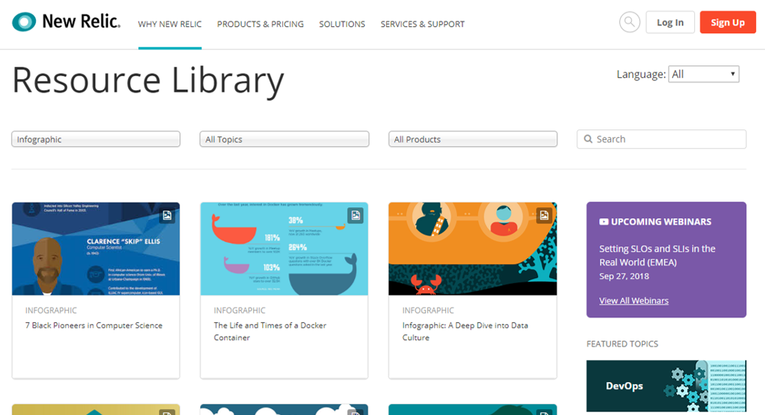
New Relic uses infographics for both fun cultural topics, as well as technology deep dives.
“A good resource center should serve as the hub of all your inbound marketing efforts. Done well it can support your search engine optimization and social media efforts, as well as your lead generation and website conversion efforts.”
4. Using Testimonials & Validation Tactics on Your technology Website
For technology companies, nothing puts sales prospects or future customers’ minds at ease more than testimonials on a website.
Hearing validation from current customers, and the positive outcomes they’ve received is one of the most powerful marketing weapons in your website design arsenal. In fact, customer testimonials have the highest effectiveness rating (89 percent) when it comes to influencing new buyers.
The thing is, you’ll need more than just a few quotes on the homepage of your website. Testimonials, validation, and success stories need to be presented on different pages (and in different formats) to be optimally effective and engage the maximum amount of prospects. Here are some of the key formats that testimonials should be presented in throughout your website:
Quotes
The simplest, and most straightforward way to present a customer testimonial on a site.
However, don’t be fooled into thinking that presenting quotes in your website design is something you don’t have to put a lot of thought into. Many tech companies are now adding more visual elements into how they present quotes.
This testimonial from Shopify is a good example of how you should think about presenting quotes:

Success Stories
Similar to case studies, customer success stories are a great way of building trust and credibility with potential customers. Customer success case studies often contain multiple quotes from the client or company you’ve worked with, and also take a deeper dive into the business goals you’ve helped them achieve, as well as the road you took to get there.
This will give prospects not only an idea of what your customers are saying, but also what your implementation and ongoing success processes are like.
Video Testimonials
To supplement your text quotes and case studies, it’s also a great idea to incorporate video testimonials wherever possible. While text quotes are great, they don’t have the same impact as prospects hearing how customers feel right from the horse’s mouth.
The other benefit is that customers willing to take time out of their day to record a video testimonial are likely some of your most loyal and committed customers, and can provide in-depth insight into what makes your product, service, or technology the perfect fit for their personal or business needs.
Featured Testimonial Sections
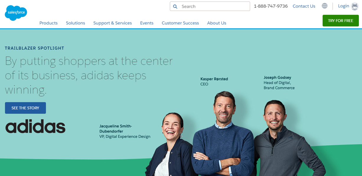
Many technology companies today have specific sections or pages on their websites dedicated solely to customer testimonials. And rather just presenting a quote, you can now use headers and “NASCAR” style logo bars to quickly present featured testimonials along with a quick call to action.
Take SalesForce.com’s testimonial webpage, which makes great use of the above-the-fold logo bar to present an attractive, impactful customer success story from Adidas.
Customer Reviews
For technology apps and products (especially in consumer-facing), users are constantly leaving reviews on Yelp, Google Play, Facebook for Business, and countless others. And assuming you’re getting good ratings, there are a variety of widgets and plugins that can be incorporated into your website that will automatically show visitors your real-time ratings.
Moreover, peer-created content on a website design is seen as the most trustworthy by potential buyers. After you have your review site reputation management under control, consider using one of these plugins to enhance the credibility of your brand.
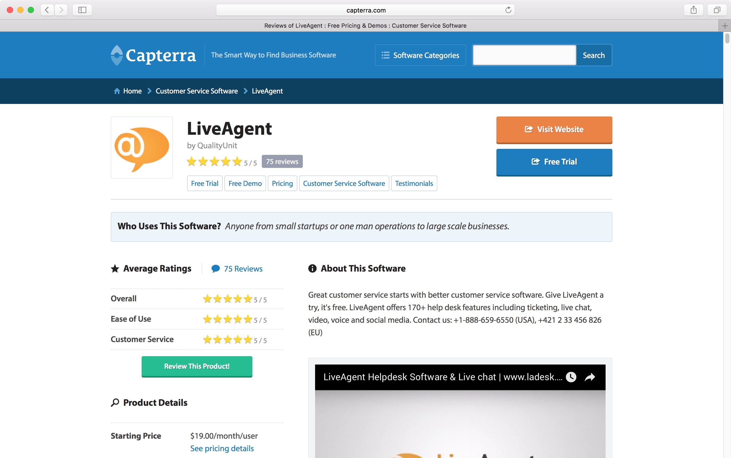
Pulling reviews from a site like G2Crowd or Capterra and linking back to them is just one easy way to display validation on your website.
“Testimonials are effective because they increase your conversion rates. They build trust by acting as a third-party endorsement and triggering conformity bias, also known as the bandwagon effect. In this way, testimonials are an important form of social proof.”
5. Website Tools & Calculators
No matter what industry or customer base your technology company serves, your website design needs to go much further beyond static content. Many prospects don’t just want to see a product demo video or read a whitepaper, they want to know how your offerings might impact their specific, individual situation. In the past, they might have had to call a sales representative or crunch the numbers by hand.
But today, it’s more than wise to provide users with useful, interactive tools on your website. This will not only help them see the value of your product as it relates to their circumstances but can also play a pivotal role in lead generation and prospect qualification.
Below are some of the most effective interactive, online tools that tech companies need to consider incorporating into their website design:
Calculators
Technology users, consumers, and customers always have one question at the top of mind: What’s in it for me? If your product is designed for enterprise size businesses, for instance, prospects are going to want to do their due diligence to make sure any new system is well worth the investment.
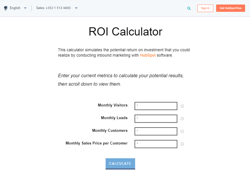
Even consumers that pay for services on a monthly basis need to be assured of the same thing. That’s where interactive, online calculators come into play. You can allow visitors to enter critical data from their own situation, and see the potential return on investment (ROI).
Calculators can range from simple to highly complex, but Hubspot’s ROI Calculator is a great example of how it should be done on a basic level.
Product Comparisons
If you’re like many technology companies out there, you’ve got more than one version of your product. At least. Many companies that serve different industries, business sizes, and customer bases can have upwards of eight or ten different versions, all with various features, pricing, and functionality.
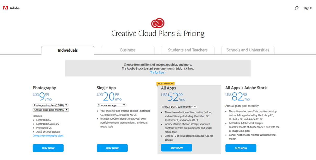
This presents somewhat of a problem for site visitors, as they may not know which product is right for them. That’s where comparison tools on your website can play a big role, allowing visitors to input various information about their needs, and help be director to the version that’s best for them.
Adobe’s Creative Suite Comparison tool is a good example of one way this can be accomplished.
Assessments
In many situations, potential customers that would benefit from your product or service simply aren’t aware of the impact it might have on their lives. Moreover, when they enter into a contract or agreement with a technology vendor, they want to feel like you’ve taken a consultative approach with them throughout the process.
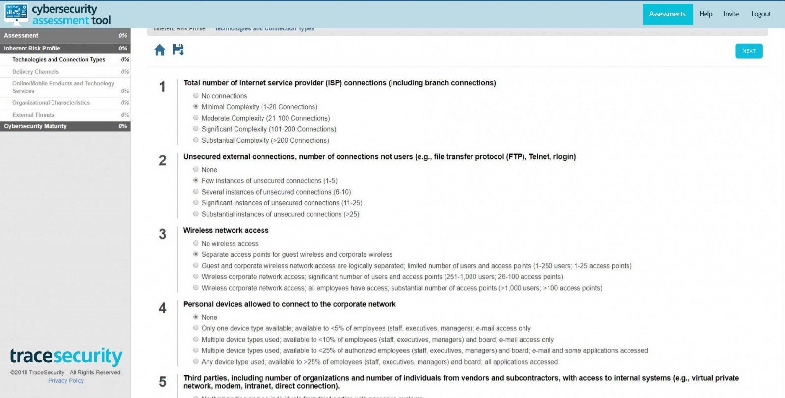
That’s why online assessment tools can be valuable at the beginning of the sales cycle. Prospects can plug in variables that relate to their current situation, and the assessment tool will indicate gaps that your company could fill, and with which features and functions.
These tools can either be web-based, or like the Systems Assessment Planning Toolkit from Microsoft, a set of files and worksheets that the user simply downloads.
The bottom line when it comes to online tools for your website is that they’re a great way to both show the value of your product, as well as gather leads. The more prospects use these online tools, the more they will qualify themselves prior to the sales cycle, and have a better idea of the ROI of your products as they move through the sales funnel.
“With interactive content, we can learn a tremendous amount from interactions. Rankings people give themselves or their companies when taking an assessment, questions they missed (or nailed) on a topical quiz, variations they assembled in a product configurator, or the range of parameters they tried with a calculator.Interactive content reveals incredible insights about individual prospects. We can then use that information to tailor subsequent nurturing and personalization.”
6. Showcasing Company Culture on Your Website
Potential customers and sales prospects aren’t just looking for a technology product these days. Rather, they want a partner to guide them throughout the process of implementing new technologies to transform their business. And even for consumer-facing tech companies, people want to know the people behind the apps they’re using and (potentially) handing over personal information to. Therefore, showcasing your company culture on your website can go a long ways towards building credibility, not to mention being a great recruiting tool for future talent.
Consider incorporating some of the following elements on your website to help people put a face to your technology business:
Employee Videos
One of the best ways to give people a feeling of your organizational values is producing short videos where employees talk about their routines, work, and overall experiences with the company. These videos should be around two or three minutes long, and include short jump-cuts between a diverse array of employees.
Employee videos are typically produced with a “What is it like to work here?” theme, but can encompass other areas like product development and customer success.
Just make sure that your company values are clearly stated from the get-go, your employees back them up, and that anyone appearing on camera appears natural and unscripted.
Company Blog
No matter what area of technology you’re in, a company blog is a must in today’s world. Your company blog will likely encompass a variety of topics, from technical how-to’s to industry perspectives. But your blog is also one of the most powerful tools to communication your corporate values to the public on a consistent basis.
Experiment with formats like employee profiles, customer success stories, and executive leadership Q&As. These will all give potential customers a “look under the hood” at how your corporate culture is evolving and being put into action on a day by day, month by month basis.
And don’t forget to keep blogging on a regular basis, as 80 percent of purchasing decision makers prefer to get information from a series of articles as opposed to ads.

Social Responsibility
While community service may not be one of the top priorities for your organization (you’ve got a business to run after all), it does pay to take some effort to get involved in local charities, events or causes. Whether it’s sponsoring a fundraiser or having employees volunteer at an animal shelter, it shows potential customers that your organization is capable of being committed to something bigger.
Having a specific webpage dedicated to your social responsibility efforts can also help open the door to new business clients and partnerships.
Who knows, some of those charitable organizations you’re working with today might be in need of the technology you provide tomorrow.
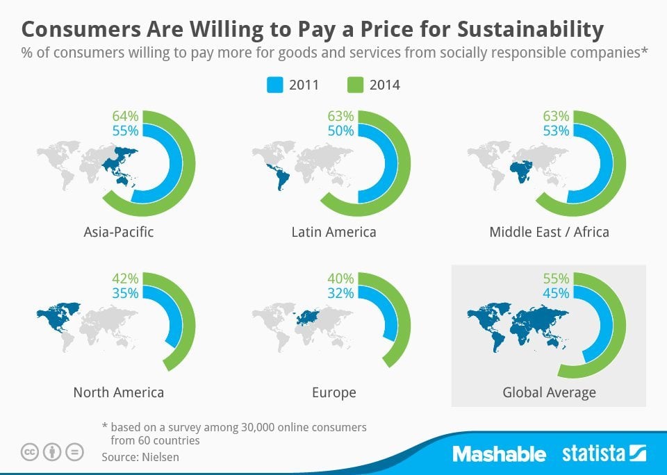
Finally, consider the overall design, look, feel, and colors of your website as it relates to your culture. An enterprise B2B SaaS company will likely have a completely different internal culture than an app designed for food delivery, for instance, and your overall design should reflect that.
Whether your culture is serious and consultative, or fun and exciting, make sure that the overall tone of your website is as congruent as possible.
“The perfect company culture video will vary, depending on many things. Things like the industry, company values, industry values, and budget. Pouring boatloads of cash into a company culture video may be a great idea for one company, and for others, filming a quick, 30 second video on an iPhone is perfectly acceptable.”
7. Customer Communities
No matter what stage of growth your company is in, you’ve at least got a handful of customers who not only use your product or service on a regular basis but are practically in love with it.
Many technology companies have recognized that these evangelists can be some of the strongest marketing there is, and have therefore dedicated portions of their websites to allow the formation of customer communities.
There are different approaches to implementing an online customer community on your website, and it will depend largely on what your product is, and how your best customers prefer to interact with one another.
Forums
One of the easiest, yet most effective, forms of building a customer community on your website. Basic online forums can be easily implemented and allow customers to share thoughts, ask questions or discuss topics related to your product. Potential customers and sales prospects can browse the forums, see what common issues have arisen, and generally how people interact with your brand.
It’s important to note that if you do choose to include a forum on your website, to make sure there are moderators and administrators to constantly monitor the discussion.
You’ll want to help guide users to solutions, provide helpful information, and facilitate a generally positive discussion.
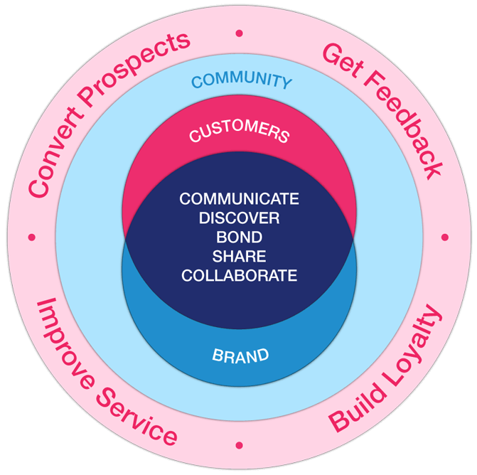
Check out this graphic The value of forum customer communities per Vanilla Forums
Social Communities
Taking things a step further, many tech companies now offer an even more in-depth customer community experience on their websites. With social style customer communities, customers can login through a portal and interact with others in a similar style to a private Facebook group.
Companies like SalesForce, for instance, provide the software infrastructure for such communities, which facilitate things like real-time discussion, individual chats, and reward badges.
While social communities are usually not completely visible to the public, sales prospects will be impressed to see that you’ve developed an exclusive, in-depth community that they might someday become a part of.
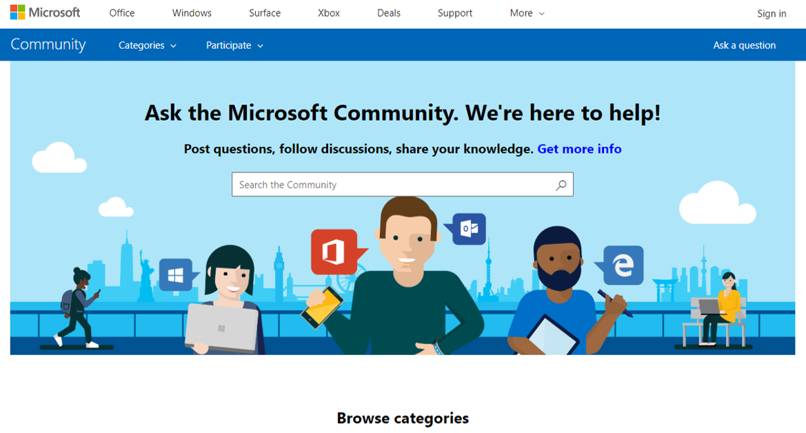
The Microsoft Customer Community
Partner Communities
Whether it’s channel sales, implementation, or customer service, most technology companies today simply can’t go it alone. Partners are essential to maximizing growth and performance, but all too often take a back seat to more pressing matters like sales and revenue growth.
Providing your partners a space on your website where they can connect, discuss strategies, and share useful information will not only increase their performance, but serve to attract additional partners in the future.
If you rely on implementation partners in many cases, for example, dedicating a partner implementation community will help enhance their performance and in turn increase customer satisfaction with your processes.
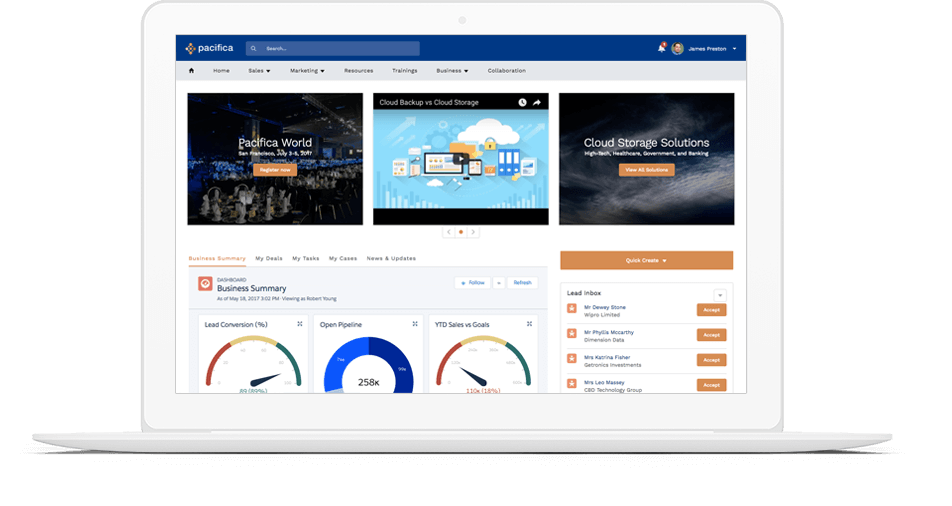
“If you are launching a new community or refreshing your existing community, taking time to prepare a plan is crucial for ensuring success. The best way to start off is to determine why you are building the community to begin with. Reasons may range from you are trying to support your existing business or marketing efforts to wanting to counteract negative reviews and identify passionate fans.”
8. Free Sandbox or Free Trials for Your SaaS or Technology Offering
Building on your customer communities, there are those highly passionate individuals (who may or may not even be customers) that love to geek out on playing, creating or tinkering with your product.
They love taking a deep dive into learning how your technology works, and seeing if they can create something new and unique with it. Others may just be getting into technology, and want to be walked through the nuts and bolts in an interactive way before purchasing your product.
Either way, providing visitors to your website the option of accessing a free “Sandbox Environment” where they can experience your product firsthand is a great way to further educate your customer community and generate leads among those who are curious.
Below are some examples of tech brands that have really nailed what it takes to provide a great sandbox environment on their websites:
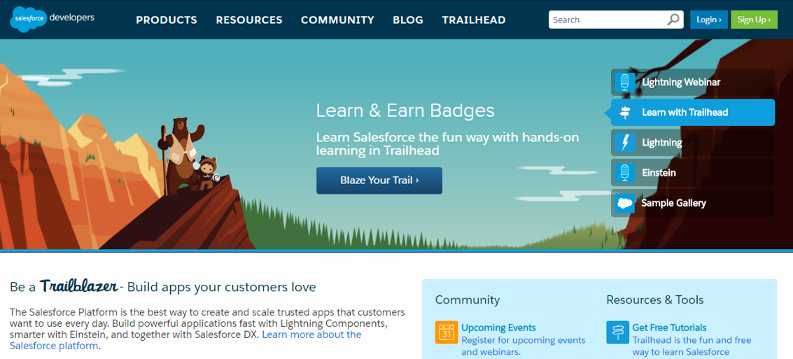
One of the most popular sandbox environment on the web, SalesForce has taken the time and effort to provide countless resources and events around their sandbox community.
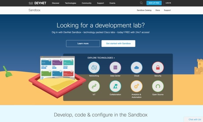
Networking giant Cisco serves a plethora of areas in technology, and has managed to provide a sandbox environment that covers just about each and every base.
Engineers, developers, network admins, architects, or anyone else who wants to develop apps is free to do so, 24/7. Networking, Data Center, and Internet of Things (IoT) development environments are all included free of charge.
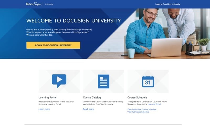
The DocuSign sandbox section of their website is one of the best examples of how to generate leads in a straightforward manner. This no-frills approach has users enter key information that will help route and qualify the lead, and has an easy call-to-action that doesn’t take users to much time to complete.
A great example of how a sandbox page can be well executed to help potential clients go from A to Z in terms of accomplishing their overall business goals, in this case processing more payments.
Braintree focuses the messaging on the pillars of access, security, and experimentation, and is also well-designed to collect lead generation information.
So, if you haven’t realized it by now, technology companies need to think long and hard about each and every aspect of their website design. Over 80 percent of marketers say that conversion is the number one priority in web design, so be rest assured that great design will lead to sales.
From SaaS companies to consumer apps, you’ll need to consider your customer base, target prospects, and business goals when building (or redesigning) your website.
Using tactics like landing pages, sandbox environments, and interactive tools can all play a huge role in generating more leads. And by including online communities and corporate culture content, customers and prospects will get a better sense of your brand’s values and personality.
Key Takeaways
Technology companies can create great sites to convert traffic and drive leads. Check out the summary of our top web design tips for Tech and SaaS.
- Include a landing page strategy in your web design process.
- Use product tours to simply explain your features and benefits.
- Build a great resource center to drive traffic to your site and answer common questions.
- Leverage testimonials for validation and conversion.
- Tools and calculators can significantly increase conversion.
- Showcase your company culture.
- Build a community for your customers and partners.
- Offer developer tools or free trials.
Written by: Tony Zayas, Chief Revenue Officer
In my role as Chief Revenue Officer at Insivia, I am at the forefront of driving transformation and results for SaaS and technology companies. I lead strategic marketing and business development initiatives, helping businesses overcome plateaus and achieve significant growth. My journey has led me to collaborate with leading businesses and apply my knowledge to revolutionize industries.
