It’s only logical that your software company launches a mobile-friendly version of your website. In fact, at least 50% of web traffic comes from mobile devices.
“Mobile is becoming not only the new digital hub, but also the bridge to the physical world. That’s why mobile will affect more than just your digital operations – it will transform your entire business,” says Thomas Husson, the Vice President, and Principal Analyst at Forrester Research.

As technology evolves, your software business must evolve with it. Within the past decade, there has been a drastic increase in the use of cell phones. Some reports state that almost 60% of all website traffic is generated from mobile phones, gaining a 20% increase since 2015.
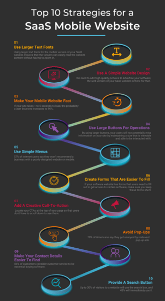
To use this fact to your benefit, your software company will do well in creating a mobile-friendly SaaS website. Consider the following mobile SaaS website strategies during development.

1. Use Larger Text Fonts
Using larger text fonts for the mobile version of your SaaS website ensures that the viewers can easily read the website content without having to zoom in. This ensures that the other features of your software website aren’t hidden when the user zooms in to view the information they’re looking at.
When you are designing your site for mobile, make sure you’re actually looking at your design on a device itself. IOS and Android provide sizing guidelines on typography.
Make your font large enough so that viewers can view the quality content your software website has to offer, no matter the size of their mobile device.
2. Use A Simple Website Design
Having a simple website design has the advantage of your mobile website loading fast. Keep the design of your software website simple. No need to add high-quality pictures to advertise your software, the web version of your SaaS website is there for that.
“A clean design and focused copy can go a long way. Remember that you only have a few seconds to convey who you are as a company. This is true for any website design, but is particularly important when you are designing for smaller devices.” Said Michael LaVista, founder, CEO, Caxy Interactive, an application design and development company.
KISS – Keep it Simple Stupid
A best practice to implement is ensuring your design helps users focus on a primary task. This can be done by limiting the number of onscreen controls, interactions, and more.
It’s always a good idea to follow the 10-second rule. That’s the average amount of time you have to convey your message to your potential buyer and keep their attention. Anything lengthy and beyond that span of time can easily lose a customer. Once you grab their attention from there, you want to consistently keep your content short and scannable.
If the content is easy to read, you have a higher chance of retaining your audience.
3. Make Your Mobile Website Fast
You need to do whatever you can to make your mobile website loading speed swift and steady. 40% of people abandon a website that takes more than 3 seconds to load, and if your site takes 1 to 5 seconds to load, the probability a user bounces increases to 90%.
Do your homework on what makes your mobile website fast and incorporate your findings in designing your mobile SaaS website. You might do well in cutting down high-size images and videos complementing your software descriptions. You can leave the fancy bits for the web version of your SaaS website.
Here are a few quick ways to improve page loading speed:
- Ditch cheap hosting
- Cheap hosting leads to poor performance. Your customer experience journey is just beginning when considering a user on mobile, and one of the worst mistakes to make is settling for a below par hosting option for a low monthly rate. Make the investment now.
- Optimize your images
- Images are, of course, a vital aspect of web and mobile design. But, high resolution or large images can delay loading times. The quality of your content is important, so try compressing images, changing their file format, or enabling lazy loading. Ultimately, shedding some of the weight the graphics and images on your site hold will decrease loading time. In fact, you can do this for free at tinypng.com.
- Use asynchronous and defer loading for CSS and JavaScript
- Asynchronous loading enables multiple files to load at the same time, which can speed up a page’s performance.
- Eliminate unnecessary plugins
- Plugins that are outdated or not well maintained can not only post a security threat, but can even erupt compatibility issues that hurt performance. Additionally, you should review the plugins you have installed and evaluate whether or not they are actually necessary still.
4. Use Large Buttons For Operations
While designing for mobile, use large enough buttons so the user does not need to struggle to zoom in. Similarly to utilizing larger text for a mobile format, by eliminating white space and using larger buttons, your users will not potentially miss information on your site by maintaining a size that is viewable and able to be interacted with.
Making a button bigger will lead to a visually dominant screen, but when a button is too small, it cannot be clicked on by a normal finger. MIT’s Touch Lab reported that most fingertips are appx 8-10mm wide, so test user interaction with multiple people on your team to make sure your design is accommodating to the majority of users.
As for your links to other websites or blogs, make sure that is a gap between the two hyperlinks. A sufficient gap ensures that the user only clicks on the desired link without accidentally clicking on the other one due to the limited space mobile devices offer.
Additionally, make sure your design is very explicit. Don’t make your users guess what a button does, just tell them!
5. Use Simple Menus
57% of internet users say they won’t recommend a business with a poorly designed website on mobile. Mobile devices don’t have a lot of space, unlike desktop computers. For this reason, it would be best if your software website has menus that are relatively simple, easy to read and understand.
The menus should be able to provide an overview of your desktop website without compromising on its simplicity.
Using these simple menus, mobile users can easily navigate software to software to find the one that provides the best solution to their problems.
Making your software easy to see through simple menus can also increase the noticeability of that software.
6. Create Forms That Are Easier To Fill
If your software website has forms that users need to fill out to get access to certain software, make sure you keep these forms short.
Filling out long forms may be hard for users due to the size of screen space on a mobile device. This may send them back to where they came from, in fact, 27% of users abandon an online form because it is too long.
To avoid this, use a concise form with only a few fields. Determine what questions are absolutely vital to ask and focus on those; if you can skip those additional questions about demographics or location, we recommend you do. However, in many cases general information about users can be imperative to your business operations, so be intentional with what forms you send out or push. Ask yourself, does every user need to answer these questions? If not, segment your audience and distribute surveys with purpose and intent.
Design is also imperative here. Utilize focus groups among your own teams to test the usability of the forms you’re pushing. Question whether or not you’re following the other tips listed in this article, and make sure the format of the questions is accessible to mobile users.
Using a dropdown menu for choices is a better alternative than a standard multiple choice format.
7. Add A Creative Call-To-Action
Adding enticing call-to-actions (CTAs) may be challenging when working on a mobile website. However, they are a must if you intend to sell your software. Locate your CTAs at the top of your page so that users don’t have to scroll down to see them.
Use intriguing images, texts, and banners to make your CTA stand out. As a designer, consider what makes you relate to a CTA enough to complete the action. It turns out that color theory can be a mobile designer’s best friend as SAP found that orange CTAs boosted their conversion rate by over 32.5%.
There is no one size fits all solution, nor is there a perfect way to design a call to action. This is where AB testing could prove its necessity for your teams. By AB testing call to actions on your site, you’re able to determine what works most often and effectively, and in this scenario (unlike many) beautiful, cool design is not always what is the most important focus. What is most important is whatever works.
8. Avoid Pop-Ups
While designing a mobile website for your SaaS company, make sure it’s free from pop-ups. 70% of Americans say they get annoyed by irrelevant pop-up ads. Viewers hate pop-ups, and there’s nothing that may make a viewer retreat faster than a mobile website with pop-ups.
9. Make Your Contact Details Easier To Find
84% of customers consider customer service to be essential buying software. For this reason, you should always have your contact details in a place where they are easy to locate by your viewers. This helps the users save time, and they don’t have to aimlessly navigate around your software website to find a way to contact you.
If they’re looking for your contact details, it means they have a query regarding your software. Don’t make your users do grunt work just because they want to get in touch with you. You can use chatbots and live chat that appears at the bottom-right corner of the mobile website to help your viewers get in touch with you.
10. Provide A Search Button
Simple menus aren’t always the answer to find the software that your mobile website users have been looking for. This is where the search button comes into play. Up to 30% of visitors to a website will use the search box, and 43% will immediately use it.
You should include a search button in your SaaS website to make sure that your users can find their desired software and information effortlessly without having to toggle through different menus. This is a great way to retain viewers on your website as this saves the viewers’ time as having to navigate between many menus may send the users off running from your SaaS website.
Bottom line
In the end, all that matters is that the mobile version of your website can generate the desired traffic through both organic searches and PPCs. Mobile websites play a vital role in generating leads for your software website, and their pertinence in effective marketing cannot be denied.
